
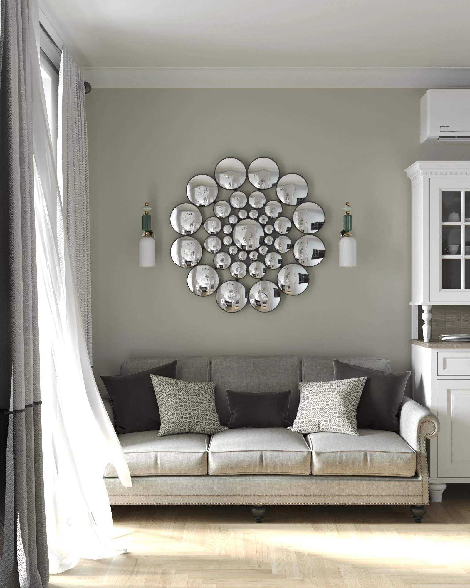
Your home does not need a major renovation to look more polished, personal, and inviting. Sometimes, one thoughtful decorative detail is enough to completely change the mood of a room. From statement wall art and colorful accents to natural textures and beautifully styled shelves, simple additions can make an impressive difference. I love how small decorating choices can bring personality to even the most understated spaces without making them feel cluttered. In this collection, I’m sharing simple decor ideas that add character, warmth, color, and visual interest while remaining practical for everyday living. If you’re looking for an easy way to refresh your space, these inspiring interiors are a great place to start.
A Whimsical Wall of Oversized Paper Flowers
I love how this wall turns a simple entertaining area into something instantly cheerful. Large pink, yellow, and magenta paper flowers are arranged across a light-colored wall, mixed with green leaves and smaller round floral shapes in blue, red, and pink. Below, a compact serving table holds desserts, drinks, and dishes, creating a festive setting that feels playful without requiring an elaborate room makeover. The exposed brick, wood ceiling, and warm flooring give the colorful display an especially inviting backdrop.
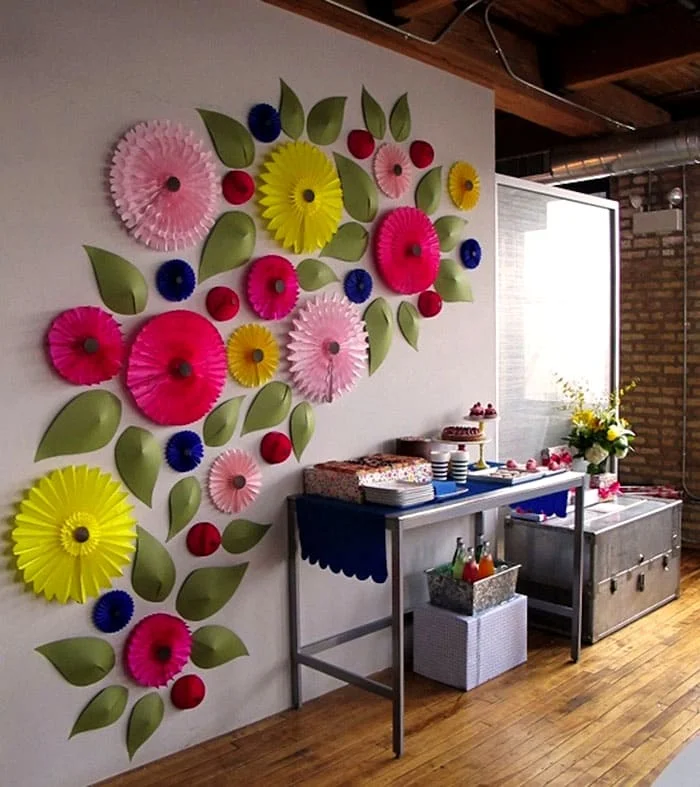
What makes this idea work for me is the way the decoration follows the wall vertically and horizontally instead of being confined to one small picture or arrangement. The varied flower sizes create movement, while the repeated colors visually connect the wall with the entertaining setup below. I also like that the decoration makes use of otherwise empty wall space without taking away valuable floor area.
When I want to make a room feel more celebratory without replacing furniture, oversized wall decorations are one of the easiest approaches I consider. The important lesson here is scale. A collection of small pieces could disappear on such a large wall, while these oversized flowers immediately establish a focal point. Keeping the palette limited to a handful of repeated colors also prevents the arrangement from feeling completely chaotic.
For a similar look, I would arrange the largest pieces first and then fill the gaps with smaller flowers and leaves. I would keep the installation concentrated around one area rather than spreading individual pieces randomly throughout the room. That gives the finished display the feeling of an intentional composition rather than a collection of unrelated decorations.
Rustic Wall Display With Wood, Woven Texture, and Natural Branches
This rustic interior takes a completely different approach, using natural-looking materials and objects to create character. A wooden shelf with black metal brackets is mounted above a patterned textile wall hanging, while a collection of small metal cups is attached across the textile. Beneath it stands a sculptural branch arrangement, and a tree stump serves as a small pedestal for an iron. The pale horizontal wood walls and light tiled floor keep the space bright while allowing the darker decorative elements to stand out.
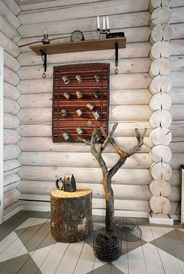
I find the layering particularly effective because every object occupies a different visual level. The shelf draws attention upward, the textile anchors the center of the wall, and the branch installation brings the decoration toward the floor. Rather than filling the entire wall with traditional artwork, the room combines practical objects, natural forms, and handmade-looking pieces.
For me, this is a good example of how rustic decorating can feel collected rather than overly coordinated. I would not try to make every object match. Instead, I would look for a common connection such as natural wood, aged metal, woven texture, or an earthy finish. The contrast between the pale wall and darker objects is what gives the arrangement definition.
The biggest takeaway is to use vertical space creatively. A shelf does not have to be reserved for books, and a wall hanging does not need to stand alone. Combining several types of objects can make a small corner feel much more interesting while preserving the relaxed character of the room.
Playful Framed Art Above a Simple Gray Sofa
This living room proves that a very simple sofa can become much more expressive with the right wall styling. A light gray upholstered sofa sits against a white wall, with a long floating shelf positioned above it. Three framed artworks rest on the shelf, including two playful black cat illustrations and a smaller patterned piece. Trailing green plants soften both ends of the shelf, while a gray rug and neutral furnishings maintain a calm foundation.
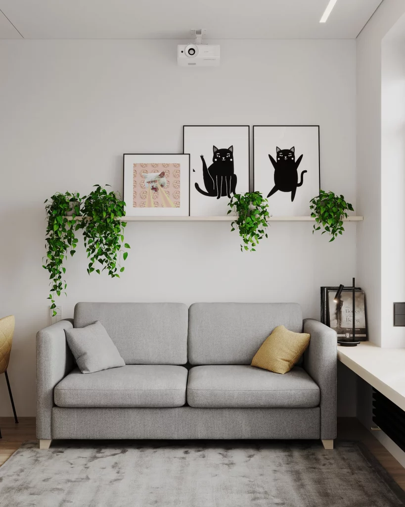
I like the balance between the graphic artwork and the organic greenery. The black-and-white illustrations provide definition against the white wall, while the cascading plants introduce movement and natural texture. The floating shelf also gives the room a practical display surface without making the wall feel visually heavy.
This is one of those decorating ideas I find especially easy to adapt because the basic formula is so flexible. A simple shelf can become a rotating display for artwork and plants, allowing the room to change without major alterations. I also appreciate that the artwork is casually layered rather than arranged in a rigid grid, which gives the space a more relaxed personality.
If I wanted to recreate this feeling, I would start with three or four pieces that have a visual relationship but are not identical. Then I would add greenery at different points along the shelf so the display does not feel too symmetrical. The key is leaving enough open wall around the arrangement to preserve the clean atmosphere seen here.
Minimalist Piano Wall With a Gallery-Style Clock
The dark wood upright piano immediately gives this room a warm focal point. Above it, a large minimalist clock is created from small framed pictures arranged in a circular formation, with simple clock hands positioned at the center. Deep green curtains frame the bright window, while neatly shaped green plants bring additional texture to the corner. The darker flooring and wooden piano balance the otherwise light room.
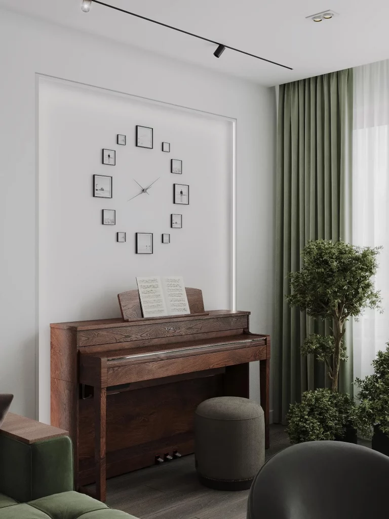
What stands out to me is how the wall decoration complements the piano without competing with it. Instead of hanging one oversized artwork directly above the instrument, the small frames create a lighter, more delicate arrangement. The circular shape also contrasts beautifully with the piano’s strong horizontal and vertical lines.
I find this a clever way to combine decoration with function. The clock is still useful, but the surrounding frames turn it into a personalized wall feature. This kind of arrangement can be especially effective when a room already contains a substantial piece of furniture that deserves to remain the main focus.
I would keep the surrounding decoration relatively restrained if I were recreating this look. The piano, clock arrangement, curtains, and plants already provide enough visual interest. Rather than adding more objects, I would concentrate on maintaining clear space around the main elements so the composition continues to feel calm and sophisticated.
Layered Artwork Above a Rich Red Cabinet
This cozy interior uses a deep red cabinet as its strongest decorative statement. The cabinet sits against pale horizontal wood walls and is topped with a collection of framed artwork, a small round hanging object, a red lamp, a dark textured vase filled with branches, and a decorative shell-like object. A black-and-white forest image provides the largest artwork, while the smaller pieces create a layered arrangement beneath it.
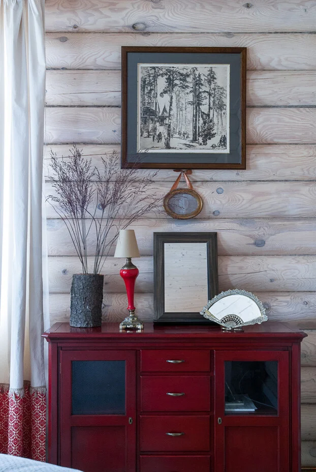
I like how the red cabinet anchors the entire composition while the smaller accessories repeat and soften its visual impact. The wood wall provides a natural background, and the monochrome artwork keeps the upper portion from becoming too colorful. The tall branches also add height and help connect the cabinet with the artwork above.
For me, this is a strong example of decorating with layers rather than relying on one perfectly centered piece. The objects overlap slightly in visual weight, which gives the wall personality and makes it feel collected over time. The cabinet itself also provides useful enclosed storage, so the decorative display does not come at the expense of practicality.
When styling a similar surface, I would begin with the largest artwork and then build outward with smaller pieces. I would also vary heights, just as this arrangement does, so everything does not sit along one straight line. A few contrasting finishes can make the display feel much more individual while still keeping the overall composition cohesive.
Warm Built-In Shelves Filled With Earthy Objects
These built-in shelves create a warm, curated display using a restrained palette of brown, beige, cream, and muted terracotta. Each dark wooden shelf holds a combination of pottery, small bowls, carved wooden pieces, vases, books, branches, and sculptural objects. A large woven circular piece occupies the top shelf, while the arrangement becomes more intimate and varied on the shelves below. The light wood floor and warm neutral wall create a soft backdrop for the collection.
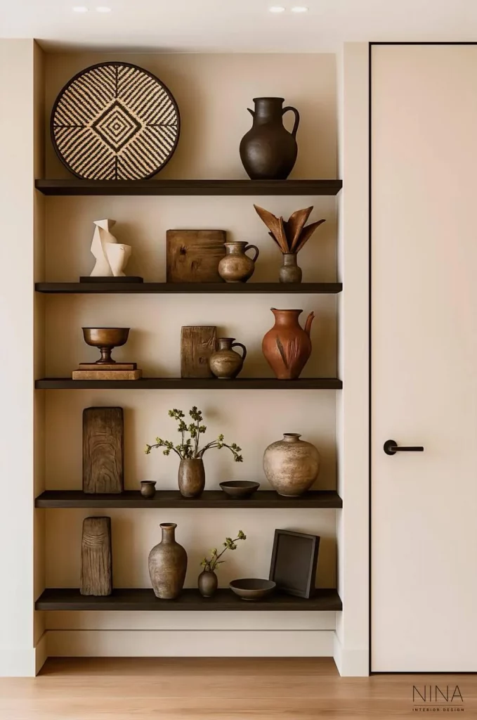
I find the repetition of earthy materials particularly successful. Although every shelf contains different objects, the similar tones and natural finishes make the entire unit feel connected. There is also enough empty space around individual pieces that the display does not become visually overwhelming.
This is exactly how I like to approach open shelving: not as a place to put everything, but as an opportunity to edit. Grouping objects by color and material creates consistency, while varying their heights and shapes prevents the shelves from looking repetitive. The combination of upright wooden pieces, rounded pottery, shallow bowls, and organic branches gives the eye plenty of small details to discover.
If I were styling shelves like these, I would resist filling every available space. I would place a few larger objects first, then introduce smaller pieces around them and leave intentional gaps. That negative space is what allows the individual objects to remain visible and gives the overall display its polished quality.
Nautical Dining Room With an Unexpected Mix of Chairs
This dining area makes a strong statement with a white-painted brick wall, a dark blue cabinet, and an anchor mounted prominently in the center. A simple round wooden table is surrounded by chairs in several finishes, including brown, black, and a distressed turquoise chair. Hanging glass pendant lights add variety overhead, while dark flooring and curtains reinforce the dramatic atmosphere.
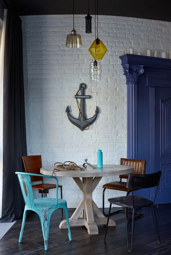
I love the individuality created by the mismatched seating. The chairs do not look like they were selected from one matching set, yet their different shapes and finishes make the dining area feel relaxed and characterful. The anchor immediately establishes a nautical reference, while the blue cabinet strengthens that theme without turning the entire room into a literal maritime display.
For me, this image is a reminder that a dining room does not need perfectly matching chairs to look finished. Mixing seating can introduce personality and make a simple table feel more collected. The trick is allowing one or two elements, such as the blue furniture and nautical wall decoration here, to create a visual thread between otherwise different pieces.
I would keep the central wall decoration strong but avoid adding too many competing accessories. The anchor already commands attention, and the pendant lights add another distinctive layer. The result works because the room embraces contrast while maintaining a recognizable color story.
Colorful Ceramic Plates as a Dining Room Focal Point
Here, turquoise becomes the defining decorative color. Floor-length turquoise curtains frame the dining area, while a collection of patterned ceramic plates decorates the white wall. The white table and chairs create a crisp foundation, with black seating cushions and a mustard-colored table runner adding contrast. Decorative bowls and small vessels repeat the colors and patterns used throughout the room.
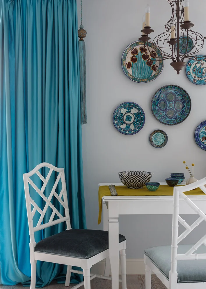
I find the plate arrangement especially effective because it turns everyday objects into wall art. Each plate has its own pattern, yet the turquoise, blue, and darker decorative details create enough consistency to make the collection feel intentional. The arrangement also fills the wall vertically, giving the dining area more personality without requiring a large painting.
This is a decorating trick I often appreciate because it can combine sentimental or collected pieces with visual impact. Instead of hiding attractive dishes inside a cabinet, displaying them allows their patterns and shapes to become part of the room. The different sizes also create a more dynamic composition than a row of identical pieces would.
If I were creating a similar display, I would first decide on a dominant color and then select pieces that share it while varying their patterns. I would also arrange the largest plates first and use smaller ones to balance the surrounding spaces. The goal is to create a loose composition that feels lively rather than perfectly symmetrical.
Woven Wall Plates for a Soft Natural Accent
The final interior takes a quieter approach with a cluster of woven circular wall pieces arranged against a warm off-white wall. The pieces vary in size and feature different spiral and geometric patterns in neutral natural tones. Below them is a sculptural white chair and a small cylindrical side table decorated with a textured pattern. Wooden flooring and a tall louvered wooden door add warmth to the minimalist space.
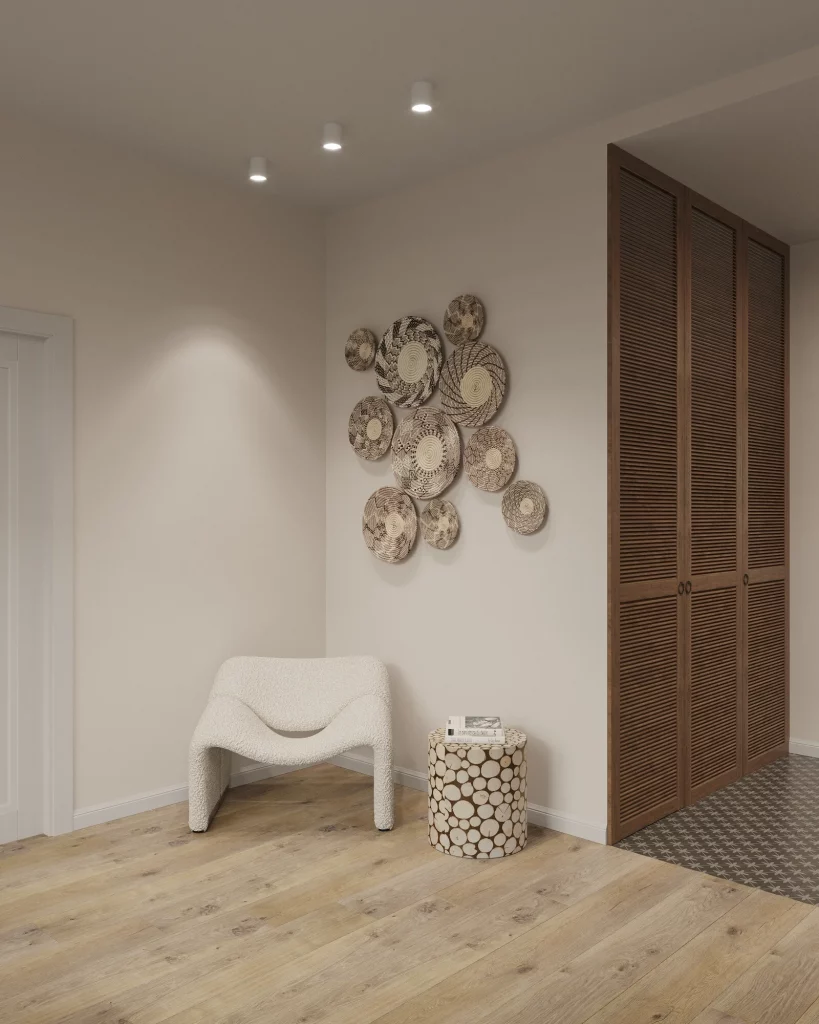
I like how much character these woven pieces bring to an otherwise understated corner. Their natural texture stands out against the smooth wall, while the circular shapes provide a gentle contrast to the straight lines of the door and floorboards. Because the colors remain neutral, the arrangement adds interest without making the room feel busy.
For me, this is one of the simplest ideas in the collection to translate into an everyday home. A blank wall can feel finished with nothing more than a carefully arranged group of textured objects. The different sizes are important because they keep the composition from looking like a rigid pattern, while the repeated circular shape gives the collection cohesion.
I would use this approach when I wanted warmth and texture without introducing a strong new color. Starting with one larger woven piece and gradually surrounding it with smaller ones can make the arrangement feel naturally balanced. I would also leave plenty of surrounding wall visible, as the open space is an important part of the calm effect shown here.
Warm Wood and Patterned Wallpaper in a Welcoming Hallway
I immediately notice how warm and inviting this hallway feels because of its combination of light wood and delicate patterned wallpaper. The walls are mostly covered in a small repeating geometric pattern, while the doors, frames, and central built-in door are finished in a similar warm natural wood tone. Large pale floor tiles keep the lower part of the space bright, and two small round wall displays containing botanical elements add a subtle decorative touch. Recessed ceiling lights provide clean, even illumination without competing with the wall finishes.
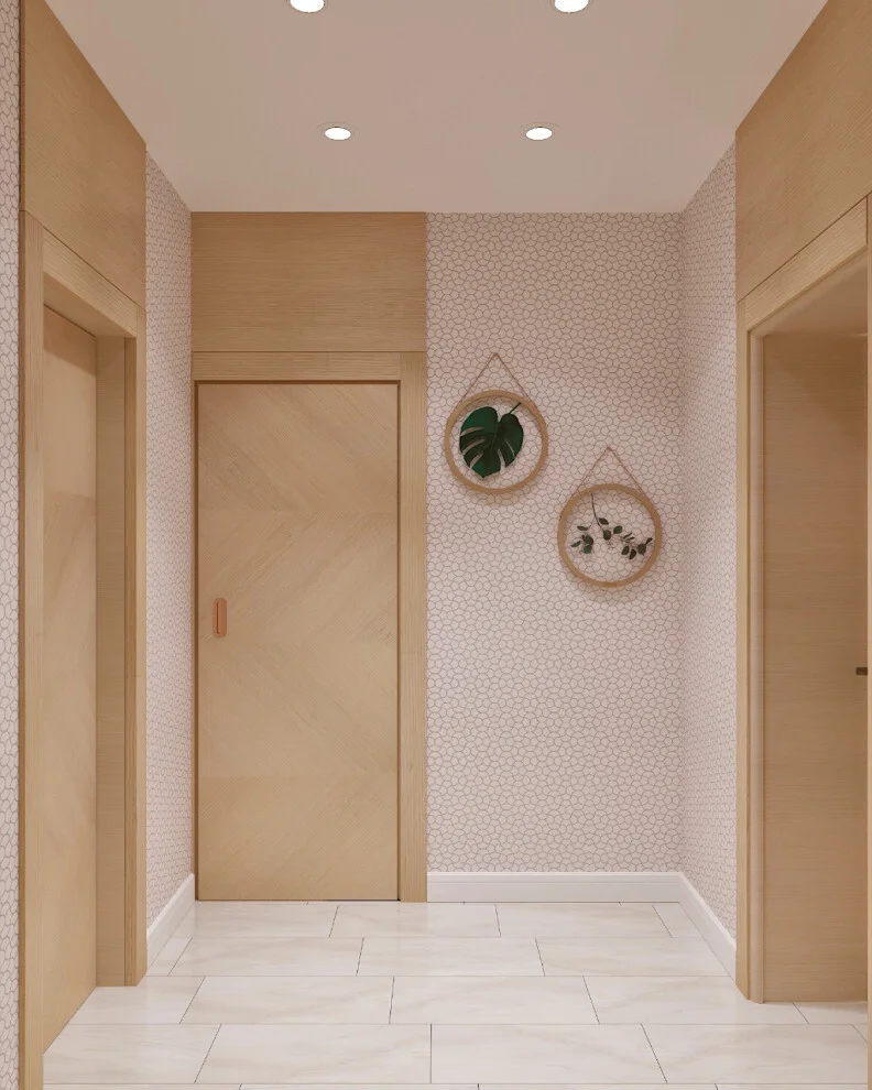
What makes this hallway work so well for me is the balance between repetition and simplicity. The wood appears throughout the door surrounds and doors, creating continuity, while the wallpaper introduces enough pattern to prevent the corridor from feeling flat. I also like that the wall decoration is limited to two pieces rather than filling every available surface. In a hallway, where circulation and practicality matter, keeping the floor mostly open is particularly useful.
If I wanted to recreate this feeling at home, I would focus on one strong combination rather than trying to add lots of accessories. A light wood finish paired with a restrained geometric wallpaper can already create a finished look. The small botanical wall pieces show another easy trick I often like: repeat the natural theme in just a couple of carefully positioned objects instead of turning the hallway into a gallery wall.
Layered Natural Textures for a Relaxed Bedroom
This bedroom combines a soft neutral foundation with plenty of natural-looking decorative details. The bed is dressed in light beige and gray bedding, while white pillows feature green botanical prints that coordinate with the large leafy plant positioned beside the bed. Above the bed are two simple botanical artworks in black frames. On the opposite wall, a collection of round woven and patterned pieces creates an informal gallery arrangement. A woven basket planter, a small wooden-topped cabinet, and a warm pendant light add even more texture to the otherwise light room.
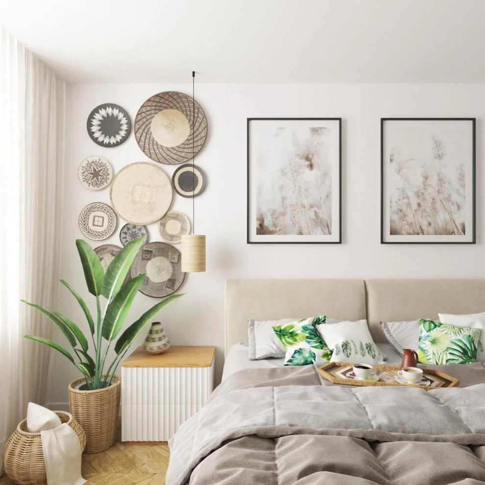
I think the strongest feature here is the way the room connects the artwork, textiles, plants, and woven accessories. Nothing looks overly formal, yet the different elements feel related. The large plant also helps fill the vertical space beside the window without requiring another piece of furniture. Meanwhile, the round wall decorations bring movement to an area that could otherwise feel empty.
For a similar result, I would start with a calm neutral base and then introduce natural textures one layer at a time. Woven wall pieces can make a bedroom wall more interesting without making it visually heavy, while botanical bedding provides an easy way to bring in pattern. I especially like the idea of repeating a motif in several places, as this room does with greenery, because it makes individual decorating choices feel intentional rather than random.
Elegant Entryway Styling With a Decorative Mirror
This entryway has a noticeably more traditional feel, with pale walls, white crown molding, warm wood flooring, and a tall mirrored door or cabinet at the center. A white storage piece on the left is styled with candles and a vase of orange flowers, while a small framed artwork and a decorative deer head add interest to the wall. A compact stool sits beneath the artwork, and a soft rectangular rug is placed in front of the mirrored area.
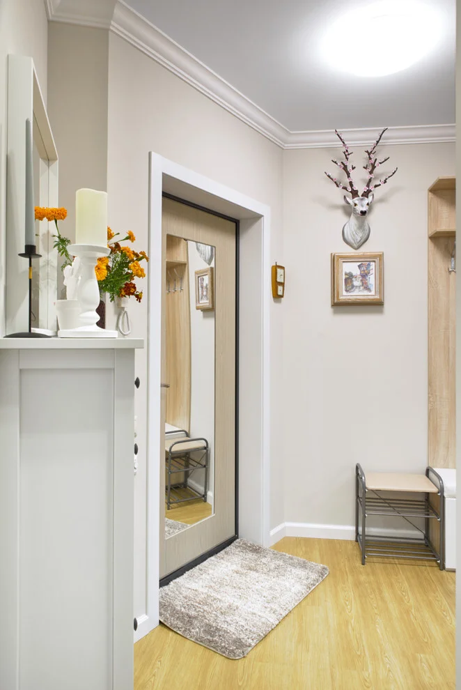
The mirror is one of the most effective details in this space because it gives the entryway a practical function while visually opening the area. I also like the contrast between the cool pale walls and the warmer wooden floor. The white storage cabinet provides another useful surface for everyday organization, but the candles and flowers make it feel decorative rather than purely functional.
For me, this image is a good reminder that an entryway deserves the same attention as a living room. A mirror, a small storage piece, one piece of wall art, and a simple floral arrangement can be enough to make the first few steps into a home feel finished. The key is to keep the arrangement purposeful. Here, every decorative element has its own place instead of competing for attention.
Graphic Curtains and Geometric Mirrors Energize a Dining Room
This dining room takes a much bolder approach to simple decorating. The walls combine soft blue and lavender-gray tones, while long curtains feature a strong blue-and-white chevron pattern. On the left wall, a collection of geometric mirrors creates an eye-catching arrangement. A large pale abstract painting hangs behind the dining table, which is surrounded by white upholstered chairs. Above the table, several exposed bulbs hang from a single ceiling fixture, each suspended from colorful cords.
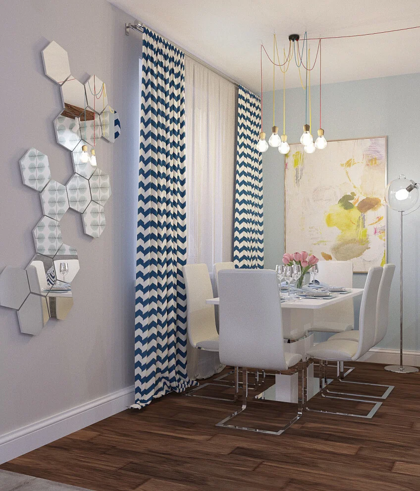
What I find especially interesting is that the room relies on a few large visual statements instead of lots of small accessories. The curtains immediately establish a pattern, the mirror arrangement adds another geometric element, and the artwork introduces softer abstract shapes. Because the dining furniture itself is relatively simple and light, these decorative features can stand out without making the room feel overloaded.
If I were taking inspiration from this image, I would choose one patterned textile as the starting point and then look for smaller decorative elements that echo its shapes or colors. The important lesson is not to copy every detail, but to let one strong feature influence the rest of the room. The colorful pendant cords are another clever example of how an ordinary functional element can become part of the visual identity of a space.
Serene White Dining Decor With Sculptural Natural Accents
This dining area takes simplicity in a completely different direction. Almost everything is white or very light, from the walls and floor to the dining table, chairs, tablecloth, and decorative objects. A round table is dressed with a white cloth edged in a subtle dark line and styled with clear glasses, tall white candles, and a white sculptural vase. Inside the vase is a dramatic natural branch with greenery. Soft taupe curtains frame the large window, while a minimal abstract artwork leans against the wall behind the table.
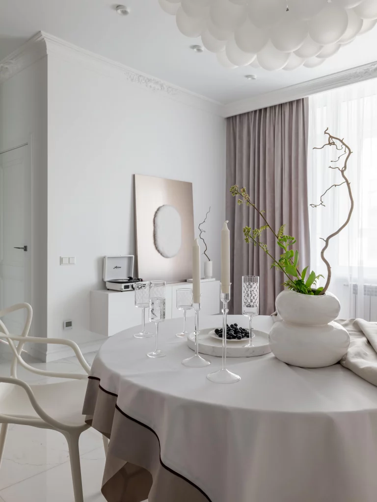
I love how texture and shape become more important than color in this room. The sculptural vase creates a strong focal point, while the branch introduces an organic, irregular silhouette against the otherwise controlled interior. The glassware and candles add delicate vertical details to the table without making it feel cluttered. Even the simple tablecloth contributes to the overall styling through its curved edge and contrasting trim.
A monochromatic room like this works best when different forms and surfaces are allowed to do the decorating. I would not try to fill an interior like this with additional accessories because the restraint is part of its appeal. Instead, I would pay attention to the silhouettes of the objects already present. One unusually shaped vase or a single natural branch can have much more impact than a collection of unrelated decorations.
Cozy Reading Corner With Macramé and Warm Wood
This quiet corner feels designed around comfort and texture. A wooden armchair with a gray upholstered cushion sits in front of a simple wooden credenza, while a small black side table adds a darker accent beside the chair. Underneath, a large round woven rug creates a soft foundation. Above the credenza hangs a handmade-looking cream textile wall hanging with three horizontal sections and long loose strands. Two small potted plants sit on the cabinet, and full-length neutral curtains frame the window.
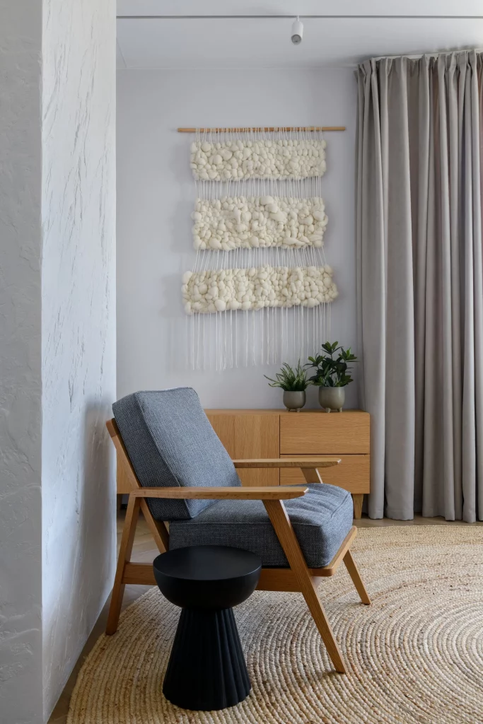
For me, this is one of the clearest examples of how a single decorative wall piece can transform a simple corner. The macramé-style hanging adds texture and movement without introducing a strong color. The wooden furniture and woven rug reinforce that natural feeling, while the black table gives the composition a little visual contrast.
I would recreate this type of corner by keeping the furniture straightforward and concentrating on tactile details. A comfortable-looking chair, a compact side table, a wooden cabinet, and one substantial piece of textured wall art are enough to establish a clear purpose. The plants also help soften the straight lines of the furniture. It is a good reminder that decorating does not always mean adding more; sometimes it means choosing a few elements that work especially well together.
Colorful Pink Cabinet Styled With an Indoor Plant Display
This interior immediately stands apart with its dusty pink storage cabinet and unusual gold-toned plant stand. The cabinet has multiple compartments and shelves, displaying books, candles, decorative objects, and a framed botanical artwork. Beside it, several potted plants are arranged at different heights on a sculptural stand with curved supports. A black geometric pendant hangs above, while the opening into the adjacent room reveals a much deeper red interior. A patterned rug adds another layer of color and texture across the wooden floor.
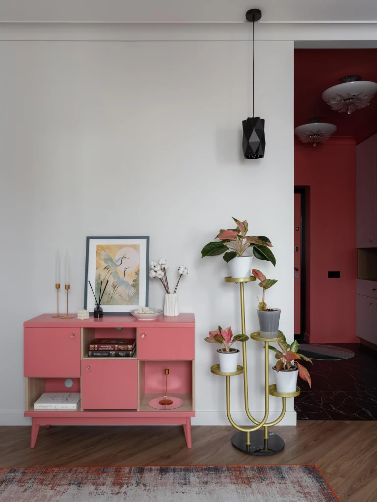
I particularly like how the cabinet becomes a decorative statement without losing its practical purpose. The combination of closed storage and open compartments allows everyday objects and accessories to be displayed selectively. The plant stand then creates a second vertical focal point, giving the corner height and making the greenery feel like an intentional part of the composition rather than a collection of separate pots.
This image inspires me to think about storage as an opportunity for decoration. Instead of treating a cabinet as something that should simply disappear into the room, a distinctive finish can make it one of the main features. I would also use the same principle with plants: grouping them at varied heights, as shown here, creates much more visual interest than placing every pot at the same level.
Bohemian Bedroom With Statement Macramé and Woven Lighting
This bedroom combines a restrained gray-and-white palette with natural wood and woven textures. A light wooden bed sits against a softly textured gray wall, with crisp white bedding and a dark charcoal blanket covering the lower portion. A patterned gray-and-white accent pillow sits in the center. Above the bed is a large cream macramé wall hanging, while matching woven pendant lights hang on both sides. Small wooden bedside tables hold simple plants and a few personal items, and a large round woven rug fills much of the floor.
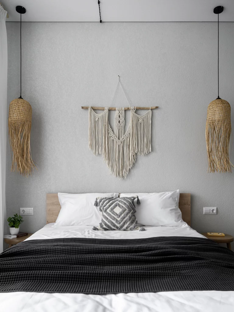
The symmetry of this room is what catches my eye first. The two pendant lights frame the bed, while the central textile artwork creates a strong focal point above the headboard. The dark blanket gives the pale bedding definition, and the woven rug connects the natural wood furniture with the textured wall decoration. Everything feels coordinated without being overly polished.
For a similar bedroom, I would start by establishing one large focal point above the bed and then repeat its material elsewhere. Here, the woven texture appears in both the wall hanging and the pendant lights, while the rug introduces another natural surface. I find this kind of repetition especially effective because it makes a room feel cohesive even when the individual pieces are quite simple.
Smart Kids’ Room Storage With an Arched Wooden Shelf
The final image shows a bright children’s room where storage doubles as decoration. An arched wooden shelving unit is built into the wall and divided into several compartments, displaying books, toys, and small decorative pieces. Its lower section has a fluted cabinet front. Nearby, a white bed or built-in seating area sits beneath a window with a pale gray Roman shade. A round white table and small matching chairs occupy the foreground, while a large dried botanical wreath decorates the wall to the right. Soft neutral fabrics, light wood, and a few playful objects keep the atmosphere calm and child-friendly.
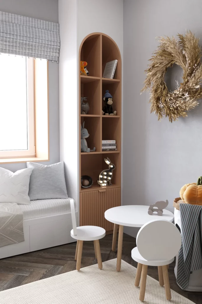
I think the built-in shelf is the standout idea because it uses vertical wall space efficiently while giving toys and books a dedicated home. The rounded top softens what could otherwise be a very functional storage unit, and the open compartments make favorite objects easy to see and reach. The small table and chairs also give the room a defined activity area without requiring bulky furniture.
This is exactly the kind of decorating solution I would consider when a room needs to stay organized but still feel personal. Instead of covering the walls with lots of separate decorations, one well-designed storage feature can provide both function and character. The dried wreath adds another focal point without introducing a busy color palette, while the simple furniture allows the toys and books to bring the playful element naturally.
Turn a Stairway Into a Personal Gallery
I love how this bright stairway uses the wall beside the stairs as a small gallery rather than leaving the vertical space empty. The white interior, warm wood stair treads and handrails, and simple metal balustrade create a clean backdrop for a collection of framed artwork. A green wall clock adds another point of interest, while the wreath on the nearby white door introduces texture and a seasonal touch. The result feels fresh, personal, and welcoming without making the narrow area look crowded.
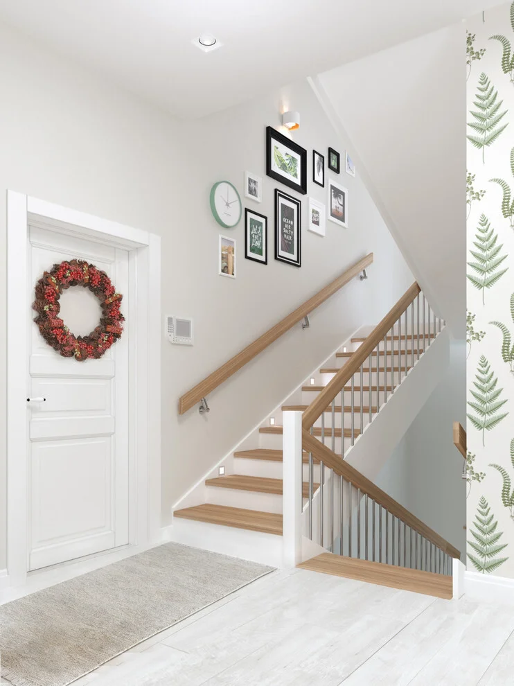
The arrangement works especially well because the artwork follows the natural movement of the staircase. Instead of relying on one oversized piece, several smaller frames create a layered composition that makes the stairway feel more decorative. I also like the contrast between the dark frames and pale walls because it gives the display definition while keeping the overall room light and airy.
When I decorate a transitional area such as a staircase, I find that using the wall itself as the main decorating surface is one of the easiest ways to make an impact. I would start with a few meaningful prints or photographs, then arrange them at different heights while keeping enough open wall around the collection. The green clock shown here is also a great reminder that a functional object can become part of the decoration.
Bring Life to a Narrow Windowed Corner
This compact enclosed space makes excellent use of a narrow footprint. I can see a simple wooden shelving unit positioned at the far end, with potted plants arranged across several shelves. White-framed windows on both sides bring in abundant natural light, while a roller shade softens the brightness on the right. A woven wall hanging above the shelving adds handmade texture, and the patterned floor introduces a strong decorative element beneath the otherwise restrained palette.
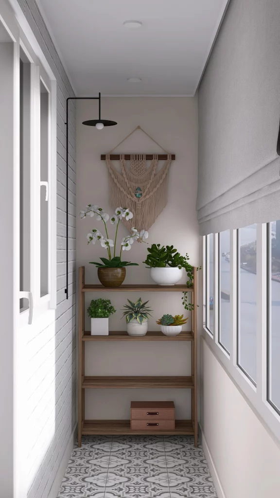
What makes this arrangement particularly effective to me is the way the plants take advantage of the available vertical space. Instead of spreading pots across the floor and reducing the walking area, the wooden shelf keeps the greenery organized at different heights. The combination of leafy plants, white ceramic pots, wood, and patterned tile creates contrast without requiring a large collection of furniture.
I would use a similar approach whenever a small passage, enclosed balcony, or windowed corner feels unfinished. A slim shelving unit can provide several decorating surfaces while occupying very little floor space. I also like the idea of combining plants with one textile wall accent, as shown here, because the greenery supplies freshness while the woven piece prevents the space from feeling visually flat.
Make a Hallway Wall the Main Attraction
This hallway keeps its architecture simple, allowing one sculptural gold-toned wall decoration to become the focal point. The pale walls and light wood flooring create a soft neutral setting, while a large geometric arrangement of pointed, star-like forms brings movement and personality to the otherwise open wall. A tall built-in cabinet occupies the right side, with a subtly textured lower section adding another layer of visual interest.
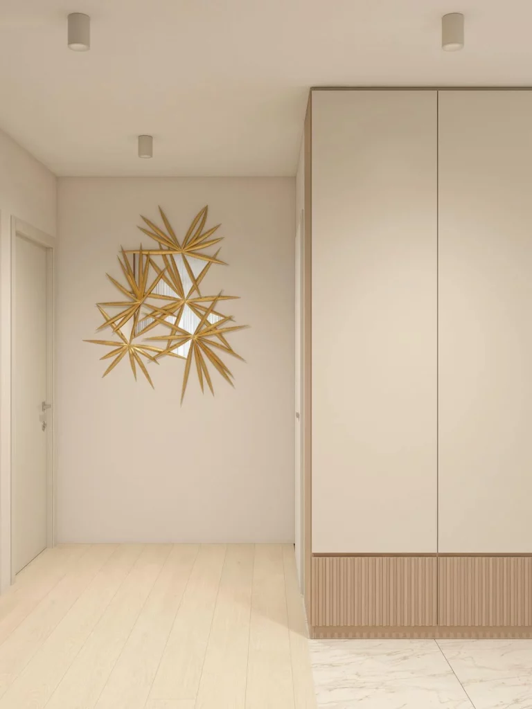
I think this works because the decoration is large enough to command attention without requiring additional accessories around it. The surrounding wall remains open, so the metallic artwork has room to breathe. The warm gold finish also relates naturally to the pale wood tones, helping the statement piece feel connected to the rest of the hallway rather than randomly placed.
For me, this is a great example of why a single strong decorative object can sometimes be more effective than several smaller pieces. If a hallway has a generous uninterrupted wall, I would consider one sculptural accent with an interesting silhouette. Keeping the surrounding area relatively uncluttered lets the shape and finish do all the work.
Style a Console With Soft Art and Simple Accessories
I’m drawn to the calm, symmetrical feeling of this hallway vignette. A white console table sits between two glass-paneled doors, creating a natural central point for the room. Above it hangs a tall abstract painting with pale blue-gray, cream, and muted pink tones. Two candles in silver-toned holders sit on one side, while a white vase filled with pink and dusty botanical stems balances the other side. The patterned floor adds another decorative layer beneath the restrained wall palette.
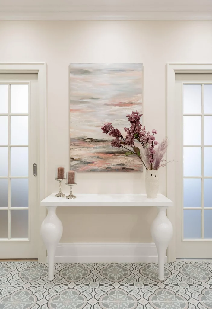
The arrangement feels polished because the accessories are limited and carefully distributed. The artwork gives the wall height and color, while the flowers echo its softer pink tones. I especially like how the white console keeps the display visually light even though the patterned floor already provides a considerable amount of detail.
When I style a console table, I prefer giving one larger piece of art the leading role and then adding only a few accessories that support it. This photograph demonstrates that principle beautifully. Rather than filling every available surface, I would choose objects with related colors or shapes and leave enough negative space for the arrangement to remain elegant.
Add Color With Hanging Flower Baskets
This bright corner takes a completely different approach by using two hanging planters as the main decorative feature. The baskets are suspended from black wall hooks and filled with abundant greenery and vivid pink and yellow flowers. Beneath them is a deep pink upholstered seating area, while large windows provide a city view and plenty of daylight. Gray roller shades add a restrained architectural element that keeps the colorful flowers from becoming overwhelming.
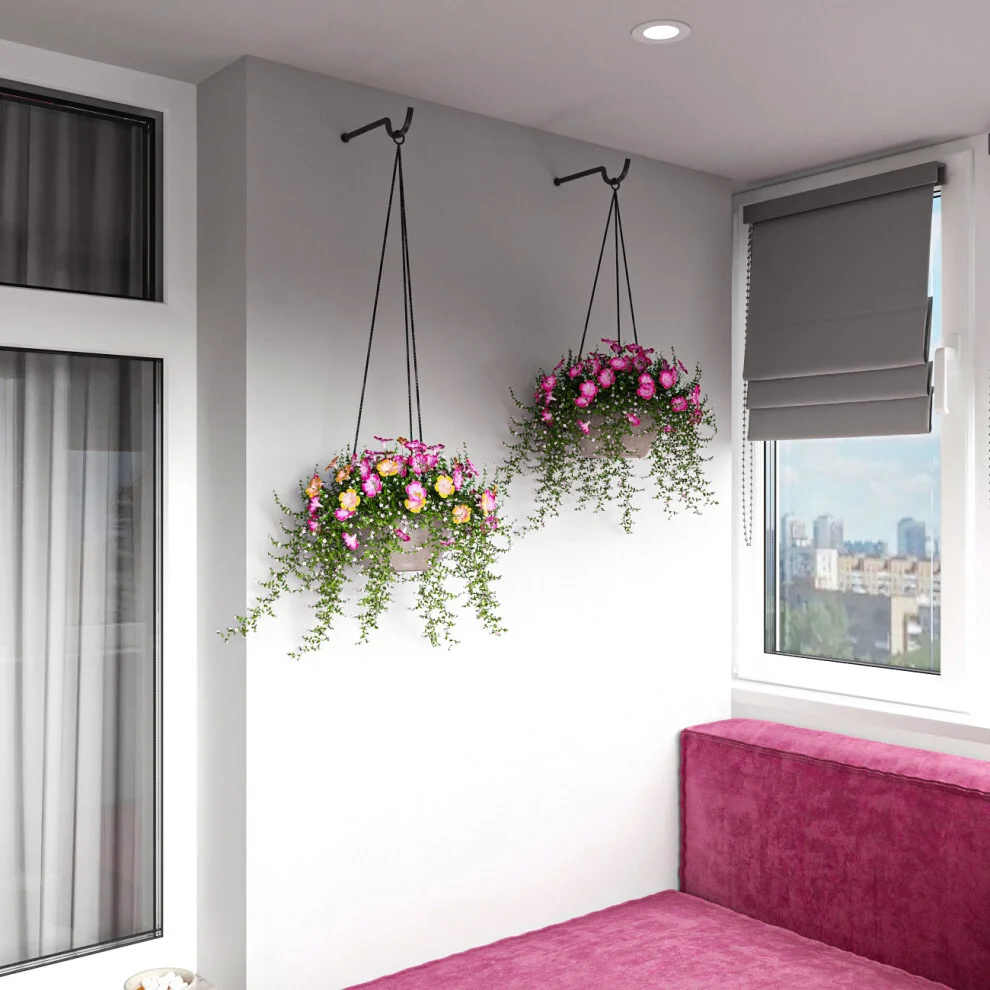
I like how the hanging plants introduce decoration at eye level without taking up floor space. Their trailing greenery creates a softer outline against the white wall, while the flowers repeat the strong pink already visible in the seating. The result feels cheerful and layered, yet the arrangement remains quite simple because only two hanging planters are needed.
This is one of my favorite approaches for adding personality to a compact room. When floor space is limited, I would look upward and consider whether a wall-mounted or hanging element could provide the decorative impact instead. Here, the plants also soften the hard lines of the windows and walls, creating a more inviting atmosphere without adding another piece of furniture.
Create a Curated Look Around a Minimal TV Console
This living area combines a pale wood-textured wall with a low, light-colored media console. The television is mounted high on the right, while the console is decorated with a potted rubber plant, framed artwork, sculptural heads, a white Buddha-style figure, a black candlestick, books, and small decorative objects. A textured curtain frames the left side, and the mostly neutral palette allows the individual accessories to stand out.
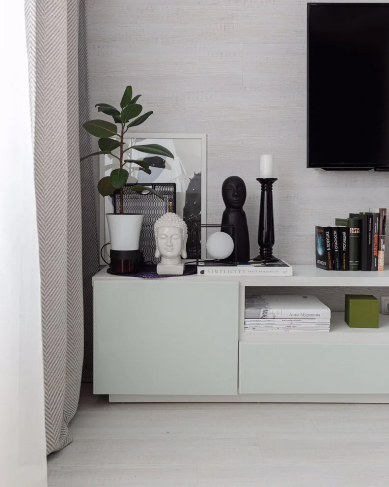
What I find particularly successful is the mixture of shapes and heights. The tall plant gives the composition vertical movement, while the smaller sculptures and stacked books create lower layers. The closed cabinet provides visual calm beneath the display, and the open shelving allows books and a few colored objects to remain visible without turning the entire unit into an overloaded arrangement.
I often find that a console looks more intentional when decorative objects are grouped into different visual levels instead of being lined up uniformly. This image is a good example of that idea. I would start with one taller element, such as the plant shown here, then introduce smaller sculptural pieces and books around it while leaving some open space between groups.
Make a Statement With a Collection of Decorative Masks
Here, an entire living room wall becomes an expressive display of decorative masks. The collection varies in size, shape, color, and pattern, creating a striking focal point above a pair of deep rust-colored sofas. A round black coffee table sits in front, while dark curtains, wood flooring, and a blue-toned cabinet complete the room. The contrast between the restrained furniture and the highly detailed wall arrangement gives the space a distinctive character.
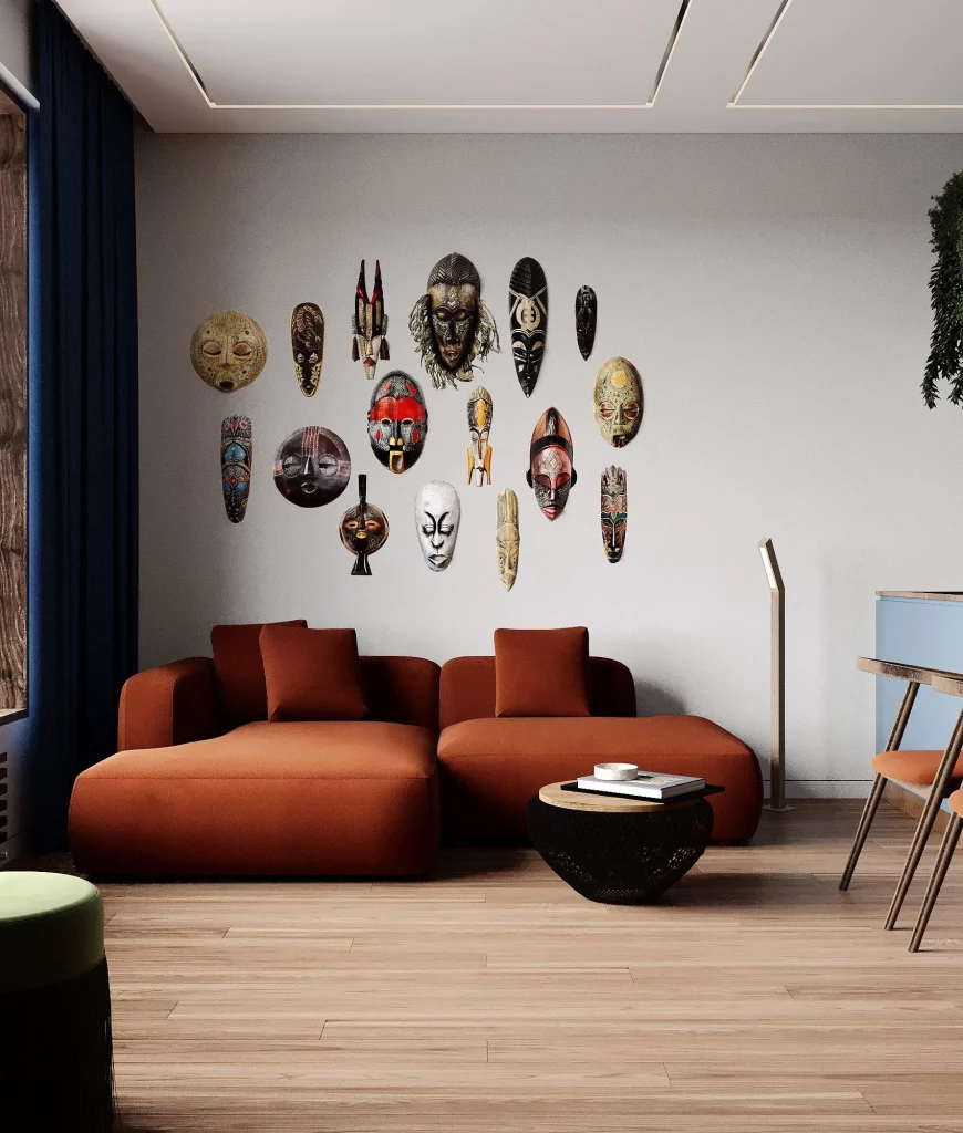
I think the collection works because the masks are treated almost like an art installation rather than scattered randomly around the room. There is enough spacing between individual pieces to distinguish their forms, but together they create one cohesive visual statement. The warm tones in the seating also help connect the wall display to the rest of the room.
If I were recreating this kind of look, I would approach the wall as one composition instead of thinking about each object separately. Collections can feel intentional when they share a common theme, as they clearly do here. The key lesson I take from this photograph is that a single repeated decorative category can become much more powerful when displayed as a carefully considered group.
Use Sculptural Wall Flowers for a Soft Statement
This elegant hallway features a cluster of dimensional flower-shaped wall decorations arranged vertically beside a doorway. The pieces combine muted blue, gray, gold, and natural metallic tones, creating a soft but noticeable accent against the white paneled wall. The room itself is refined and uncluttered, with a small upholstered stool in one corner and a glossy floor that reflects the surrounding light.
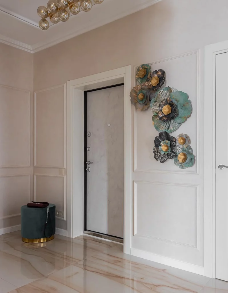
The decorative flowers work particularly well because they add dimension without taking up any floor space. Their layered, petal-like construction creates shadows and texture that a flat picture would not provide. I also like the way the blue-gray tones relate to the small stool, giving the hallway a subtle connection between the wall and floor-level accents.
For a hallway like this, I would choose wall décor with enough texture to be appreciated from different angles. Dimensional pieces are especially useful when the rest of the room is intentionally restrained. Rather than adding several unrelated accessories, one vertical arrangement can provide the personality needed to make a transitional space feel finished.
Keep an Entryway Warm With Plants and Natural Texture
This spacious entryway combines a clean white wall with dark-framed glass doors, warm wood flooring, and a slim black console table. Three small framed artworks are arranged horizontally above the console, while a large potted palm anchors the left side. A second green plant, small decorative objects, and a round woven or carved wooden piece leaning beneath the console add natural texture. A wooden lounge chair completes the inviting corner.
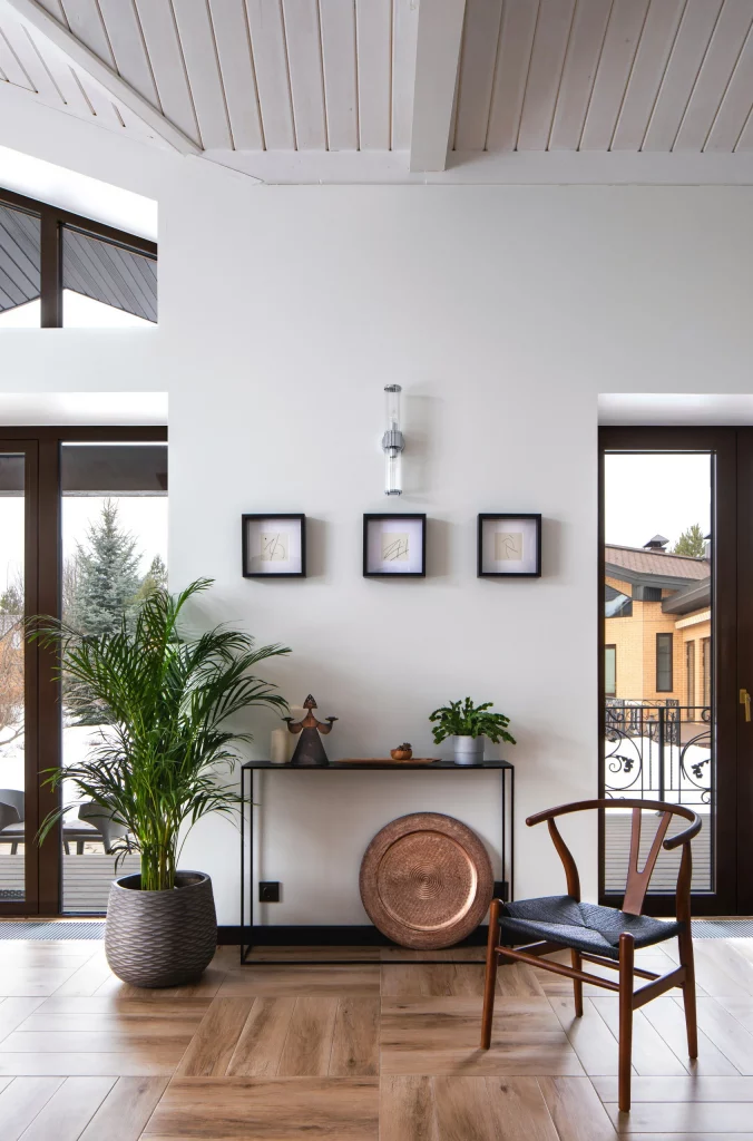
I particularly like the balance between the darker architectural elements and the warmth of the wood. The large palm adds height and softness, while the low console keeps the central wall visually open. The round wooden accent underneath introduces another organic shape, preventing the furniture arrangement from feeling too linear.
This is a useful decorating formula for a larger entryway: combine one tall element, one slim piece of furniture, a small amount of wall art, and a few objects with natural textures. I would resist filling every corner because the generous negative space is part of what makes this room feel sophisticated. The greenery provides enough visual energy to keep the neutral setting from appearing sterile.
Elevate a Simple Desk With an Organic Mirror
The final image shows a compact black desk styled against a warm neutral wall. Above it hangs an unusual organic-shaped mirror with an irregular silhouette and soft reflective surface. A small minimalist wire sculpture sits on the desktop alongside stacked books, a dark bowl filled with branches, and another sculptural object. A white textured stool with rounded wooden feet sits in front, while sheer curtains and a softly upholstered foreground piece reinforce the calm atmosphere.
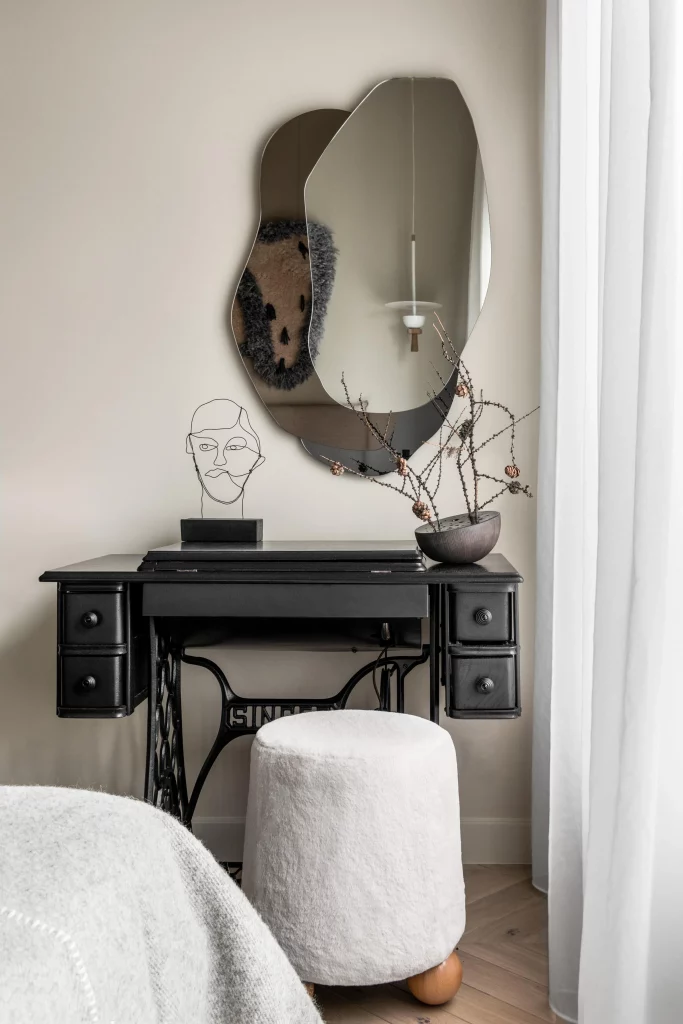
To me, the mirror is the detail that transforms this small workspace into something much more decorative. Its irregular shape contrasts beautifully with the straight lines of the desk, while the black furniture and accessories create definition against the pale wall. The branches introduce a delicate organic element, and the textured stool adds softness without competing with the mirror.
I would take inspiration from this arrangement whenever a practical desk or console feels too utilitarian. Instead of adding lots of decoration, I would introduce one distinctive mirror or sculptural wall piece and then repeat its mood with just a few carefully selected objects. The photograph shows how texture, shape, and restraint can make a small corner feel considered and stylish.
Round Mirror and Black Console Against Warm Wood
I love the welcoming contrast in this entryway, where a round mirror with a black frame stands out against a wall covered in warm honey-toned horizontal wood boards. A slim console table combines a natural wood top with a black base, creating a visual connection with the mirror. On top, a large textured gray planter holds a full green arrangement, accompanied by two small black decorative vessels, while a woven basket fills the lower shelf. The patterned geometric floor adds another layer of interest, and the dark gray door on one side contrasts beautifully with the rich brown wooden door on the other.
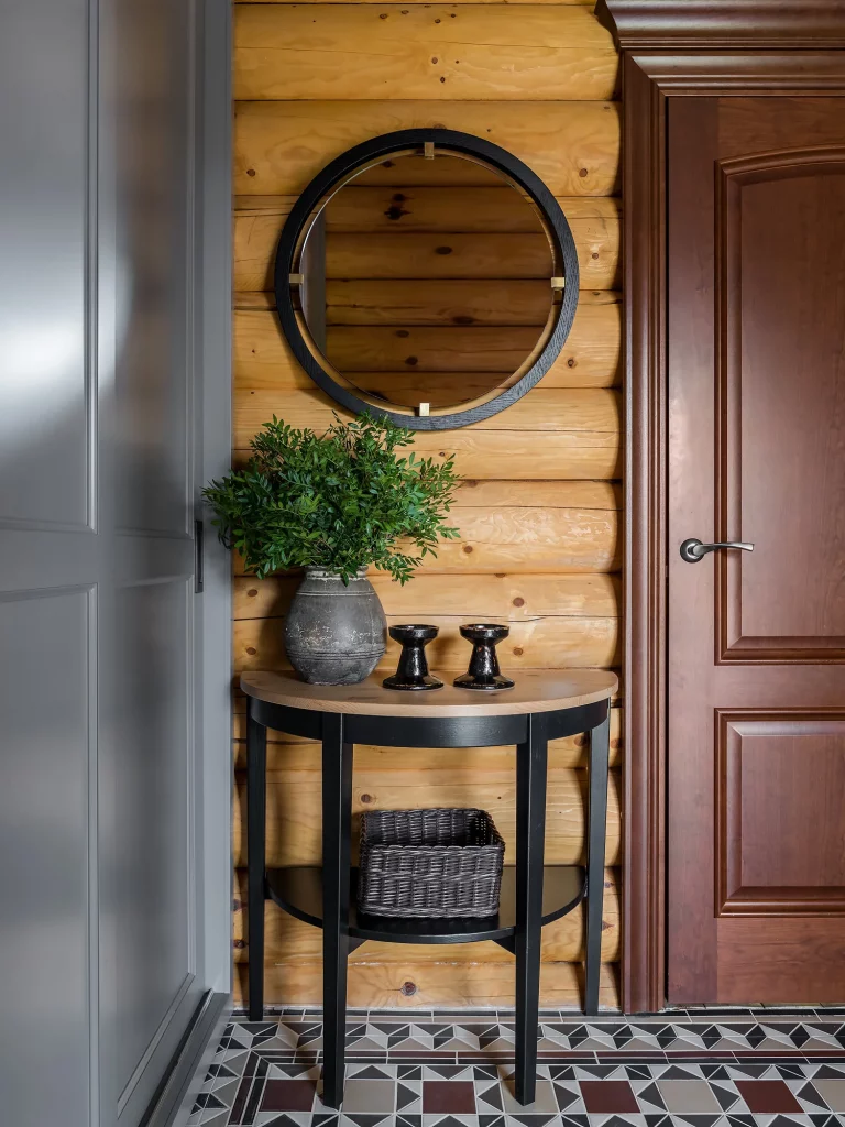
The arrangement works because the console is both useful and decorative without making the narrow area feel crowded. I particularly like the way the round mirror breaks up all the horizontal lines of the wood wall. It also adds a reflective surface that makes the compact entry feel more open, while the basket provides practical storage beneath the table. The limited palette of wood, black, gray, and green keeps all of these details visually connected.
From my perspective, this is a great example of how one statement piece can anchor a small decorating zone. If I were recreating the idea, I would start with a console that fits comfortably against the wall and then choose one oversized round mirror rather than filling the space with several small pieces. The combination of natural texture, greenery, and dark accents gives the entryway personality while remaining remarkably simple.
Soft Bedroom Corner With a Floating Wood Vanity
This bedroom corner takes a much softer approach, using a floating natural-wood vanity beneath a cluster of reflective silver globe pendant lights. Sheer white curtains allow daylight to filter into the room, while long taupe-gray drapes add softness and height. A gray upholstered storage ottoman sits directly beneath the vanity, and the surface is styled with pink tulips, white decorative vessels, and a small tray of personal items. I find the overall effect calm, airy, and feminine without becoming overly ornate.
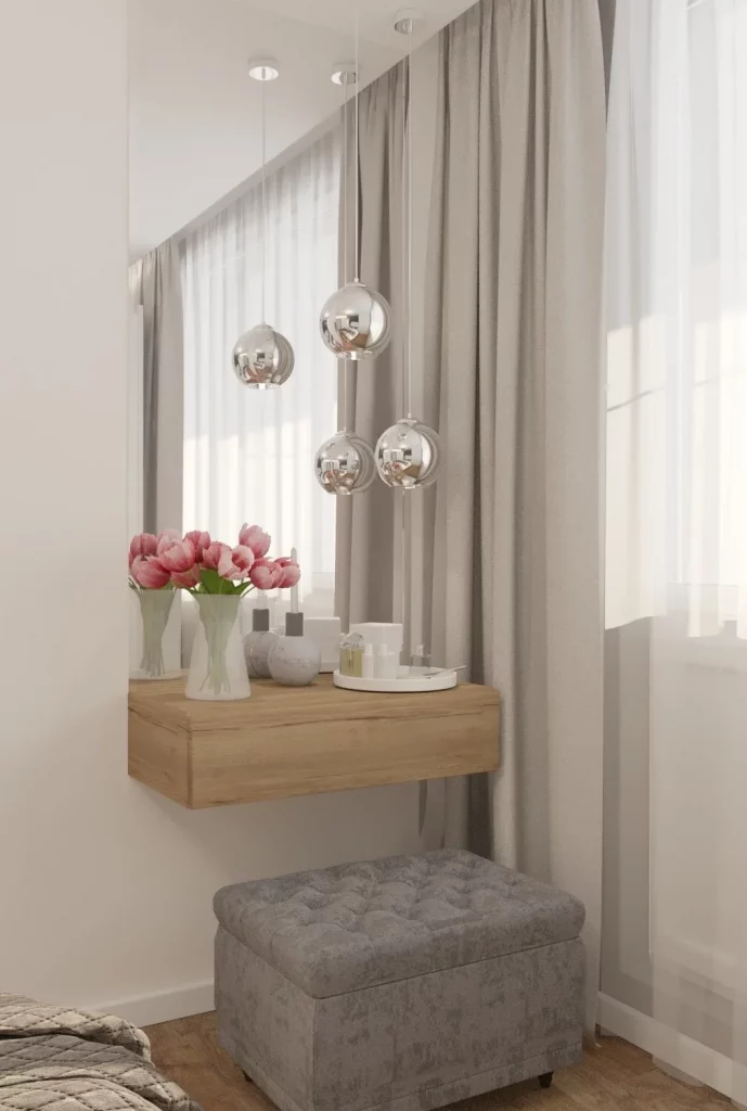
The floating vanity is particularly effective because it keeps the floor visually clear and gives this small corner a lighter appearance. The upholstered ottoman adds comfortable seating while also providing concealed storage, making it more practical than a purely decorative stool. Above it, the grouping of pendant lights creates an immediate focal point and introduces a reflective quality that works beautifully with the pale palette.
When I decorate a compact bedroom area, I often find that keeping larger furniture pieces visually simple makes the entire room feel more spacious. Here, the natural wood brings warmth to the otherwise pale setting, while the pink flowers provide just enough color. I would keep the accessories similarly restrained, allowing one small floral arrangement or a few carefully chosen objects to provide the finishing touch rather than filling every available surface.
Playful Greenery and an Unexpected Hot-Air-Balloon Accent
I immediately notice the playful personality of this bright sitting area. A black woven lounge chair sits beside two substantial potted plants, one tall and leafy and the other shorter with patterned green foliage. Above them hangs an unusual hot-air-balloon-shaped decorative piece with a cream-colored body, delicate rope-like details, and small blue accents. Taupe curtains frame the large window, while pale wood flooring keeps the room feeling light and natural. A small whimsical figurine near the wall adds another unexpected detail.
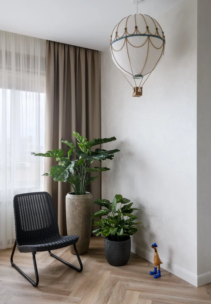
What makes this arrangement successful is the balance between substantial greenery and the relatively uncluttered room. The plants bring height, texture, and strong natural color into an otherwise neutral corner, while the woven chair adds another tactile element. I also like that the decorative balloon occupies vertical space that might otherwise have been left empty, creating a clear focal point without requiring a large piece of furniture.
For me, this image is a reminder that simple decor can still be playful. If a room already has a neutral foundation, I would use one unusual decorative object to show personality rather than introducing many unrelated accessories. Large plants can also do much of the decorative work themselves, especially when their shapes and heights vary as they do here.
Dreamy Study Corner in Layered Blush Tones
This charming room combines a compact white desk with warm wood legs, a plush mauve chair, and floor-to-ceiling curtains in muted blush and taupe shades. Sheer curtains soften the natural light coming through the windows, while large decorative paper flowers float above the desk area. A pale rug defines the workspace, and a small sign sits on the desk beside a laptop and a few personal objects. On the left, a white decorative structure and a striped textile introduce additional pattern and visual interest.
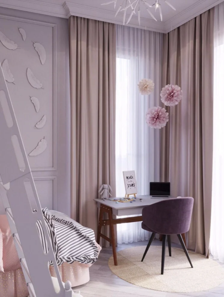
I think the strength of this room comes from its restrained color story. The pink, beige, cream, and white elements are close enough in tone to create a cohesive atmosphere, while different textures prevent the space from looking flat. The desk remains visually light, which is especially useful in a smaller room, and the chair provides a comfortable-looking focal point without overwhelming the workspace.
This is the kind of decorating idea I would use when I want a home office or study area to feel personal rather than overly corporate. Instead of adding numerous accessories, I would choose one decorative wall or ceiling element, then repeat its color subtly through the chair, curtains, or textiles. The result can feel much more intentional than simply filling the desk with decorative objects.
Graphic Hexagon Wall Art Over a Midcentury-Style Sideboard
Here, a streamlined sideboard sits against a white wall beneath an expansive arrangement of burgundy-red hexagonal wall pieces. The geometric installation spreads horizontally and then builds upward toward the center, giving the otherwise simple wall considerable visual movement. The sideboard has a dark top, muted reflective fronts, and angled dark legs. Its surface holds a round mirror, overlapping circular metal sculptures, a rustic sculptural branch, a tall glass vase, and a small glass display dome.
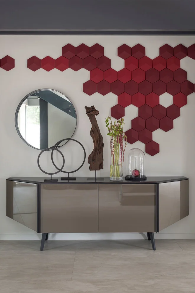
I like how the strong geometric wall art is balanced by the simpler silhouette of the sideboard. The red hexagons immediately become the room’s focal point, while the neutral furniture prevents the arrangement from becoming visually overwhelming. The round mirror and circular metal sculptures also introduce softer shapes, creating a useful contrast with the angular hexagons.
In my view, this is a smart way to transform a blank wall without changing the furniture underneath it. A modular wall arrangement can be especially useful because its size and shape can be adapted to the wall available. If I were trying this idea at home, I would first establish the overall silhouette on the floor before mounting anything, making sure the negative spaces feel intentional rather than accidental.
Minimal Dining Area With Vertical Succulent Displays
This dining area uses a clean white and gray palette, with a round dining table surrounded by four upholstered gray chairs. On the wall beside the table, five white circular wall planters contain small succulents and pale stones, creating a delicate vertical display. Additional greenery appears on the windowsill and in a glass vase on the table. The large windows bring in abundant daylight, while gray Roman-style shades provide a simple treatment without distracting from the bright setting.
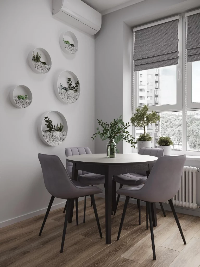
The circular wall planters are my favorite detail because they turn a narrow blank wall into a decorative feature without consuming floor space. Their repeated shape creates rhythm, while the small plants add organic texture to the minimalist room. I also like the way the round forms echo the dining table, creating a subtle connection between the wall decoration and the furniture.
When working with a small dining area, I find that vertical decoration is often much more effective than adding another piece of furniture. Wall-mounted planters offer that same benefit while introducing greenery at eye level. Keeping the containers in a single color, as shown here, also allows the plants and their natural textures to become the focus.
Clustered Round Mirrors Above a Classic Gray Sofa
A large gray upholstered sofa anchors this comfortable living area, positioned beneath an eye-catching arrangement of many round mirrors in different sizes. The mirrors form a dense circular composition around a central piece, while two decorative wall lamps flank the arrangement. Patterned and solid gray pillows add subtle variation to the sofa, and white cabinetry occupies the adjoining area. Long light curtains frame the window, allowing bright sunlight to wash across the pale wood floor.
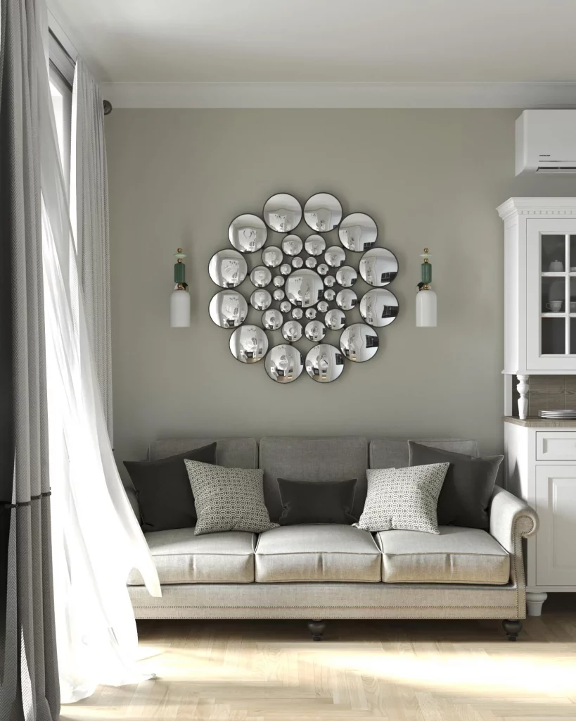
The mirror arrangement works particularly well because it adds dimension to an otherwise understated wall. Instead of relying on one large artwork, the different circular sizes create movement and reflect the room from multiple angles. I also like the symmetry created by the wall lamps, which gives the eclectic mirror display a more organized appearance.
For me, this is a strong example of how repetition can make simple decor look much more sophisticated. If I were creating a similar display, I would choose pieces that share a common shape or finish so the arrangement feels connected. I would also position the largest mirrors carefully first and build outward, because the spacing is what makes a multi-piece composition look deliberate.
Serene Blue Bedroom With a Sculptural Bird Display
This bedroom makes a bold statement with a rich blue accent wall behind the upholstered bed. A collection of white and beige bird sculptures appears to fly upward across the wall, while pale vertical wall panels frame the blue center. Matching light wood nightstands sit on either side of the bed, and the bedding layers soft blue and white fabrics with a casually draped beige throw. A large woven-style pendant hangs overhead, while blue details continue onto the nearby door and trim.
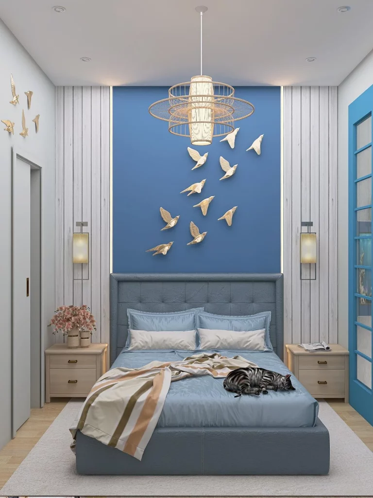
I love how the room uses one strong color to organize the entire space. The blue wall gives the bed a defined backdrop, while the lighter panels prevent the saturated color from dominating the room. The bird arrangement adds movement and personality without competing with the bed, and the matching nightstands maintain a sense of balance.
This image reminds me that a feature wall does not always need complicated wallpaper or elaborate construction. A carefully chosen paint color combined with a collection of related decorative pieces can create a similarly strong effect. I would keep the surrounding furniture relatively simple, as shown here, so the accent wall remains the visual center of the room.
Warm Wood Dining Room With Layered Pendant Lighting
This inviting space is enveloped in light wood paneling, creating a warm cabin-like atmosphere from floor to ceiling. A large window brings a snowy outdoor view into the room, while several matching pendant lights hang at different positions near the window and ceiling. A light sofa sits beside a wooden dining table surrounded by wooden chairs, with a patterned area rug defining the dining zone. Decorative plates hang on the wall above the sofa, and greenery adds a natural element near the left side of the room.
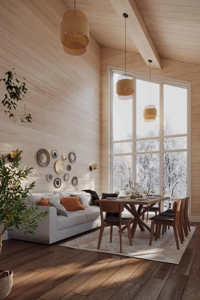
The design works because the warmth of the wood is balanced by soft upholstery, greenery, and generous natural light. I especially like the repeated pendant lights because they add visual interest to the tall space while maintaining a consistent design language. The dining rug also helps visually separate the table and chairs from the adjacent seating area without needing a physical divider.
In a wood-heavy interior, I would be careful not to introduce too many competing finishes. This room shows how repetition can create harmony: the wood appears throughout the architecture and furniture, while the textiles and plants provide contrast. I would take the same approach in a smaller home by choosing a few coordinating wood elements and allowing soft furnishings to keep the atmosphere comfortable.
Blush Dining Nook With Botanical Plate Wall Art
The final image shows a cozy dining nook centered around a compact square wooden table and four upholstered chairs in soft dusty pink. The beige wall behind the table is decorated with an asymmetrical collection of round plates featuring botanical and bird illustrations in pink, green, blue, and yellow. A pair of white ceramic vases with delicate dried stems sits on the tabletop, while warm pink curtains frame the nearby window. The pale wood floor completes the gentle, coordinated palette.
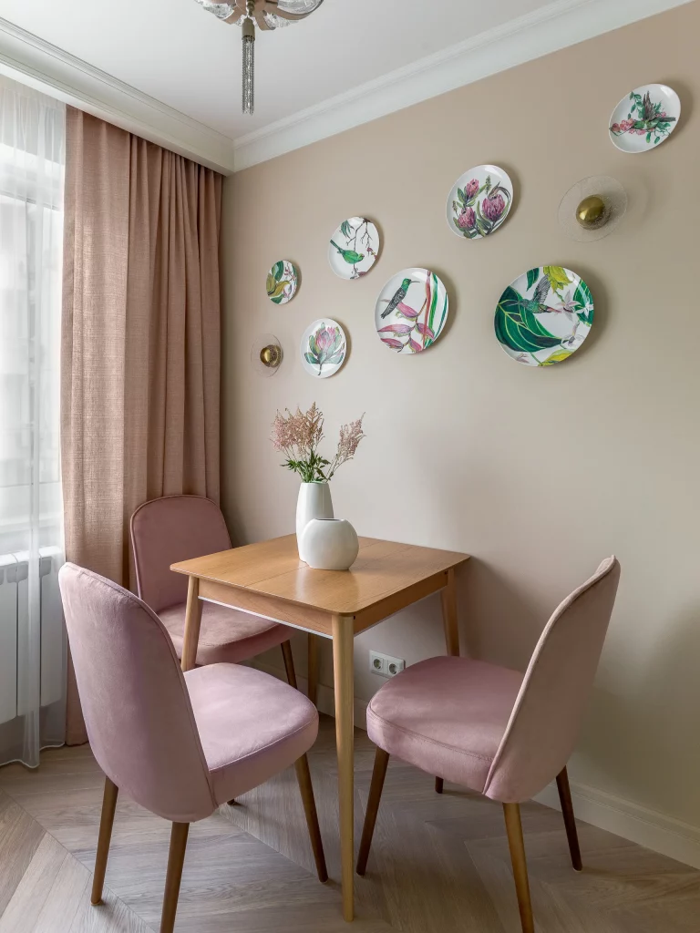
I find this room especially successful because the wall display gives the small dining area a distinct identity without taking up any usable space. The illustrated plates introduce several colors, but the surrounding furniture remains quiet enough to keep the composition cohesive. The pink chairs and curtains subtly pick up tones from the artwork, creating repetition that makes the entire corner feel intentionally styled.
This is an idea I would happily borrow for a small dining space because decorative plates can create the impact of artwork while adding an interesting collected feel. I would begin with the largest pieces and then position smaller plates around them, leaving enough wall space between each one to keep the arrangement airy. The key is to repeat at least one or two colors from the artwork elsewhere in the room, as this image demonstrates beautifully.
The right decor can transform a room without requiring a complete makeover or a large budget. I love how simple touches like statement wall art, colorful accents, natural textures, and thoughtfully styled shelves can instantly make a home feel more personal and inviting. The key is choosing details that complement your space while reflecting your own taste. Which of these simple decor ideas would you love to try in your home? Leave a comment and share your favorite!