Tired of the same old black or white front door? This year’s trending colors lean into nature and personality, from deep greens to unexpected lavender. We’ve rounded up 25 looks that actually work with different house styles, so you can find the shade that fits your home without guessing.
Each idea focuses on what makes the color pop: the hardware, the surrounding materials, and the light it gets. Whether you’re drawn to bold double doors or a soft cottage hue, this list gives you the practical details to make a confident choice for your entry.
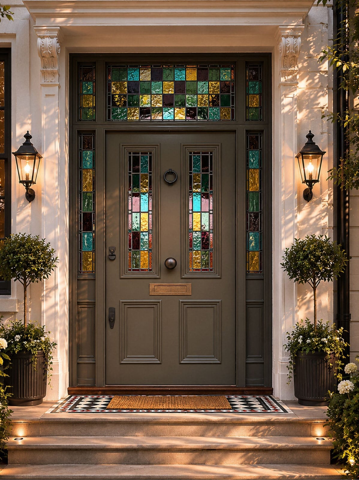
01 / 26Elegant Olive Green Double Doors with Stained Glass
The palette here is a conversation between deep olive green and the multi-color stained glass set into each door. The green grounds the busy glass, keeping the entrance from feeling like a kaleidoscope. Cream stone and warm wall lanterns soften the contrast, so the look stays traditional rather than theatrical. The ratio is roughly one part ornament to three parts calm base. What breaks the look is a matte black or brass handle, anything shiny would compete with the glass.
02 / 26Deep Green Paneled Door Under Arched Brick
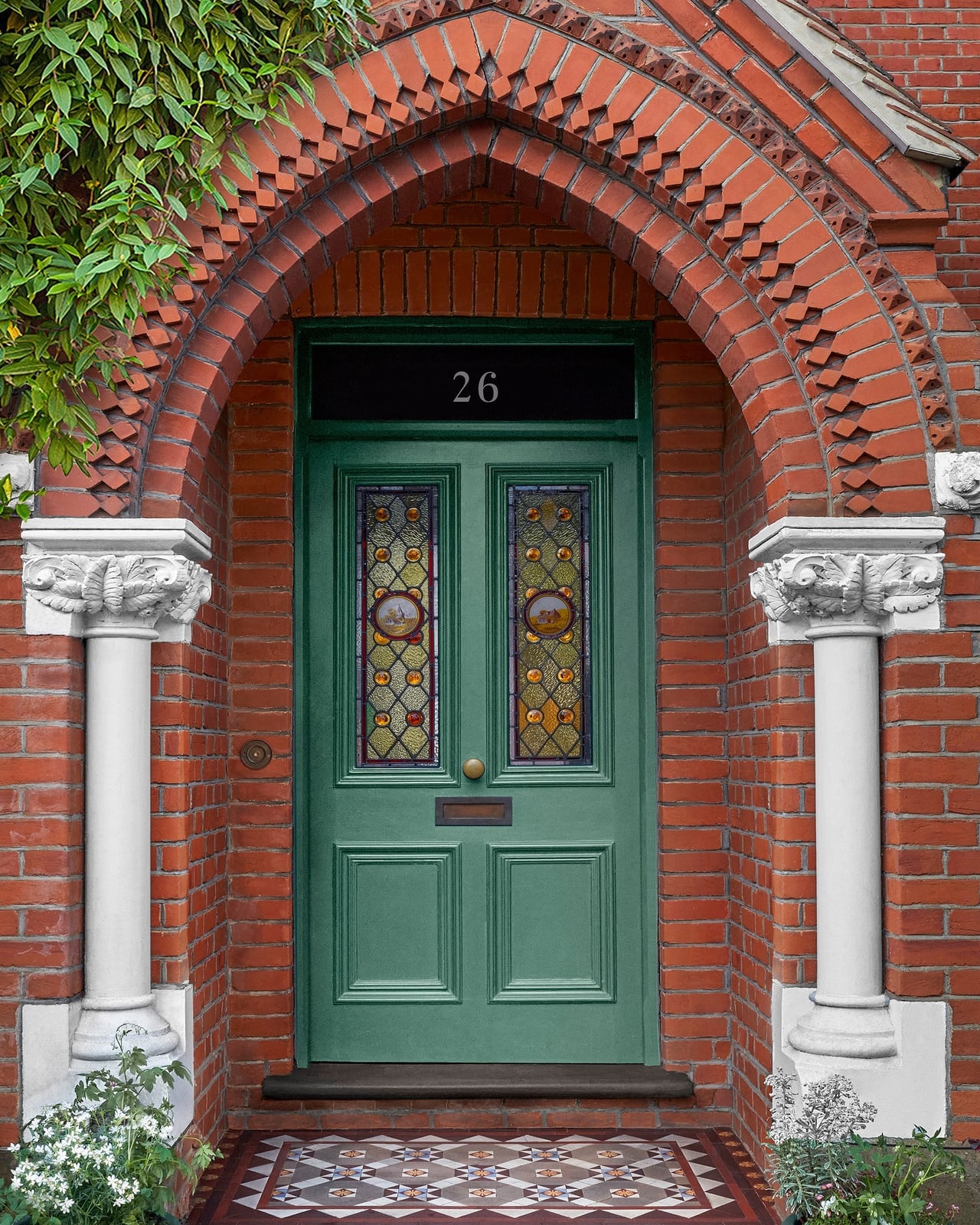
This entry works because of the brick arch. The deep green paneled door sits inside a curved surround of warm red brick, and the brick does the job of framing the door without any extra trim or molding. The stained glass panel in the door picks up daylight and adds a small pattern that the rest of the facade leaves out. The material trio, painted wood, fired brick, leaded glass, gives the entrance texture without clutter. If your home has an existing arch, a deep green door respects the architecture rather than fighting it.
03 / 26Modern Natural Wood Door with Black Frame
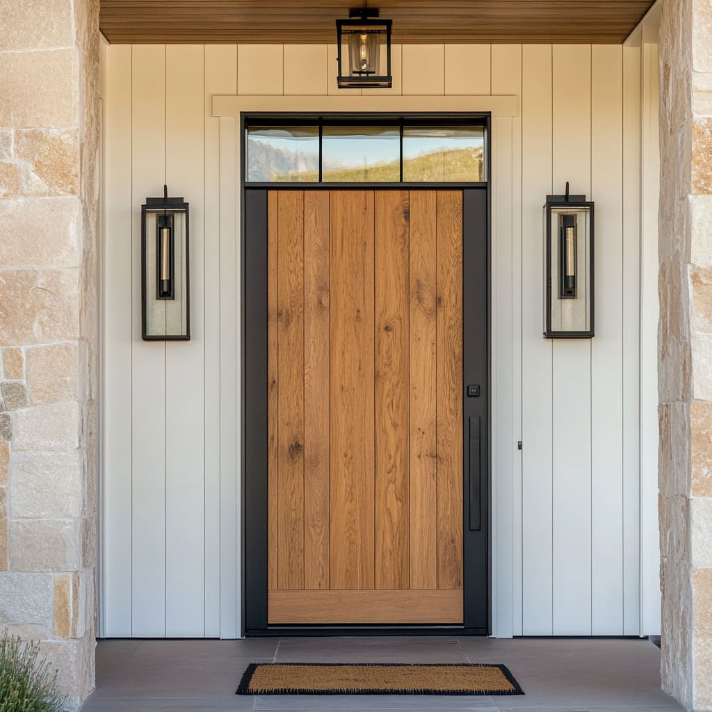
How do you make a wood door feel current rather than rustic? The answer here is the black frame and the surrounding materials. The door is vertical grain wood set into a slim black metal frame, with white board and batten siding and stone veneer flanking the entrance. The wood grain is the hero, no stain fighting it, no heavy gloss. Two black sconces on either side add evening light that hits the wood vertically, so the grain stays visible after dark. The style is modern because the palette is reduced: white, black, and one warm natural tone. What breaks it is adding a second wood finish or a decorative wreath.
04 / 26Terracotta Door with Large Glass Panel
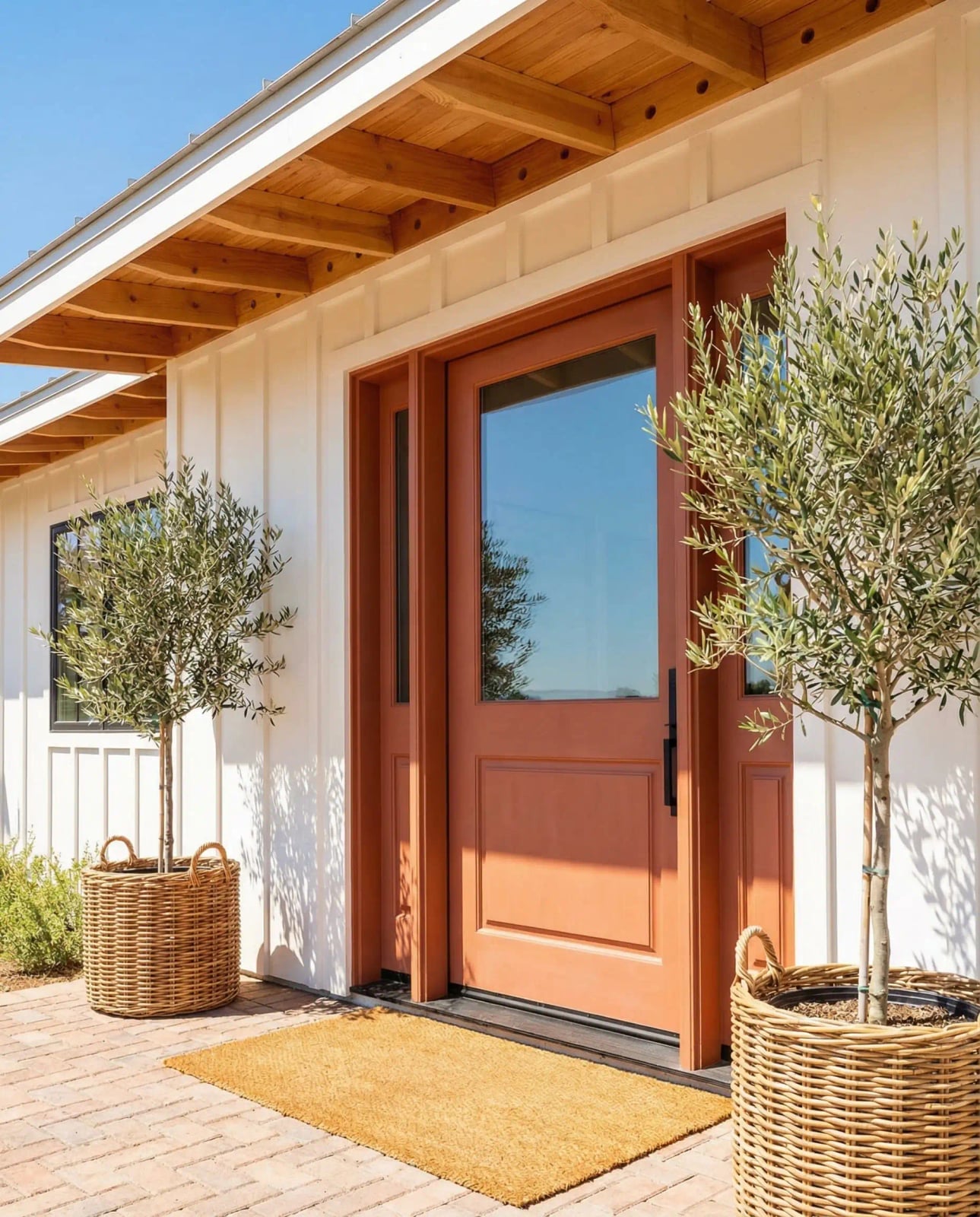
Terracotta reads as warm orange-brown, and on a modern farmhouse it lands somewhere between bold and welcoming. The door lets daylight stream into the entry, and the bright white trim keeps the terracotta from reading as heavy. Wicker planters with olive trees and a yellow doormat add texture without competing. The palette is about an 80 percent neutral base, white siding, stone floor, natural wicker, with the door carrying the remaining color. A winter or overcast day will make the terracotta look richer, not dull.
05 / 26Bold Black Double Doors on Modern Farmhouse
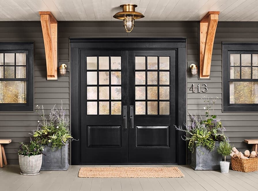
Bold black double doors with glass panels anchor a modern farmhouse facade. They sit under a deep porch with wooden beams, flanked by stone planters and matching windows. Grey siding and natural stone keep the exterior neutral, so the black doors become the focal point. An overhead light fixture adds a warm glow that softens the black in the evening. The defining ratio is roughly 70 percent neutral materials to 30 percent black. Adding a third dark color or competing hardware finishes disrupts the balance.
06 / 26Warm Natural Wood Door with Bronze Hardware
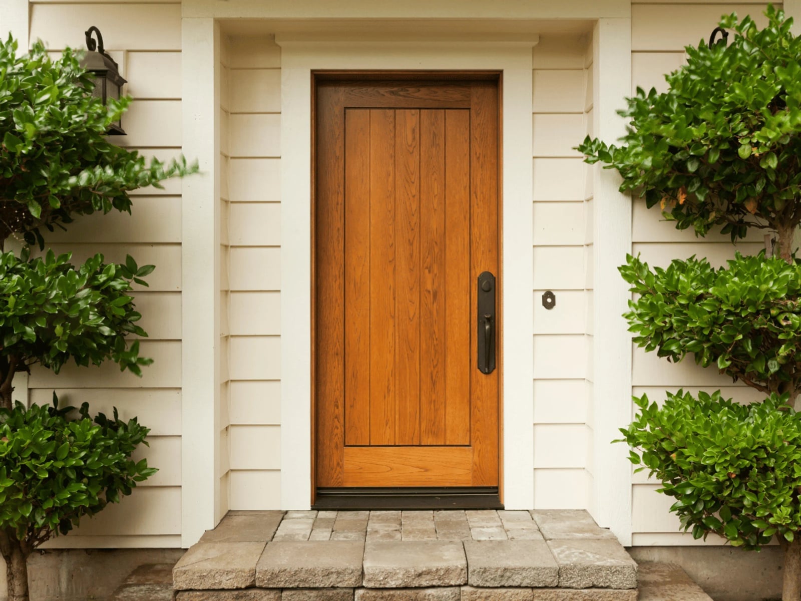
If a painted door feels like a commitment you are not ready to make, natural wood offers an alternative that skips the paint chip stage entirely. This modern entry uses a vertical plank wood door with a warm grain that catches daylight against the cream siding and the dark bronze hardware. The hardware acts as the anchor here: a matte bronze handle and matching hinges that stay quiet against the wood tone. Stone steps below ground the whole composition in texture, so the door does not float. The balance between the wood warmth and the cool metal finish defines this look. The ratio leans heavily on the wood, with the bronze acting as a supporting note. What breaks it would be adding gold or polished brass, which changes the temperature from grounded to glitzy.
07 / 26Teal Paneled Door with Brass Hardware
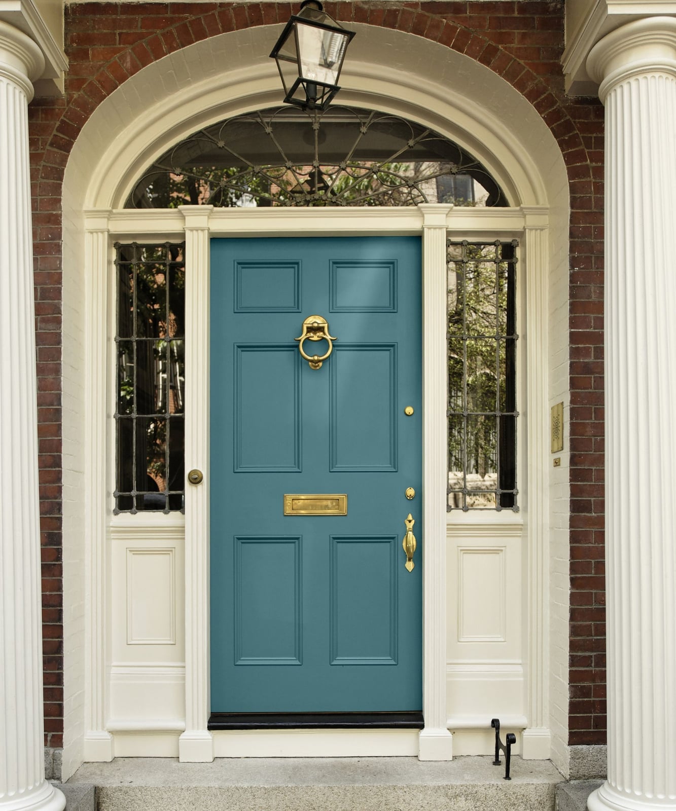
A teal paneled door with brass hardware has a traditional look that avoids feeling stiff, partly because the teal sits warm enough to play well with the brick surround. The arched transom window above draws the eye up, while the brass handle and lantern keep the metal accents from disappearing against the white trim. For renters, this palette is achievable with a temporary door wrap or a peel-and-stick film on the glass panels, since the real impact comes from the color ratio. The teal covers most of the door, the brass adds small bright points, and the brick serves as the neutral backdrop.
08 / 26Vibrant Olive Green Double Doors with Bee Knocker
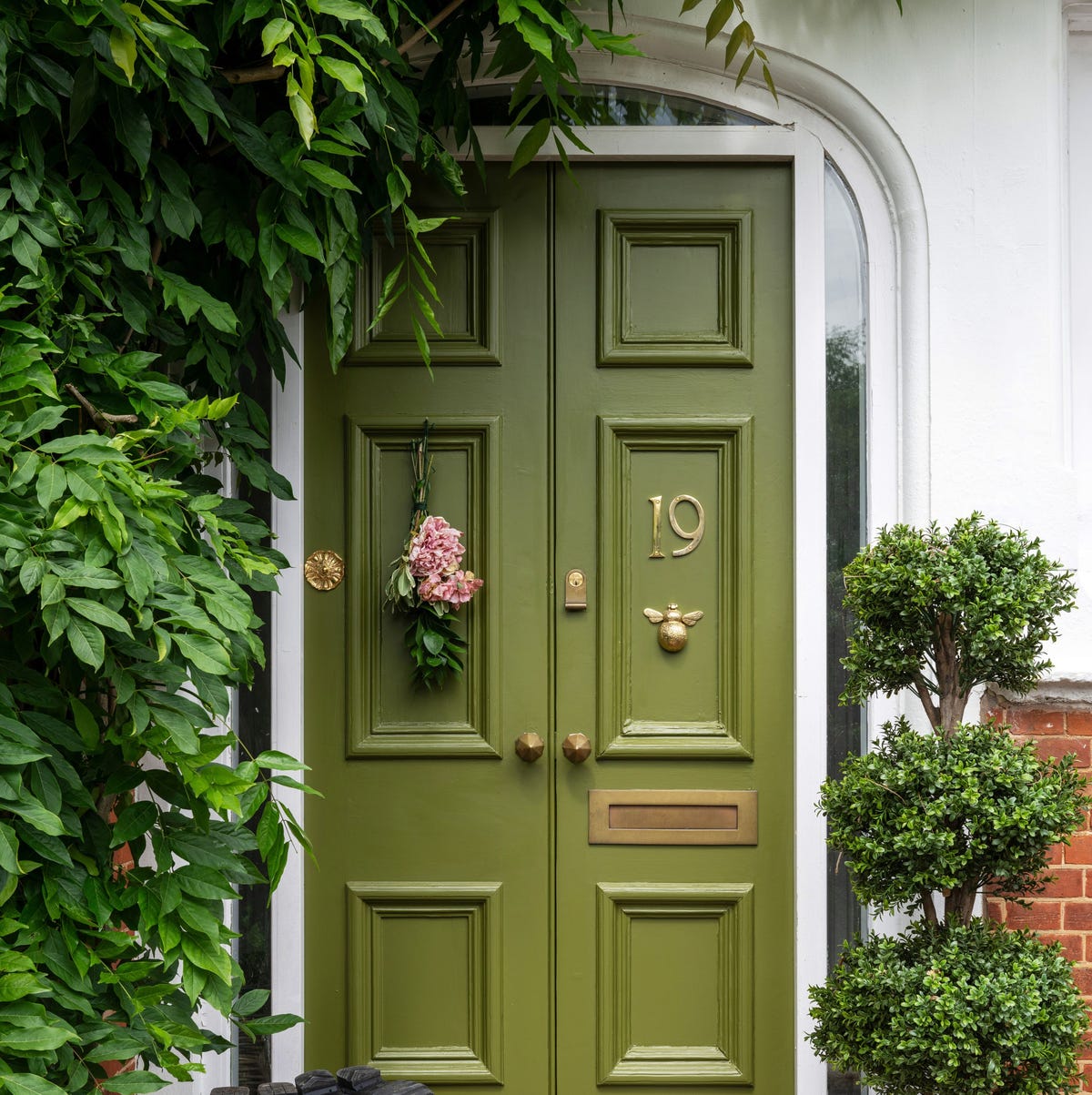
Double doors in a vibrant olive green work because the color is saturated enough to hold its own across a wide span without feeling flat. The brass hardware here includes a bee knocker, a small detail that adds personality without overwhelming the door itself. A floral swag over the top softens the strong vertical lines, and flanking topiaries frame the entry without competing. The palette is a straightforward ratio: olive green takes up most of the visual weight, brass provides the shine, and white trim keeps the edges crisp. What breaks this look is adding a second strong color on the door itself, like a painted panel, which would turn the focus from the knocker to the clash.
09 / 26Vibrant Orange Door with Glass Sidelights
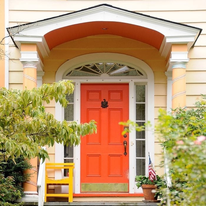
Can orange work on a front door without feeling like a costume? It can, but only when the surrounding palette holds it in place. This traditional entry uses a vibrant orange door with glass sidelights, white trim, and a wooden bench nearby that introduces a natural brown anchor. The sidelights let daylight pass through, which keeps the orange from reading as heavy or closed off. The brass handle and kickplate add small metallic notes that echo the warm side of the orange rather than fighting it. A green plant on the step brings in a complementary color that helps the orange feel deliberate. The orange sits as the single saturated point in a mostly neutral scene. The ratio is about one part orange to three parts white and wood. Adding another bright color anywhere in the same sightline, like a purple wreath or a blue planter, splits the attention.
10 / 26Deep Green Door in Stone Surround at Golden Hour
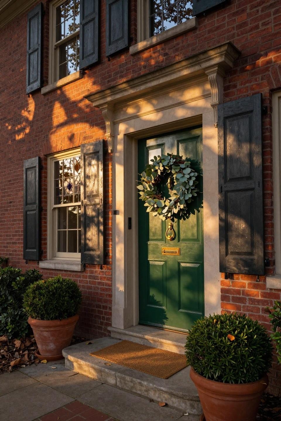
A deep green paneled door set inside a stone surround catches the golden hour light in a way that shifts the whole entry from flat to dimensional. The warm low-angle light hits the brick and stone, pulling out the red and tan tones that make the green feel richer by contrast. A simple wreath on the door adds a soft organic note without covering the panel detail. Potted shrubs on either side mirror the door color in a lighter way, creating a visual echo that extends the palette beyond the door itself. The stone surround does double duty: it frames the door physically and also provides a textured neutral that keeps the green from floating against a plain wall.
11 / 26Bright Yellow Door on Farmhouse Porch
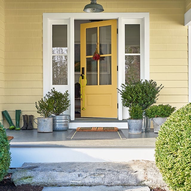
A bright front door becomes the focal point when the porch palette stays quiet. The yellow door here stands out because the house siding is white and the steps are grey. Potted plants in deep green add contrast without competing, and the natural wood wreath softens the polished finish. A pair of boots by the door and a simple overhead light reinforce the farmhouse feel without adding clutter. The ratio of bold color to neutral backdrop is about one part yellow to three parts white and grey, which gives the eye a place to rest. That balance keeps a bright door from feeling out of place.
12 / 26Muted Green Door with Galvanized Planters
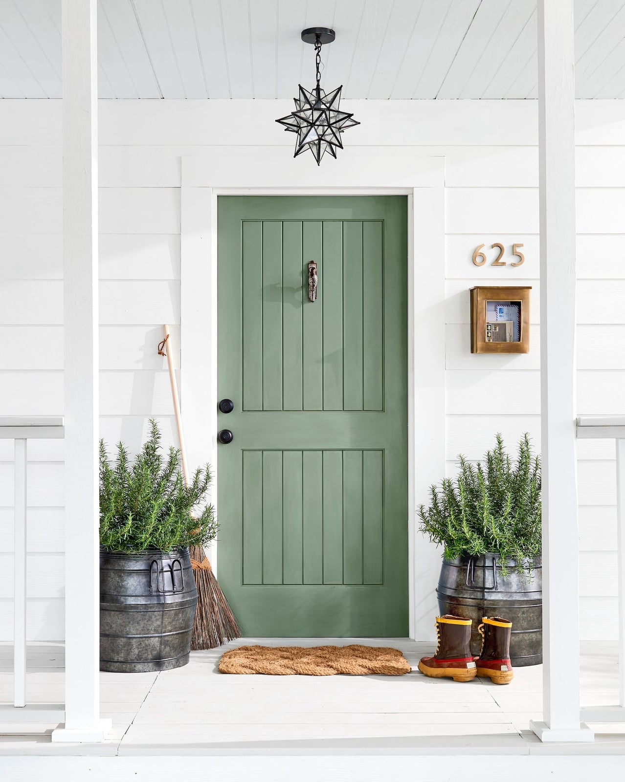
A muted green door sits somewhere between a true sage and a gray-green, which makes it a more versatile choice than a bright olive or forest green. The porch here pairs it with white trim and galvanized metal planters, which keep the look grounded in farmhouse style without going rustic. The wood broom leaning against the wall adds a small textural break from all the painted surfaces. A pendant light overhead matches the metal of the planters, so the hardware looks connected. What defines this palette is the low contrast between the door and the siding: the green is just dark enough to stand out against white, but not so dark that it looks black from the street.
13 / 26Vibrant Teal Cottage Door with Pink Flowers
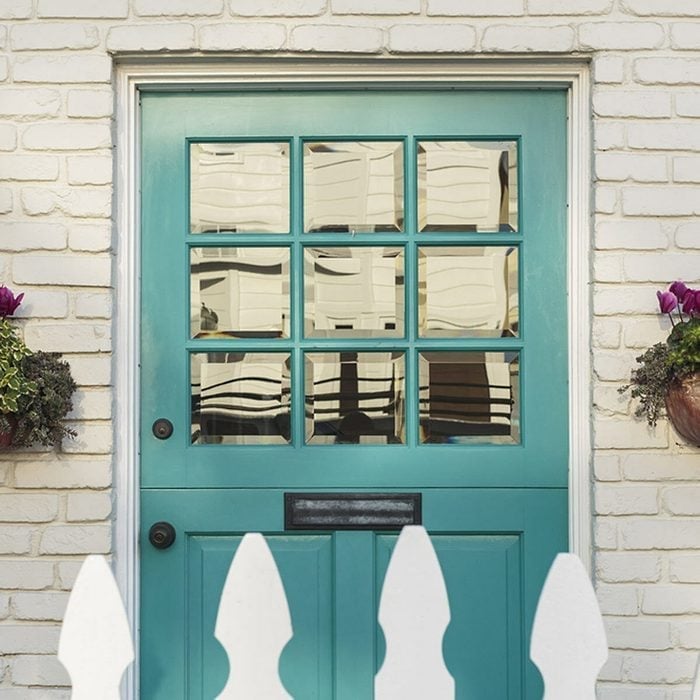
The teal door and pink flowers in the planters are complementary colors, which means each makes the other look more intense. The white picket fence and white trim around the door keep the palette from feeling busy. A brick path and a small glass panel in the door add material variety without pulling attention away from the color pairing.
14 / 26Deep Teal Double Doors with Ornate Surround
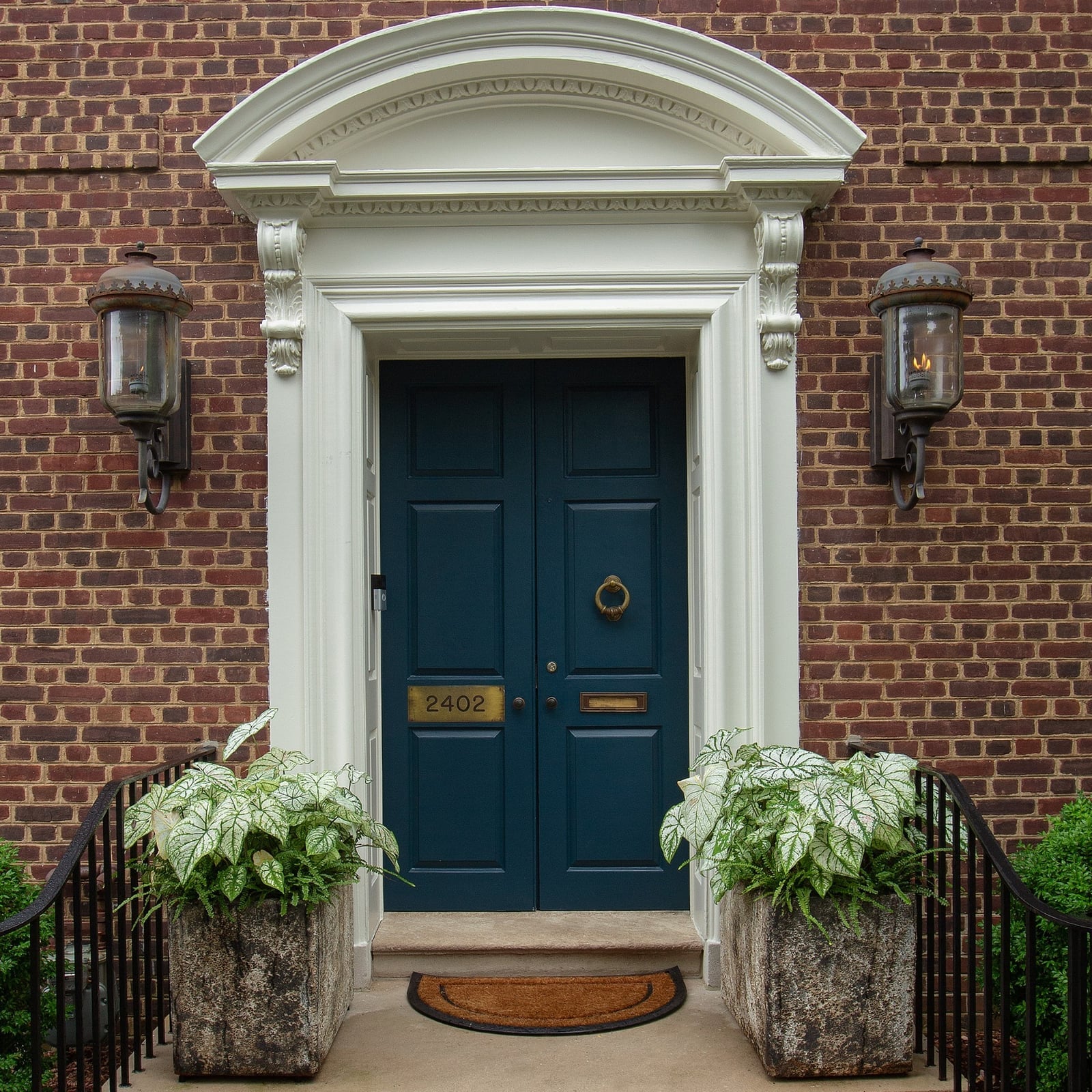
This is a front entrance designed to impress. The deep teal double doors sit within an ornate brick surround with a curved arch, and the white trim around the doors creates a crisp boundary between the brick and the paint. Exterior sconces on either side cast warm light across the door surface, which helps the teal look rich and dimensional. The planters on each side are simple and low, so they do not compete with the door or the surround. The overall palette is teal, brick red, white, and grey, with the door carrying the most visual weight.
15 / 26Soft Pink Door with Striped Steps
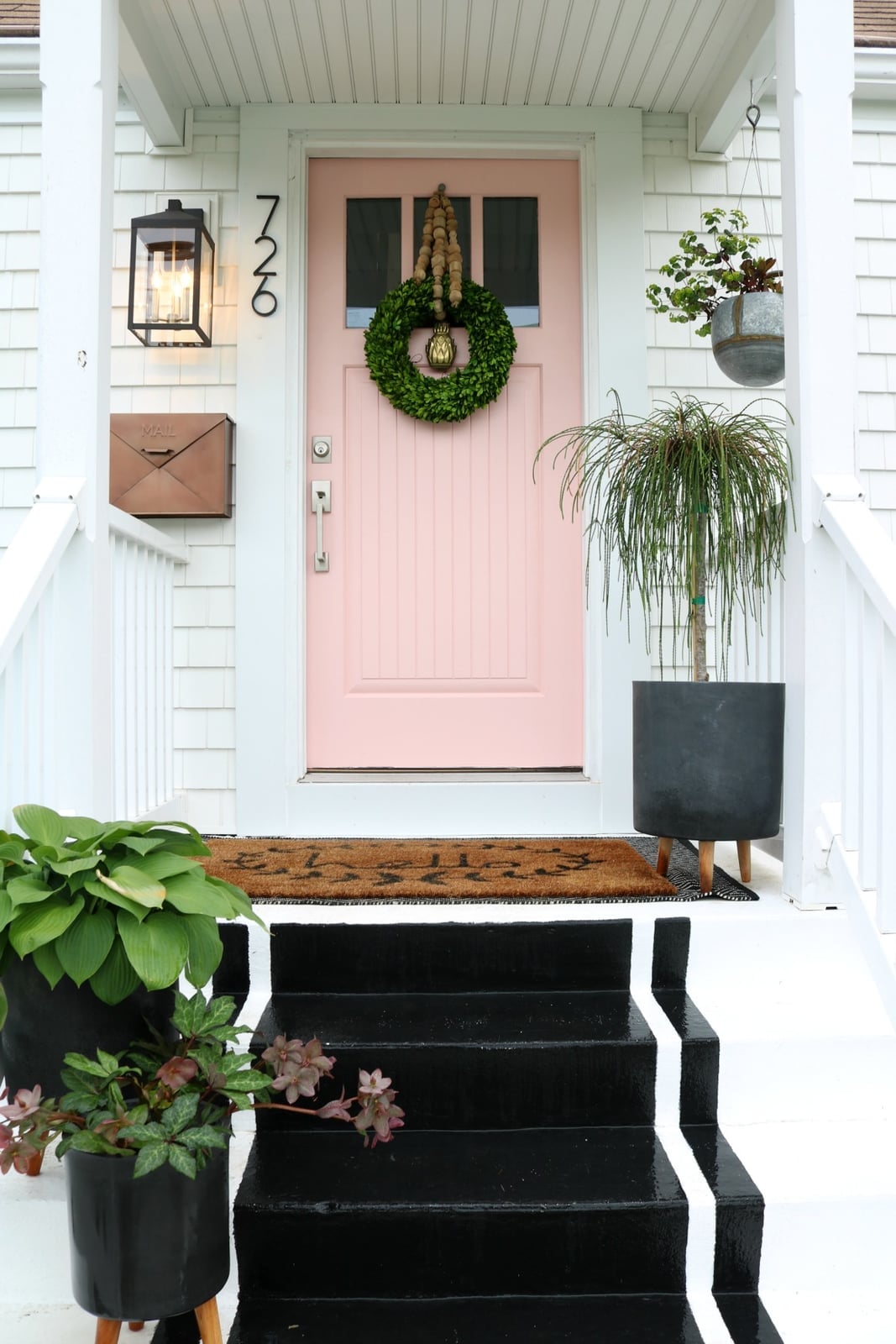
A compact porch calls for a clear focal point, and the striped steps here do that job just as much as the pink door. The black and white stripes run horizontally across the steps, creating a strong visual anchor at ground level that leads the eye up to the door. The pink is soft enough that it does not fight with the stripes for attention. Large potted plants on each side of the door and a hanging lantern add vertical interest, which helps the narrow porch feel taller. The palette is pink, white, black, and green, with the stripes acting as the unexpected element that breaks the otherwise soft look. The ratio is roughly equal parts pink and stripe, with green and white filling the rest.
16 / 26Pale Lilac Door with Stained Glass Sidelights
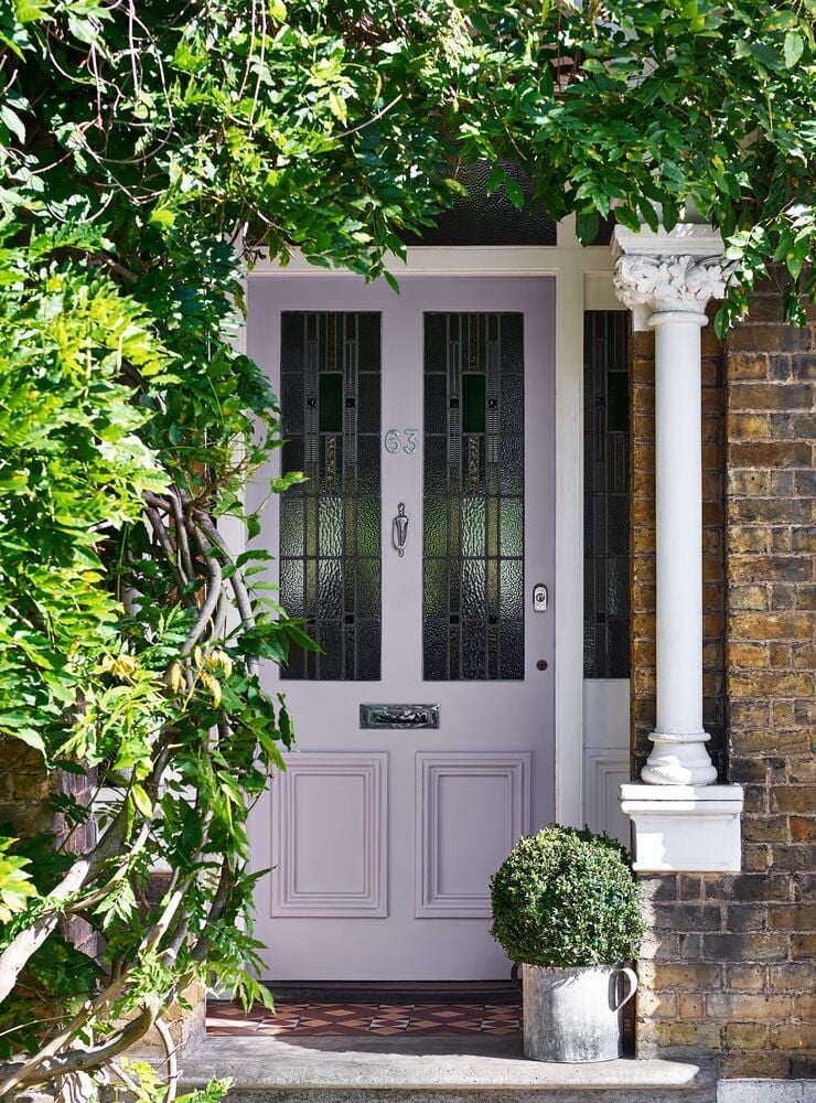
A pale lilac door is a rare find on an Art Nouveau-style entrance, and it works here because the stained glass in the door and sidelights pulls in a dark green that anchors the pastel. The palette relies on a ratio of roughly one part lavender to one part deep green, with the brick and stone surround acting as a neutral buffer. What stops the look from reading as sugary is the column and the potted plant, both of which add a structural weight that the door alone does not carry.
17 / 26Rich Teal Paneled Door with Brass Accents
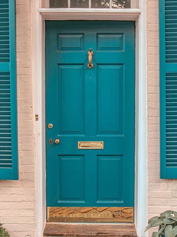
Choosing a bold front door color starts with the hardware. A rich teal paneled door with a brass mail slot and knocker shows how the metallic finish keeps a saturated color from feeling flat. The cream shutters on either side give the eye a rest, so the teal stands out without overwhelming. For renters, swapping the door itself is not an option, but switching out a standard knob for a brass knocker or mail slot changes the whole tone of the entrance without touching the lease.
18 / 26Soft Sage Green Door with Lion Knocker
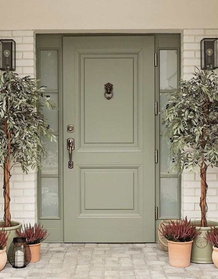
Soft sage green can read as either a neutral or a color depending on what sits next to it, and this traditional entrance leans into the tension. The paneled door with its lion knocker and sidelights keeps the look classic, while the terracotta pots and olive trees bring in a warmth that sage green on its own does not have. The exterior sconces soften the brick surround at dusk, so the door does not go dark the moment the sun drops. A close alternative would be a muted celadon, which is cooler and would need white trim instead of the warm terracotta to stay balanced. The difference is in the undertone: sage has a yellow base that plays well with natural stone and clay, while celadon has a blue base that prefers clean lines and pale gray.
19 / 26Soft Lavender Door with Hanging Baskets
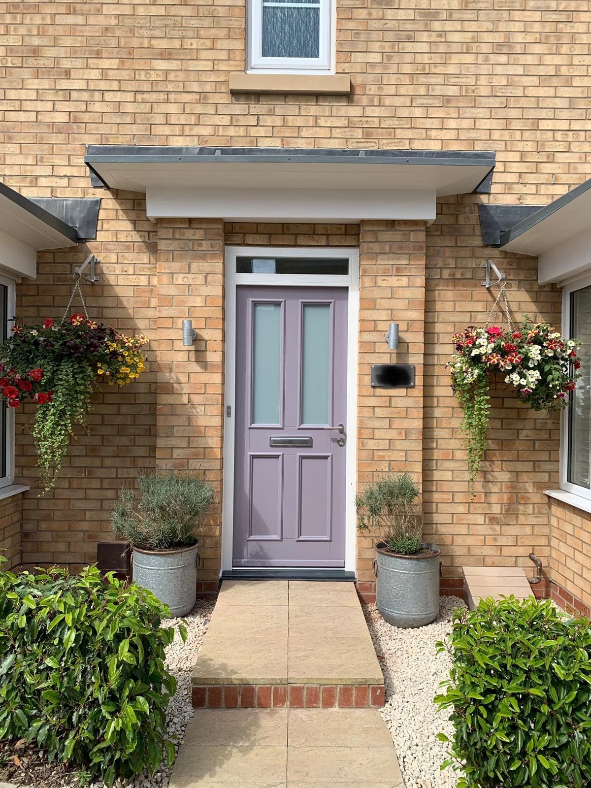
A soft lavender door with glass panes sits in a palette of grey, beige, and green, which keeps the entrance from tipping into pastel overload. The hanging baskets and potted plants repeat the green from the surrounding foliage, creating a continuous line of color from the ground to the door. The pathway leading to the door gives the eye a clear path, so the lavender becomes the destination.
20 / 26Vibrant Red Cottage Door with Arched Overhang
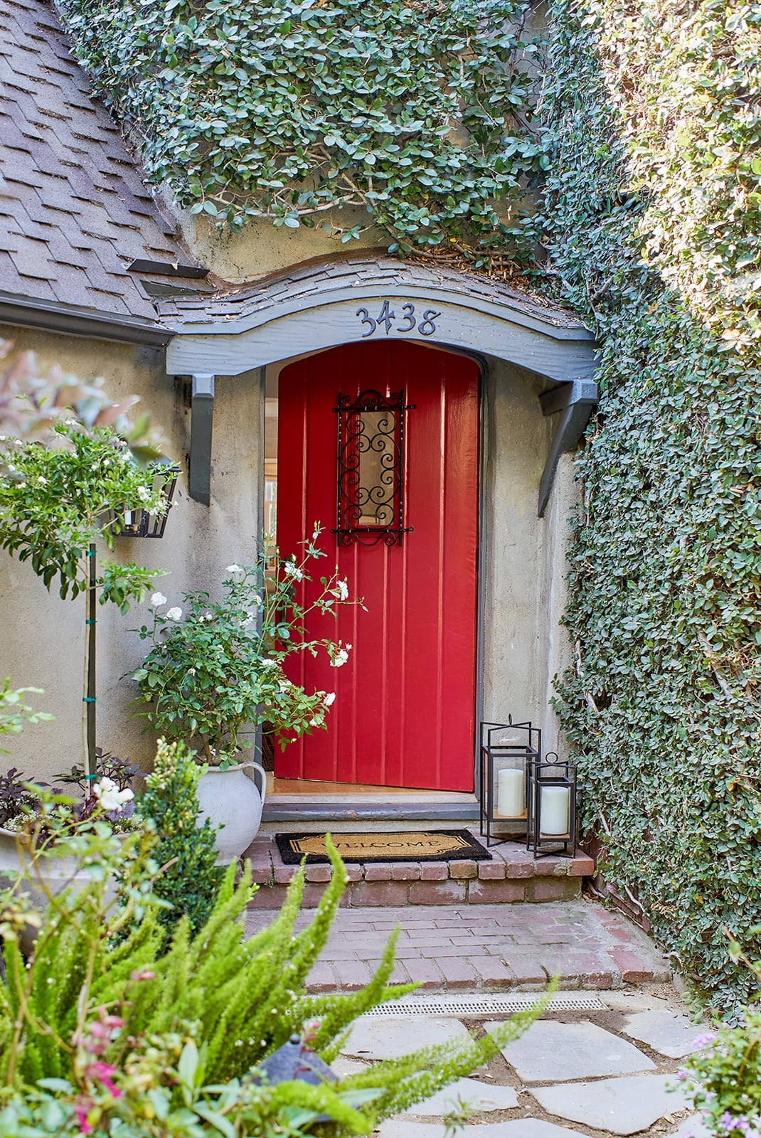
This is a confident red door on a cozy cottage porch, and it works because the arched stone overhang gives the color a frame. Without that arch, a red this bright can float against grey siding and brick. The lanterns on either side match the door’s scale instead of shrinking next to it, and the potted plants at the base of the steps anchor the color to the ground. The overall effect is balanced: the red does all the work, and everything else just holds still.
21 / 26Deep Plum Cottage Door with White Picket Fence
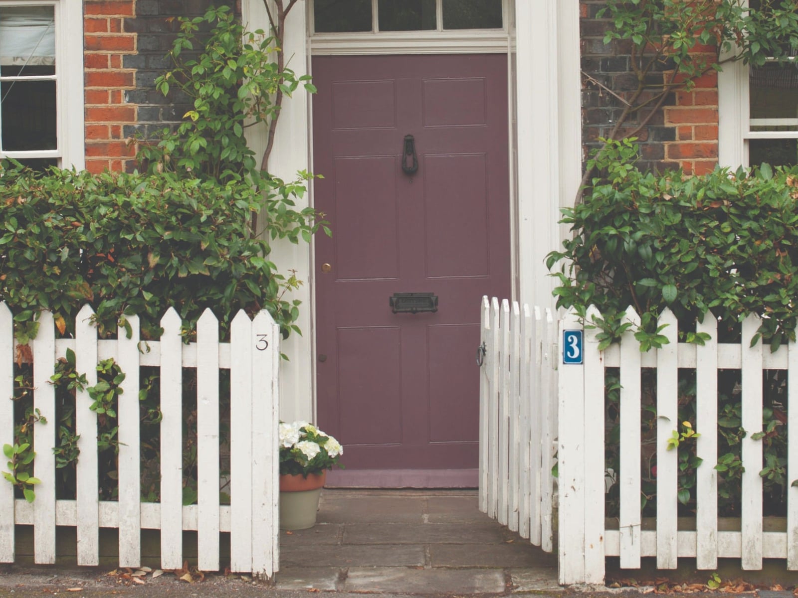
A deep plum door against a white picket fence and green hedges creates a palette that is both dramatic and cozy. The dark plum acts as a neutral against the white trim, while the green foliage adds a natural counterpoint. This color feels grounded, making it a good choice for a cottage style where you want the front door to stand out without feeling modern or stark. The key is that the plum is deep enough to hold its own against the dark green of the hedges, so the whole composition stays balanced.
22 / 26Light Grey Door with Leaded Glass and Topiaries
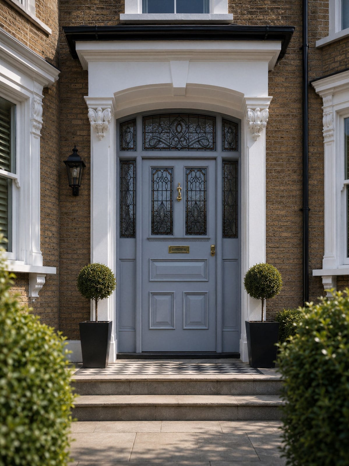
The light grey door sits between white columns and black lanterns, flanked by topiary trees in matching urns. The leaded glass panels pull in the black and gold tones from the hardware and light fixtures, so the door feels connected to the whole entry rather than floating on its own. What defines the palette here is the ratio of light grey to white to black: about sixty percent light grey, thirty percent white trim, and ten percent black and gold accents. The topiaries break the hard vertical lines with soft, rounded shapes.
23 / 26Aqua Double Doors on Grey Siding
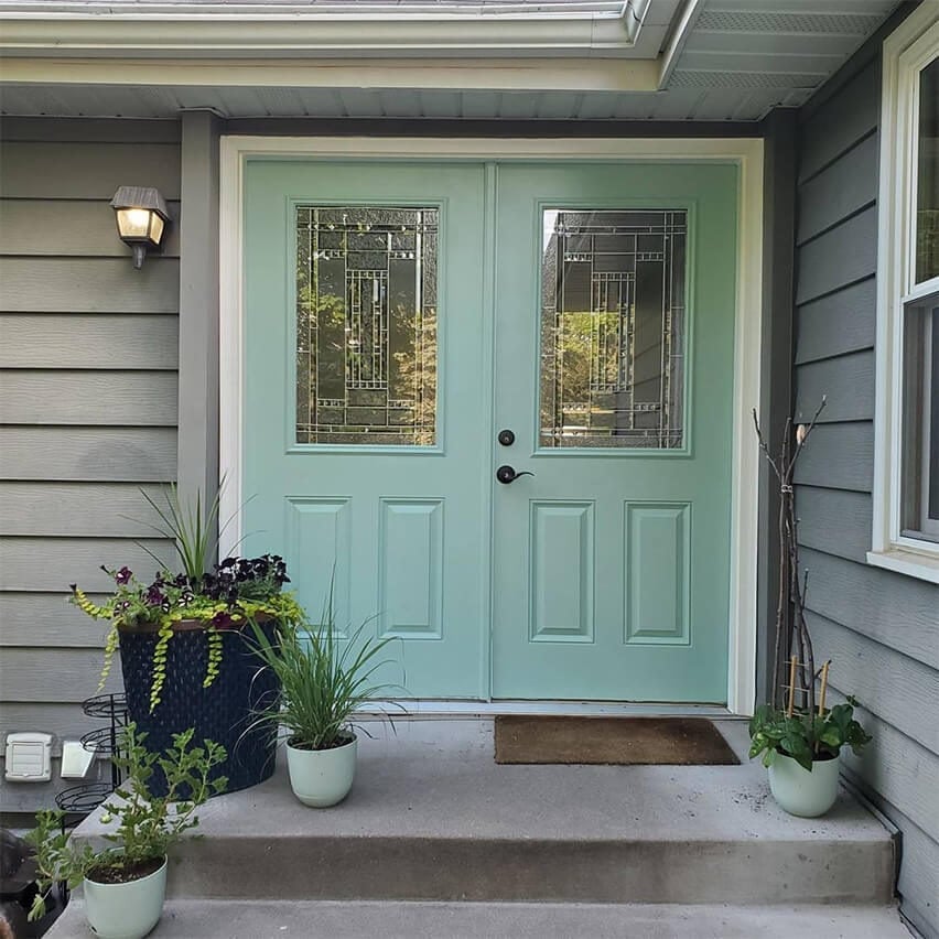
A practical rule for an aqua door on grey siding is to let the siding stay neutral and the door carry the color. The cool grey vinyl siding gives the aqua a clean backdrop, while the white trim around the double doors keeps the line crisp. The glass panes in the doors add visual space, so the color does not feel heavy. The palette works because aqua and grey sit close on the color wheel, creating a calm, coastal feel without needing blue shutters or a nautical theme.
24 / 26Soft Pink Door with Brass Mail Slot
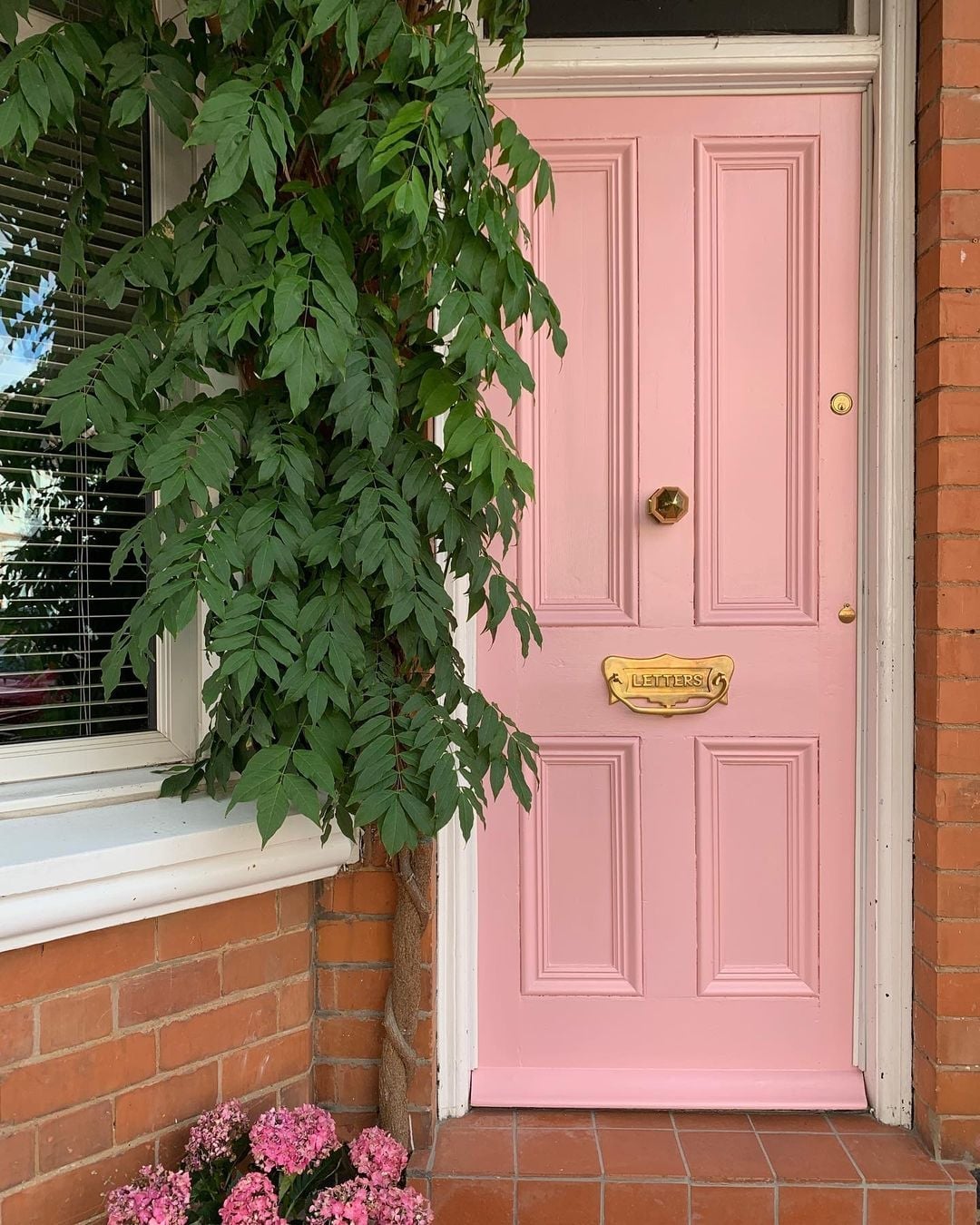
A soft pink door reads differently next to brick than it would against white siding. Here, the warm brick red tones make the pink feel more earthy and grounded, almost like a natural extension of the material palette. The brass mail slot adds a warm metallic accent that picks up the gold undertones in the pink. It is a palette that leans into warmth without going fully warm, which keeps it from reading as too sweet or pastel. The climbing plant to the right softens the transition between the pink door and the brick wall, tying the whole composition together.
25 / 26Grand Black Double Doors with Brass Hardware
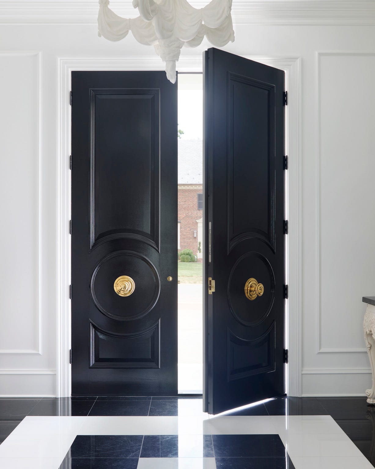
The black double doors open inward to reveal a checkered marble floor and a chandelier overhead. The brass hardware on the doors provides a warm contrast to the black paint, while the natural light from the open doors and the chandelier keeps the entry from feeling dark. The materials here do the work: the glossy black wood, the polished brass, the marble floor, the glass chandelier. Each finish reflects light differently, creating layers of texture that make the entry feel grand without needing a lot of furniture.
26 / 26Final Thoughts
The right shade depends on your home’s architecture, the surrounding light, and your personal style. The most successful front doors feel intentional against their backdrop. Before you pick up a brush, check your local climate for paint durability and consider how the color will read at different times of day. A sample patch on the door itself is always worth the extra step. The best color is one that makes you smile every time you walk up the path.