
I’ve always believed that a small kitchen can feel surprisingly spacious when every item has a purpose and a proper place. The trick is not adding more storage, but making smarter use of the cabinets, walls, corners, and work surfaces you already have. I love organization ideas that keep everyday essentials within easy reach without making the room feel crowded. From clever drawer solutions to vertical storage and multifunctional pieces, even the tiniest kitchen can become easier to use. A few thoughtful changes can also make cooking, cleaning, and putting everything away feel much less overwhelming. Here are some of my favorite small-space kitchen organization ideas for creating a space that feels streamlined, practical, and effortlessly inviting.
Warm Dining Kitchen With Patterned Tile and Vertical Window Shades
I immediately notice how this compact kitchen and dining area combines several distinct textures without making the room feel crowded. The cabinetry on the left has a muted green-gray finish with dark hardware, while the dining area is centered around a round wooden table surrounded by four wooden chairs with upholstered seats. Behind the table, tall fabric window shades are divided by slim horizontal wood-colored lines, creating a strong vertical rhythm. The patterned floor brings together cream, gray, brown, and muted green tones, while a decorative pendant hangs directly over the table.
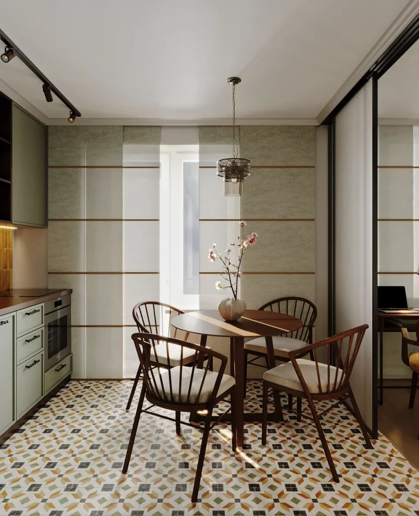
What makes this arrangement work for me is the way the dining table occupies the center without creating a heavy visual barrier. Its round shape allows the chairs to sit comfortably around it and keeps the circulation softer than a large rectangular table would. The cabinetry stays concentrated along one side, leaving the dining zone visually separate while still connected to the kitchen. I also like how the patterned floor gives the compact room definition without requiring additional decorative objects.
From my perspective, this is a useful example of allowing one strong surface to do the decorating work. The floor already introduces considerable pattern, so the cabinetry, walls, and window treatments remain comparatively restrained. If I were recreating this feeling, I would keep the main furniture footprint compact and let one distinctive material or pattern establish the personality of the room.
Streamlined L-Shaped Kitchen Beside a Compact Staircase
This kitchen takes a very different approach, using an L-shaped arrangement of pale cabinetry and countertops within a narrow passage. The cabinets are extremely clean-lined, with dark horizontal details emphasizing the lower edges and separating the cabinetry visually. A tall bank of cabinetry rises on the right, while the kitchen opens toward a bright living area and a window overlooking greenery. On the right side, a staircase is integrated directly into the surrounding architecture, reinforcing how efficiently the available space has been planned.
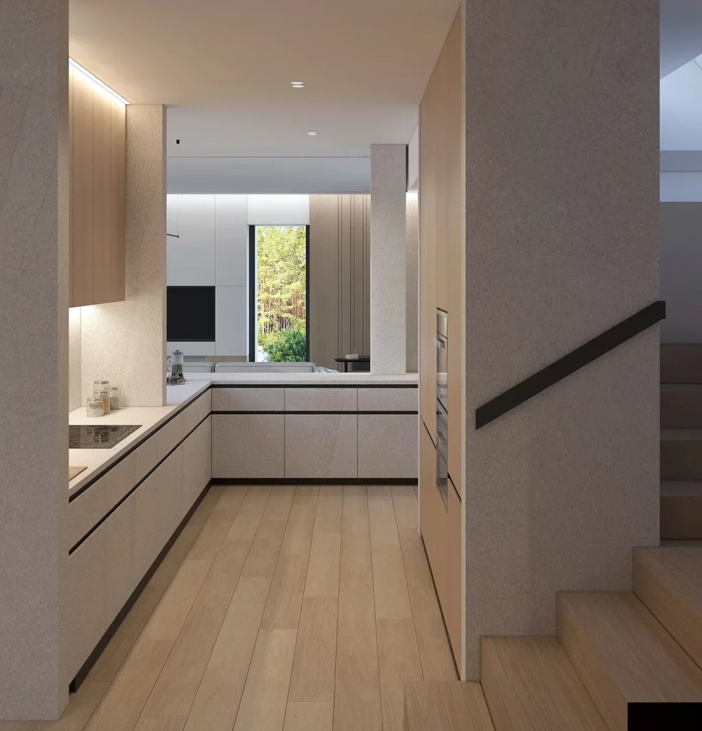
I like the way the kitchen uses the corner rather than allowing the narrow footprint to become an obstacle. The L-shaped counter provides two working surfaces while maintaining a clear central walkway. Full-height storage along the side also makes good use of vertical space, and the restrained palette keeps the room visually calm. The pale flooring continues through the kitchen and staircase area, helping all of these compact zones read as one connected interior.
For me, the strongest lesson here is that small-space organization does not have to rely on numerous visible storage accessories. A carefully planned run of cabinetry can provide the necessary capacity while keeping the room almost architectural in appearance. I would also pay attention to the dark linear details because they give definition to otherwise pale surfaces without introducing unnecessary visual clutter.
Dark-and-White Kitchen With a Dedicated Dining Nook
I find the contrast in this kitchen particularly effective. Tall dark cabinetry occupies the left side and houses integrated appliances, while white upper cabinets create a lighter transition across the back wall. Below them, dark lower cabinetry and a pale countertop establish a strong horizontal composition. The dining table sits directly in front of the kitchen and is surrounded by four upholstered chairs in blue and warm tan shades. A textured white wall treatment and a simple round clock add visual interest without filling the space with accessories.
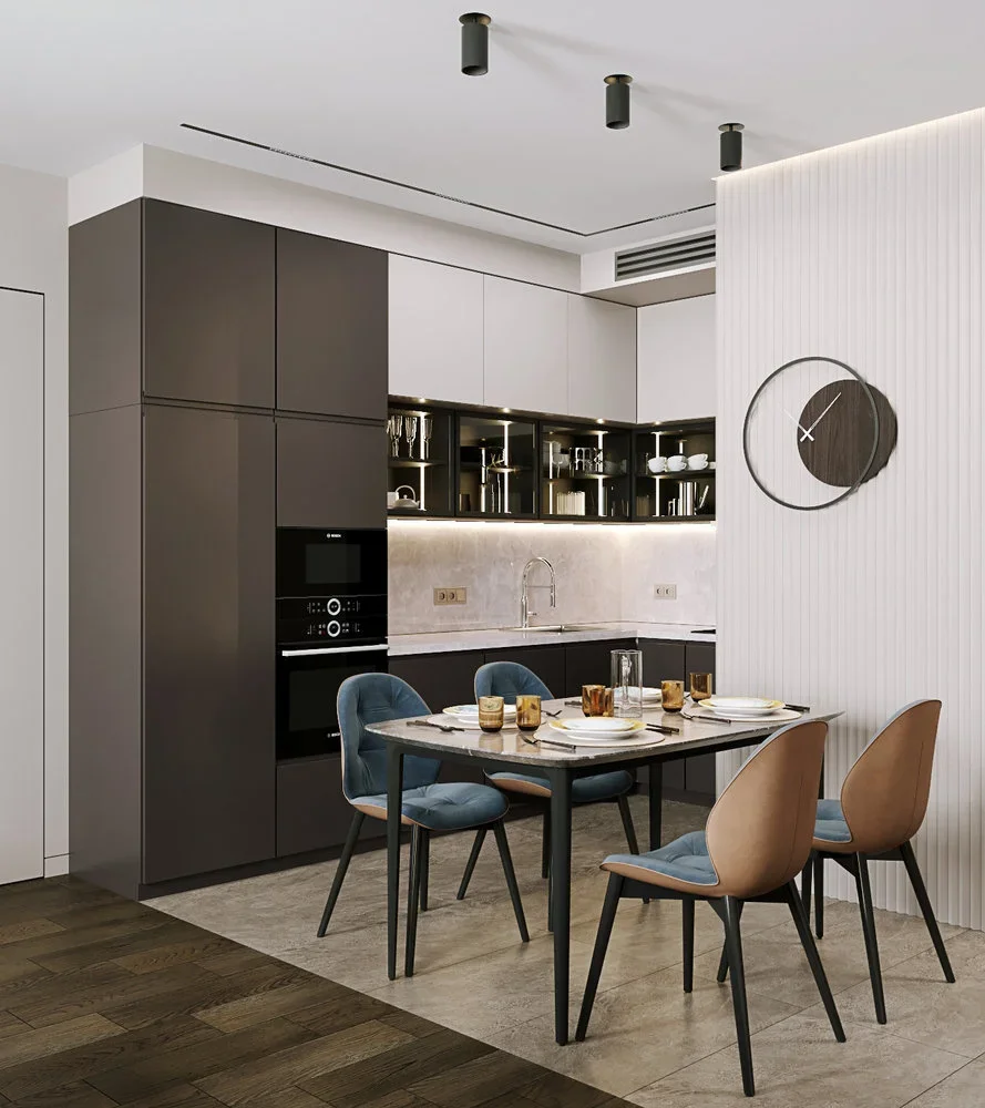
The compact dining arrangement is one of my favorite organizational details because it gives the kitchen an obvious eating area without requiring a separate room. The table remains close to the working kitchen, while the contrasting chair colors introduce softness against the dark cabinetry. Open shelving with integrated lighting provides a place for visible dishes and glassware, making frequently used pieces accessible while also breaking up the solid cabinet fronts.
When I look at small kitchens like this, I tend to favor a combination of closed and selectively open storage. The tall cabinetry handles the heavier visual mass and conceals appliances, while the illuminated shelving adds depth. The key is restraint: because only a limited portion of the storage is open, the room can still look organized rather than busy.
Minimal White Kitchen With a Warm Wood Ceiling
This compact kitchen is arranged almost entirely along a single wall, with a long run of white cabinetry above and below the counter. The backsplash is dark and textured, creating a strong contrast with the smooth white cabinet fronts. Above, a warm wood ceiling introduces a completely different texture and tone, while recessed lights provide focused illumination across the workspace. A glimpse of the adjoining dining area is visible through the doorway on the right.
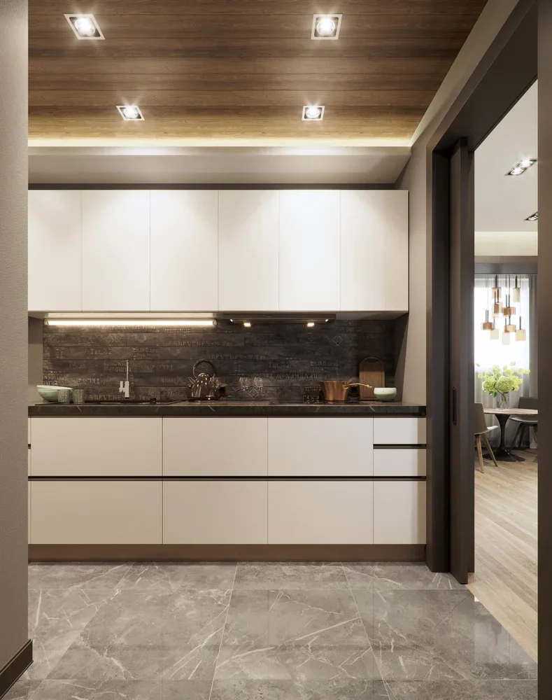
I think the single-wall arrangement is especially useful when floor space is limited because it leaves the opposite side open for movement. The upper cabinets provide substantial concealed storage, while the continuous lower cabinetry keeps the working area visually uninterrupted. The dark backsplash also helps define the countertop zone and gives the otherwise pale kitchen a clear focal band.
What I would take from this design is the importance of thinking vertically rather than horizontally. When there is not enough floor area for additional cabinets or furniture, tall upper storage can carry much of the organizational load. I also like the contrast between the dark backsplash and warm ceiling because it gives a very compact kitchen enough material variation to feel finished without relying on lots of decoration.
White and Walnut Kitchen With Fully Integrated Storage
Here, the kitchen is reduced to a beautifully controlled composition of white lower cabinetry, a white work surface, and a large expanse of warm walnut-toned cabinetry above and beside it. The oven is integrated into the lower run, while the upper wood cabinets extend almost continuously toward the ceiling. A glossy pale backsplash reflects light across the workspace. On the left, dark floor-length curtains frame a window, and the warm wood floor continues naturally beneath the kitchen.
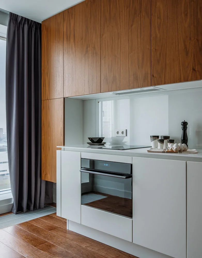
I particularly like how the upper cabinetry becomes the dominant organizing element rather than allowing individual appliances and objects to compete for attention. The clean white lower section visually lightens the work area, while the wood storage gives the kitchen warmth and depth. Because the appliances are integrated into the cabinetry, the overall arrangement feels compact and orderly.
In my experience with small-space design, visual continuity can be just as important as actual storage capacity. This kitchen demonstrates that principle beautifully: repeated cabinet surfaces create a calm background, while the contrast between walnut and white gives the space enough character. For a similar result, I would keep appliance placement visually integrated and avoid interrupting a continuous cabinet run unless there is a practical reason to do so.
Soft Beige Kitchen With Graphic Geometric Backsplash
This kitchen feels warmer and more playful than the previous examples. Soft beige cabinetry runs across both the upper and lower sections, with simple round wooden pulls adding a subtle natural detail. The countertop is a pale yellow-beige tone, and the backsplash consists of white tiles decorated with repeated curved line motifs in a muted tan color. A yellow curved faucet becomes an unexpected focal point above the sink, while a turquoise kettle and a glass container with leafy stems add small accents of color.
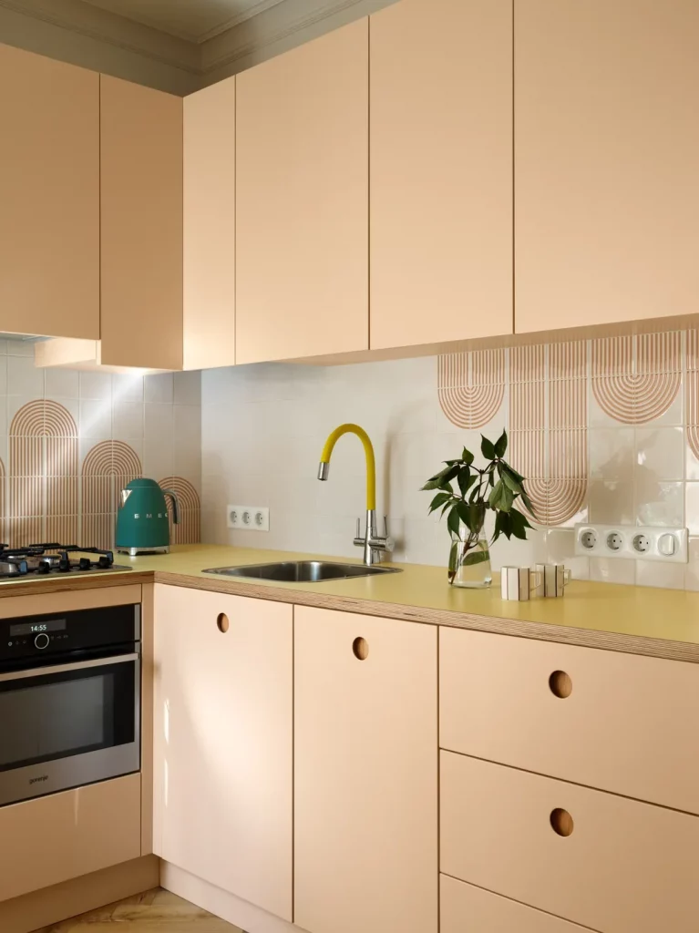
I like how the room remains organized despite having several decorative details because the cabinetry itself is extremely simple. The flat fronts provide a quiet backdrop for the patterned backsplash, while the repeated circular motifs echo the rounded cabinet pulls. The sink occupies a practical central position along the counter, with work surfaces extending on either side.
For me, this is a good reminder that a small kitchen does not have to be visually severe to feel organized. I would choose one dominant cabinet color, one backsplash pattern, and only a few carefully repeated accent colors. The image shows how those elements can create personality while the underlying cabinetry continues to provide a clean and efficient storage structure.
Blue Kitchen With a Compact Dining Table and Brass Details
Deep blue cabinetry gives this kitchen a rich, tailored appearance, with matching upper and lower cabinets surrounding a pale countertop and backsplash. Brass-colored handles and a brass chandelier add warmth to the darker cabinetry. A small wooden dining table sits directly in front of the kitchen, topped with a tall glass vase containing slender stems. The table setting includes a cup, plates, glasses, and a small decorative object, while upholstered gray chairs complete the dining area.
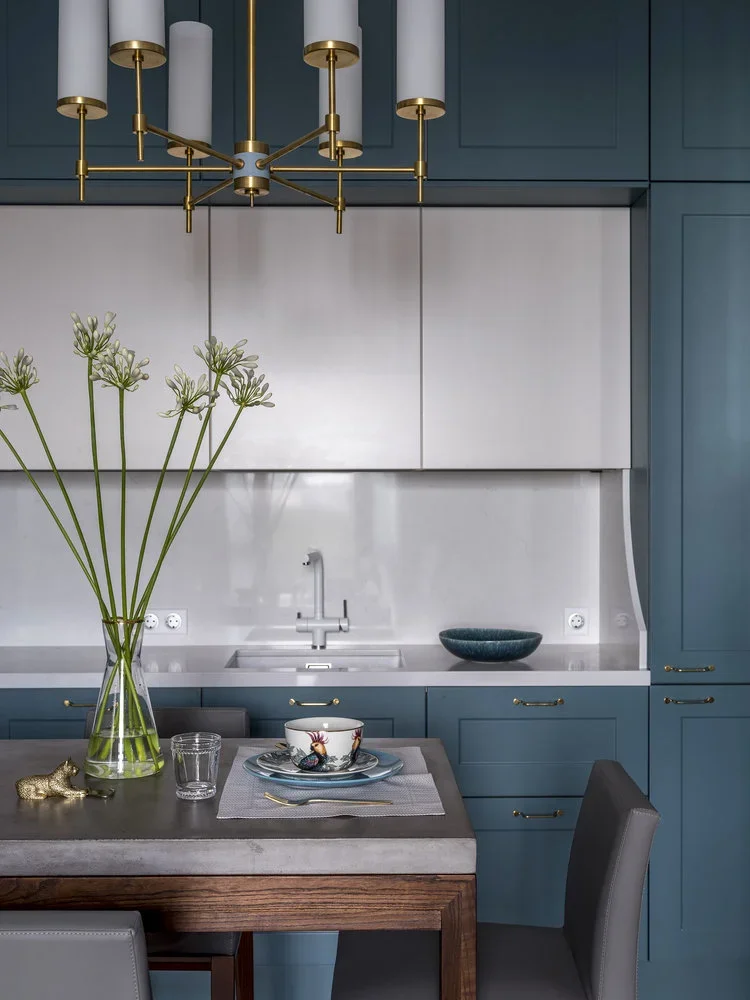
What stands out to me is the way the dining table doubles as an extension of the kitchen’s everyday function. It occupies relatively little space but provides a dedicated surface for meals and preparation. The pale countertop and backsplash prevent the dark cabinetry from making the room feel too enclosed, while the brass details repeat across the room and give the composition cohesion.
I would use this design as inspiration for anyone who wants a small kitchen with stronger color. Instead of adding color through numerous accessories, the cabinetry carries most of the visual impact. Keeping the surrounding surfaces light and the furniture compact allows the blue to remain sophisticated rather than overwhelming the limited footprint.
White Kitchen With Sculptural Lighting and Green Dining Chairs
This bright kitchen uses white cabinetry, white walls, and a pale marble-look floor with fine gray veining to create a remarkably light setting. A vertical fluted wall panel introduces texture beside the dining area, while a round dining table occupies the center. Four green upholstered chairs with slim black frames bring a deep accent color into the otherwise pale room. Above the table hangs a striking cluster of transparent spherical lights suspended at different heights, creating the most decorative element in the space.
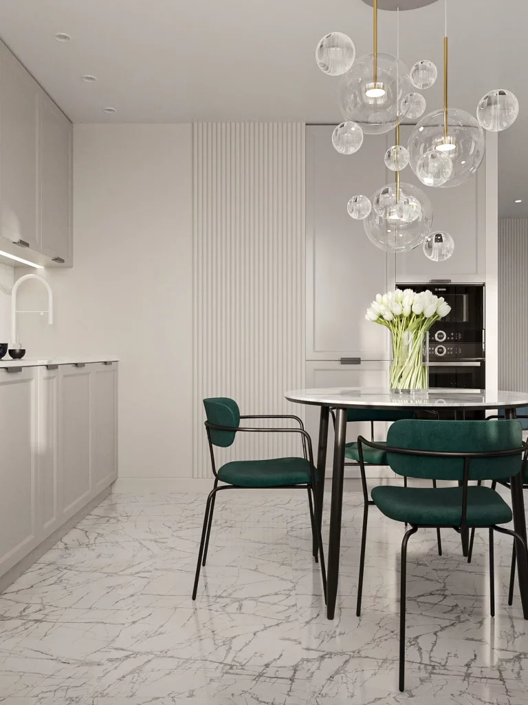
I think this layout works because the visual weight is distributed carefully. The cabinetry remains quiet and almost blends into the walls, allowing the dining table, green chairs, and sculptural lighting to define the room. The round table also makes the compact dining zone feel approachable and leaves circulation space around its perimeter. The integrated oven visible in the cabinetry keeps the appliance arrangement neat and unobtrusive.
From my perspective, this is an excellent example of using one statement lighting arrangement instead of filling a small room with numerous decorative pieces. The transparent shades maintain an airy quality even though the fixture is substantial. If I were adapting the idea, I would preserve the pale architectural background and choose one distinctive dining or lighting element as the visual centerpiece.
Mint Green Kitchen With a Practical Work-and-Dining Extension
This compact kitchen makes a strong impression through its consistent mint green cabinetry, ceiling, and walls. The cabinetry occupies the left side, with a pale countertop and a simple gray backsplash behind the sink and cooking area. A tall counter extension projects into the room and functions as a dining or work surface, with a gray upholstered chair positioned beneath it. A laptop rests on the counter, while black wall lighting, dark hardware, and a dark wood floor add contrast to the pale green surroundings.
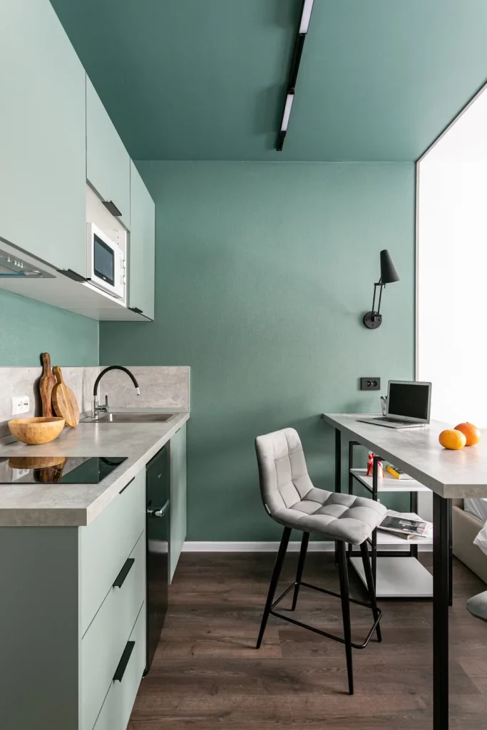
I especially like the way the counter extension serves more than one purpose. Instead of introducing a separate dining table into an already compact footprint, the long surface provides room for working, eating, or handling everyday tasks. The chair fits neatly beneath the counter area, preserving floor space when it is not being used. The consistent green treatment also visually expands the kitchen because there are fewer abrupt changes between surfaces.
For me, the smartest idea here is the multifunctional counter. In a small kitchen, I would rather have one generous surface performing several roles than several separate pieces of furniture competing for floor space. The image also shows how a strong color can be used across cabinetry and architecture to create a cohesive enclosure rather than making the room feel fragmented.
White Kitchen With a Terracotta-Colored Recess and Stone Backsplash
The final kitchen uses a simple white cabinetry system as its foundation, but a recessed section in a muted terracotta-red shade creates a dramatic architectural accent. Inside this recess, the upper cabinets and surrounding surfaces are also colored, framing a backsplash made from richly patterned stone with gray, cream, and darker mineral variations. The lower cabinetry returns to white, with a black countertop edge and integrated black oven providing crisp contrast. A compact sink and kettle occupy the work area.
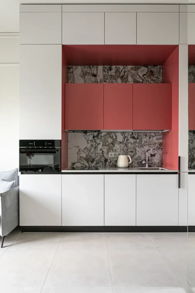
I like the organizational clarity of this arrangement because the different zones are visually defined without requiring physical partitions. The white cabinetry provides a clean background, while the colored recess immediately identifies the main working section. The stone backsplash adds texture and depth behind the counter, but the broad white cabinet fronts keep the rest of the room visually controlled.
What I would take away from this kitchen is the value of creating a focused focal zone in a small footprint. Rather than adding decorative elements everywhere, the design concentrates color and material interest in one recessed section. That approach can make a compact kitchen feel much more intentional while preserving the practical simplicity of its cabinetry and work surfaces.
Soft Green Kitchen With a Compact Central Worktop
This kitchen takes a warmer, more expressive approach, with muted green cabinetry surrounding a compact L-shaped work area and a small projecting worktop. Natural wood-colored cabinet fronts appear across the upper section, creating a gentle contrast with the green doors. Black track lighting and two hanging pendant lights define the ceiling, while the wood-look floor continues the warm feeling. A small dining area with upholstered pink-beige chairs sits directly beside the kitchen, making the entire space feel connected.
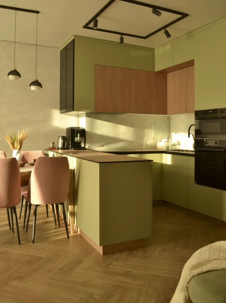
I particularly like how the projecting counter creates an additional preparation surface without requiring a large island. In a compact kitchen, that kind of small extension can be surprisingly useful because it provides workspace while preserving circulation around it. The tall cabinetry also makes good use of the available wall height, while the integrated appliances remain visually contained within the cabinetry. The combination of closed storage and a simple countertop keeps the room from appearing cluttered.
If I were recreating this approach, I would take inspiration from the balance rather than trying to copy every finish. The green cabinetry establishes a strong visual identity, while the natural wood tones prevent the room from feeling too flat. I would also keep seating streamlined around a small dining area, as these chairs demonstrate how a dining zone can coexist comfortably with a compact kitchen when the furniture footprint is controlled.
Minimal Gray Kitchen With Integrated Shelf Storage
Here I see a compact kitchen finished in restrained gray tones, with flat-front lower cabinets, a white countertop, and a built-in oven. The upper portion is deliberately simple, while a long open shelf runs above the worktop and includes subtle integrated lighting underneath. A large window sits beside the kitchen, framed by long taupe curtains. A small dining table and dark upholstered chairs occupy the adjoining area, reinforcing the efficient use of a limited room.
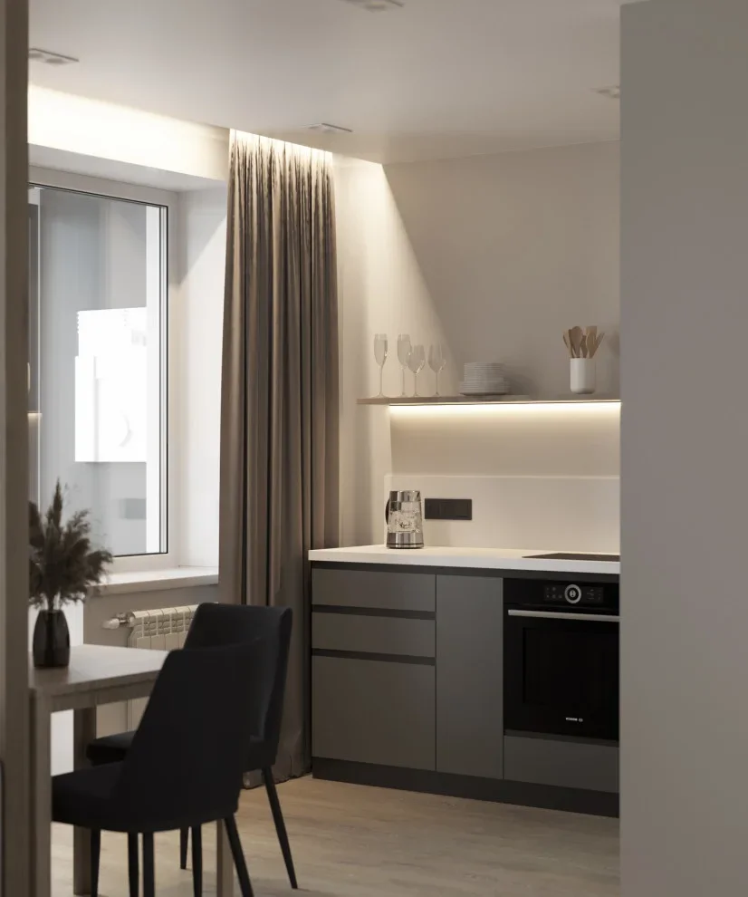
The open shelf is one of the most useful organizational details in this kitchen because it provides accessible storage without filling the entire wall with upper cabinets. Glasses, plates, and a few cooking items are displayed neatly, while the lower cabinetry conceals less decorative essentials. I also like the clear distinction between the white worktop and gray cabinetry. That contrast keeps the working surface visually defined and makes the compact kitchen easier to read.
For me, this is a good example of how small kitchens benefit from mixing concealed and visible storage carefully. I would reserve open shelving for items that are used regularly or that can be arranged neatly, while keeping everything else behind closed doors. The understated gray palette also demonstrates why simple finishes can work so well in a small room: there are fewer competing visual elements, so the space feels organized even when it contains all the basic functions of a kitchen.
Wood Cabinetry and Green Lower Units in a Tiny Kitchen
This compact kitchen uses a striking two-level cabinetry arrangement. The upper cabinets have a warm wood finish, while the lower cabinets are a deep green. A white subway-style backsplash runs across the wall and creates a bright background behind the dark countertop. The sink and cooktop share the same compact work surface, while a built-in microwave is positioned within the upper cabinetry. A green upholstered seating area appears immediately beside the kitchen, tying the surrounding space into the cabinetry color.
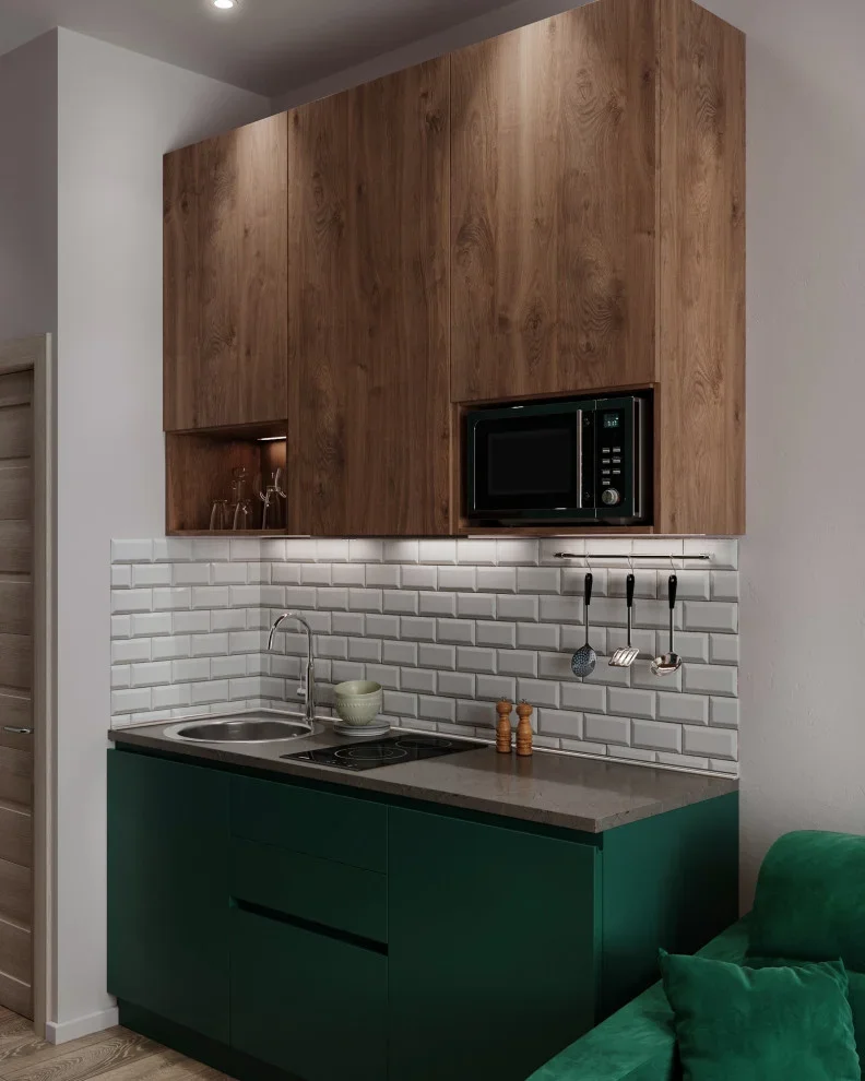
I like the organizational logic of placing the microwave inside the cabinetry rather than allowing another appliance to occupy valuable counter space. The upper cabinets also extend across most of the available wall, making the most of vertical storage. At the same time, the open niche at the left provides a small area for glasses or other frequently used pieces. The deep green lower cabinetry visually anchors the room, while the white backsplash prevents the compact kitchen from becoming too dark.
This design reminds me that a small kitchen does not have to be entirely pale to feel functional. I would use a darker cabinet color confidently when there is enough visual contrast from the backsplash and surrounding surfaces. For readers working with limited counter space, I would also look closely at the placement of built-in appliances. Moving even one appliance into cabinetry can make the remaining work surface much easier to use.
Light Wood and White Cabinetry for an Efficient Corner Kitchen
The next kitchen has a clean corner layout with light wood lower cabinets, pale upper cabinets, and a continuous white countertop. A textured gray-brown backsplash covers both walls and visually connects the two sides of the L-shaped workspace. The refrigerator stands at the far left, while the microwave is integrated into the upper cabinetry. A black faucet and dark appliances provide small points of contrast against the neutral finishes.
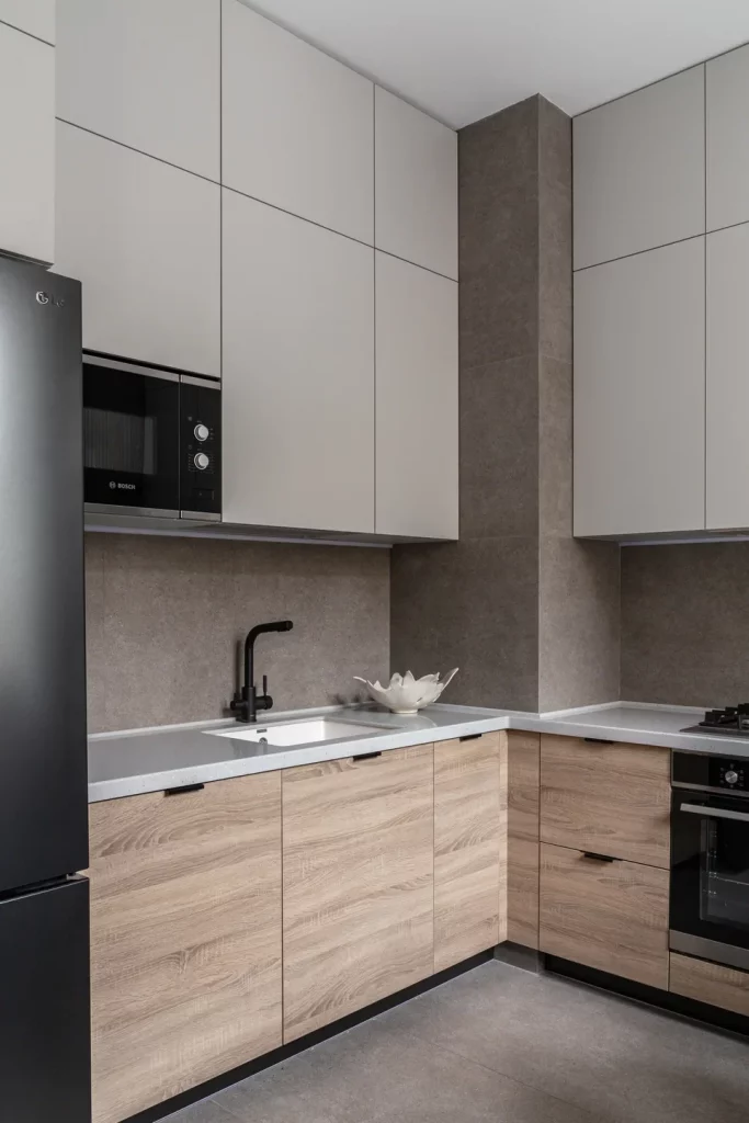
The corner configuration makes excellent use of two adjoining walls without introducing unnecessary furniture into the center of the room. I especially like the uninterrupted countertop around the corner because it provides a generous-looking work surface despite the compact footprint. The combination of drawers and cabinets below keeps storage close to the work zone, while the upper cabinets provide additional capacity without extending beyond the kitchen’s functional boundaries.
When I look at small kitchens like this, I always pay attention to the corners because they can easily become wasted space. Here, the L-shaped arrangement turns the corner into part of the working area rather than treating it as leftover space. I would also keep the countertop visually clear, as the photograph demonstrates how much more spacious a small kitchen can feel when only a few functional objects remain visible.
Streamlined Gray Kitchen With Warm Under-Cabinet Lighting
This kitchen takes a sleek gray approach, with flat-front cabinetry extending across the main wall and around the corner. A warm textured backsplash sits beneath the upper cabinets, while continuous under-cabinet lighting creates a soft horizontal glow across the worktop. The ceiling includes recessed lighting, and the wood-toned floor and ceiling introduce warmth into the predominantly gray scheme. A few small kitchen items remain visible along the counter without overwhelming the clean cabinetry.
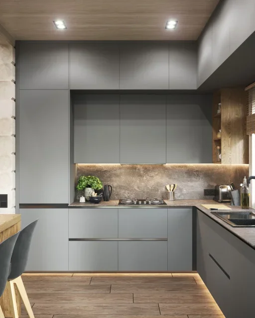
I think the lighting is particularly effective as an organizational feature because it makes the work surface easier to use while visually separating the countertop from the cabinets above. The cabinetry itself provides extensive closed storage, which keeps the compact room looking calm. The corner layout also places the sink and cooking area along connected work surfaces, creating a practical sequence for everyday tasks.
For a small kitchen, I would consider this combination of closed storage and focused lighting especially useful. From the way I have seen compact interiors styled, lighting underneath cabinets can make a bigger difference than adding decorative objects because it improves both atmosphere and function. I would keep the countertop accessories limited and purposeful, allowing the continuous cabinetry and illuminated backsplash to remain the dominant visual features.
Dark Wood and Gray Cabinetry With a Brick Accent Wall
This kitchen has a much moodier character, combining dark wood upper cabinets with gray lower cabinetry and a large dark stone-look backsplash. Warm lighting runs beneath the upper cabinets and emphasizes the backsplash texture. To one side, an exposed brick wall creates a strong architectural contrast, while framed artwork hangs against it. A small dining table with brown upholstered chairs occupies the foreground, keeping the kitchen connected to a compact eating area.
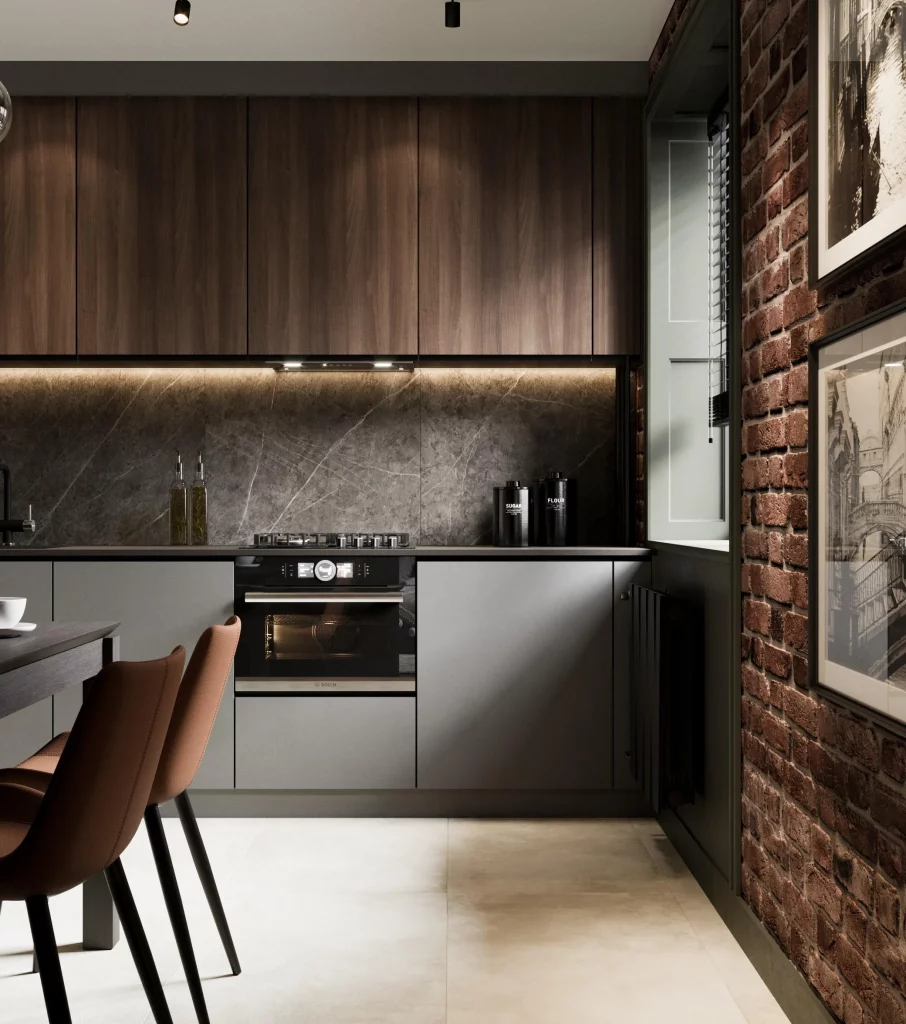
The organization is especially effective because most of the kitchen storage is concealed behind full-height, clean-lined cabinet fronts. That allows the textured backsplash and brick wall to provide character without competing with a collection of visible objects. The cooking zone is compact, yet the cabinetry creates a strong horizontal line that makes the kitchen feel cohesive. I also like how the dining chairs fit into the available space without creating a bulky visual barrier.
For me, this is a useful reminder that organization is not synonymous with an all-white interior. A darker palette can work beautifully in a small kitchen when the storage is disciplined and the lighting is carefully positioned. I would focus on keeping counters clear and letting a few architectural finishes do the decorative work. In a compact room, that approach can create a richer atmosphere without adding unnecessary accessories.
Blue Cabinetry and Marble-Look Surfaces in a Family-Friendly Layout
This kitchen combines soft blue cabinetry with white marble-look surfaces marked by subtle gray veining. The cabinets run around an L-shaped work area, with integrated appliances positioned within the tall unit at the left. A long dining table with upholstered chairs occupies the foreground, and several glass pendant lights hang above it. Black details on the lighting, hardware, and appliances create definition against the pale blue and white finishes.
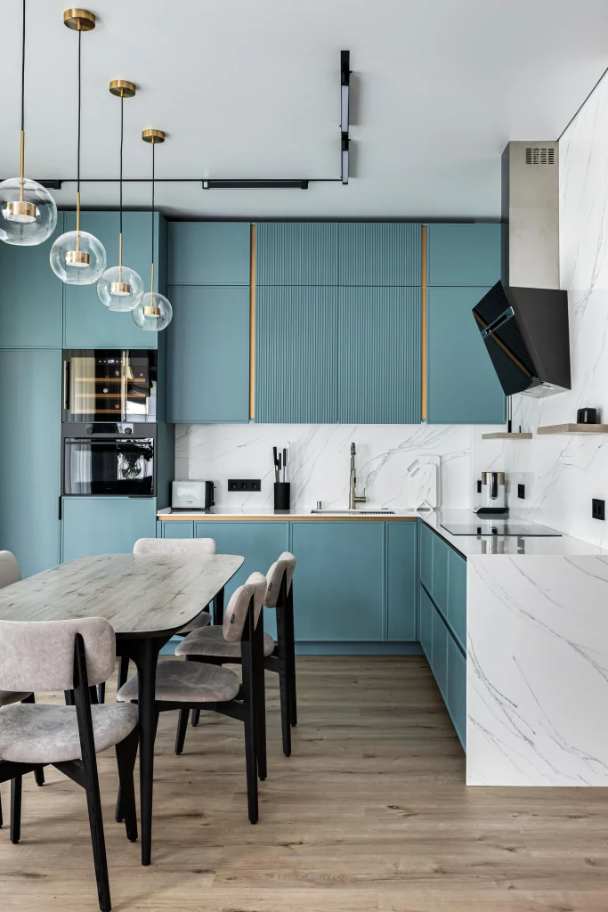
I like the way the cabinetry extends upward and around the kitchen perimeter, giving the room substantial closed storage while preserving the open center. The long dining table uses the remaining floor area efficiently and creates a natural gathering zone directly beside the kitchen. The white work surfaces also reflect light, helping the room feel open even though there is considerable cabinetry.
If I were planning a similarly compact kitchen, I would consider a consistent cabinet color across the room to make multiple storage units read as one larger composition. The blue finish here adds personality without requiring decorative clutter. I would also choose dining furniture that allows comfortable movement around the table, because circulation is just as important as storage when several functions share one small room.
Deep Blue Kitchen With a Built-In Window Seat
This compact kitchen uses rich blue cabinetry against white walls and a pale floor. The cabinetry occupies the back wall and extends into a tall storage unit on the left. Open glass-front sections display a small collection of stemware, while the lower cabinets provide enclosed storage around the cooking and sink areas. Along the right side, a built-in bench beneath the large window creates a separate seating area with a yellow cushion, adding a bright contrast to the blue cabinetry.
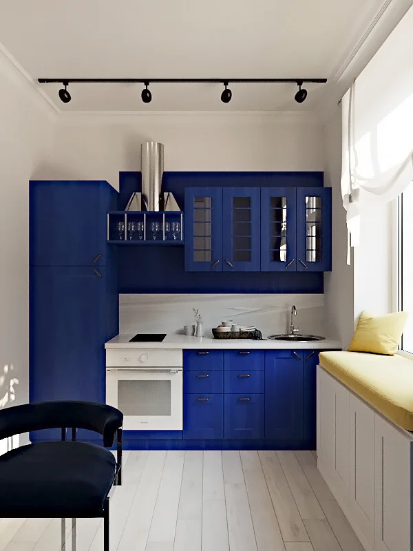
The strongest organizational idea here is the way the kitchen and seating area occupy different parts of the same small room without requiring a large piece of furniture to divide them. The tall cabinet at the left takes advantage of vertical space, while the wall-mounted upper units keep the countertop open. The window seat is another efficient use of space because it provides seating directly beneath the window rather than occupying the center of the room.
I find this especially inspiring for anyone trying to make a small kitchen serve several purposes. When floor space is limited, I would look for opportunities to use existing architectural edges for seating or storage rather than adding freestanding pieces everywhere. The blue cabinetry also shows how a strong color can make compact storage feel intentional and designed rather than purely utilitarian.
Glossy Gray Kitchen With a Space-Saving Peninsula
The final kitchen has a sleek gray finish with glossy tall cabinetry, pale wood-look panels, and a large light countertop forming a peninsula. The cabinetry runs along the back wall, while the peninsula projects into the room and provides a broad work or eating surface. A single dark stool fits beneath it. Recessed ceiling lights and slim black track-style fixtures keep the lighting understated, while the pale flooring continues the restrained palette.
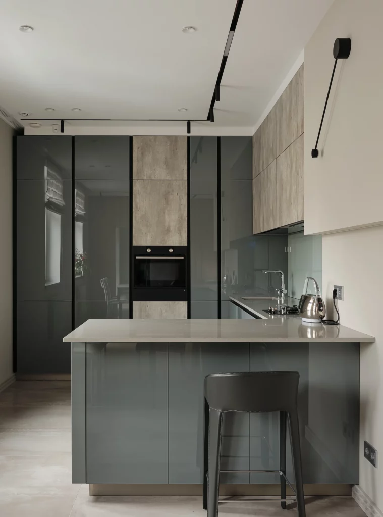
I see the peninsula as the central organizational feature because it adds usable surface area without requiring a separate freestanding island. The cabinetry behind it provides extensive enclosed storage, while the tall units use the full available height. The stool can be tucked underneath the counter when it is not needed, which helps preserve the walkway and keeps the small room visually open.
This is the kind of arrangement I would consider when a compact kitchen needs to provide both preparation space and a casual place to sit. The key is keeping the peninsula proportionate to the room so it adds function without restricting movement. I also like the restrained combination of gray, pale wood, and white because it allows the cabinetry to dominate visually while the room remains light and uncluttered.
Dark Wood Kitchen With Layered Countertop Storage
I immediately notice the strong, sophisticated composition of this compact kitchen, where deep brown cabinetry meets gray stone surfaces and a dramatic dark floor. The cabinetry runs vertically along the back and side walls, while a large window with black horizontal blinds brings in daylight without interrupting the darker palette. A sculptural black-and-chrome light fixture hangs above the work area, and the island combines a pale rectangular block with a darker extended countertop. A few decorative vessels, a small tray, and carefully placed objects sit on the available surfaces without making the kitchen feel cluttered.
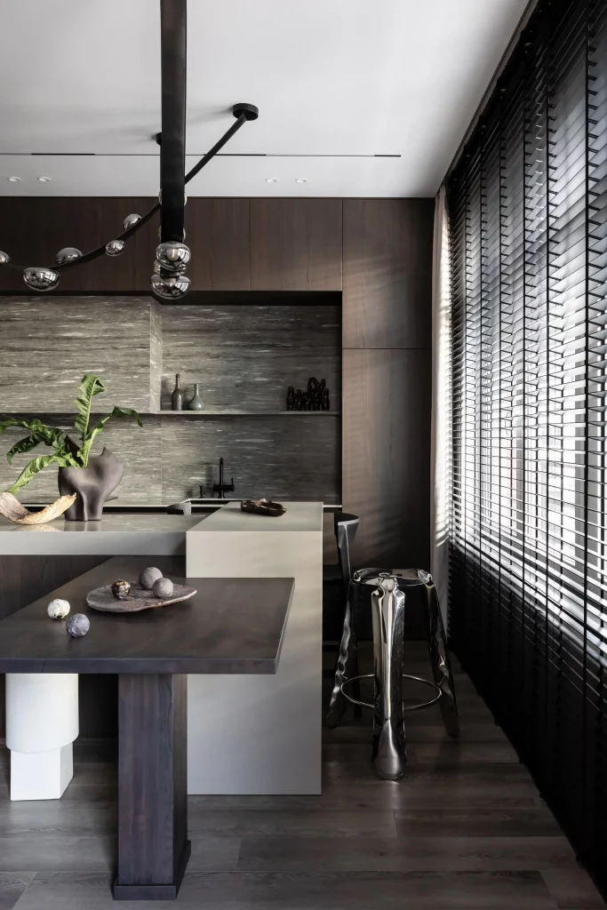
What makes this arrangement particularly useful for a small space is the way the cabinetry uses the walls instead of relying on excessive freestanding storage. I like the combination of closed cabinets above and open horizontal areas around the cooking zone because it keeps frequently used items accessible while allowing the room to retain a clean appearance. The island also performs several roles at once, providing working space, a visual anchor, and seating along the window side.
For my own small-kitchen organization approach, I would take inspiration from the disciplined use of surfaces here. Instead of filling every countertop corner, I would keep only a few objects that genuinely contribute to the room. The dark cabinetry, gray stone, metallic accents, and restrained accessories already provide enough visual interest, so organization becomes part of the aesthetic rather than something that needs to be hidden.
Warm Wood Kitchen With A Streamlined Island
This kitchen takes a much lighter approach, with tall warm-brown cabinetry extending almost from floor to ceiling along the left wall. Pale lower cabinets and a light countertop create contrast, while a rounded island in matching wood adds a practical central workspace. Four slender pendant lights descend above the island, and soft daylight enters through a large window framed with sheer curtains. The herringbone-patterned floor adds subtle texture beneath the otherwise streamlined furniture.
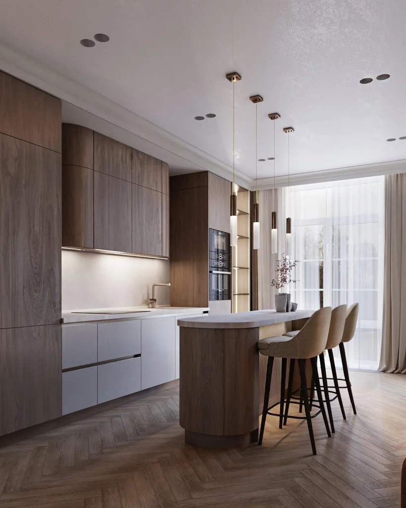
I find the tall cabinetry especially effective in a compact kitchen because it takes advantage of vertical space without adding extra pieces to the floor. The integrated appliances are also positioned within the cabinetry, keeping the overall wall visually orderly. Meanwhile, the island provides additional storage and preparation space without appearing bulky because of its rounded end.
When I look at organization in a kitchen like this, I focus on continuity. Matching cabinet finishes help individual storage zones read as one clean architectural surface, which can make a small room feel less fragmented. I would also keep the island relatively uncluttered, as the uninterrupted countertop is one of the strongest features of this design.
Compact Corner Kitchen With Textured Brown Cabinetry
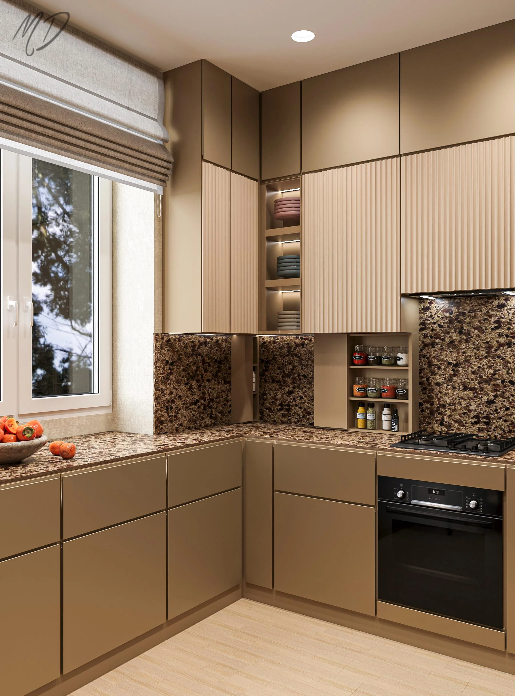
This compact corner kitchen uses a warm brown palette from the cabinetry through to the heavily patterned stone countertop and backsplash. The upper cabinets feature a combination of smooth doors and vertically fluted fronts, with a narrow open shelf section in the center for neatly folded textiles. Beneath them, additional open shelving holds small jars and containers, while the lower cabinets provide uninterrupted closed storage. A window sits directly beside the counter, bringing natural light into the work zone, and the built-in oven and cooktop occupy one side of the L-shaped arrangement.
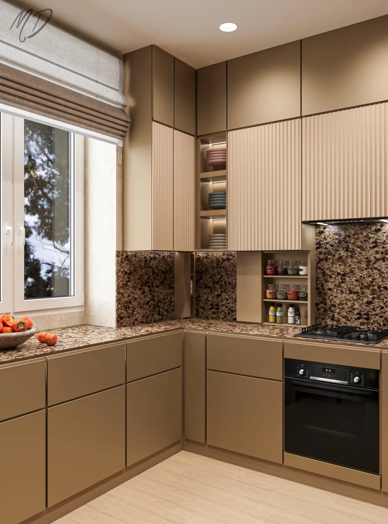
I particularly like how this kitchen separates display from storage. The open shelves are small and purposeful, while most of the kitchen equipment and supplies can remain behind closed fronts. That balance is extremely helpful in a small room because open shelving can quickly look crowded when there is too much of it. The continuous countertop also gives the corner a generous working surface despite the compact footprint.
The vertically ribbed cabinet fronts are another detail I would borrow for a small kitchen because they introduce texture without requiring additional decorative pieces. In my experience, when cabinetry already has a strong finish or pattern, organization can stay simple. A few carefully grouped containers are enough to make the open areas feel intentional rather than busy.
Modern Kitchen Island With Integrated Appliances And Vertical Slats
Here, the kitchen feels spacious because of its restrained palette of white, natural wood, gray, and black. A substantial island occupies the center, finished with dark stone on one side and wood-fronted storage beneath the counter. Tall white cabinetry and integrated ovens line the back wall, while a large range hood becomes a central architectural feature above the cooking area. Behind the island, vertical wood slats add warmth, and a dining area with upholstered chairs sits directly beyond the kitchen.
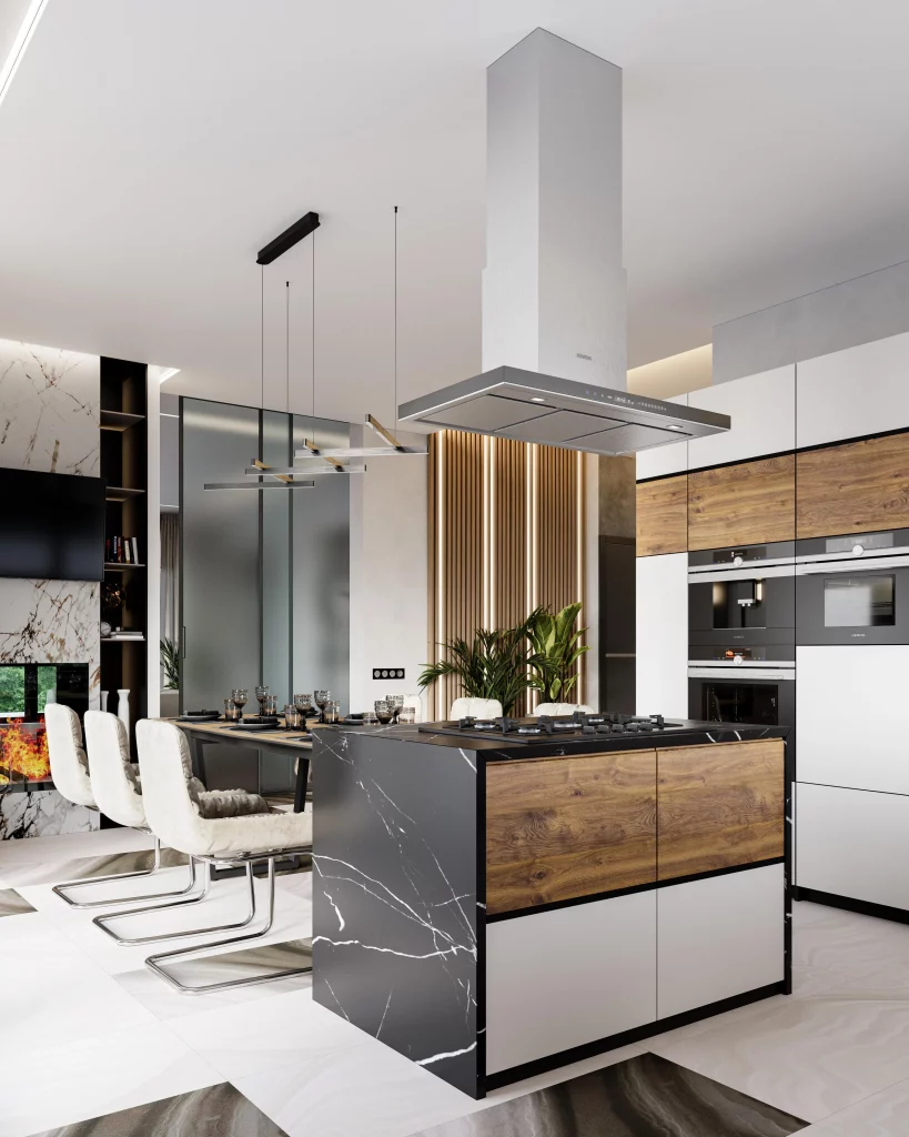
The organization works because almost everything has been incorporated into the architecture. The tall cabinets make use of vertical space, while the island combines preparation space with enclosed storage. I also like the clear separation between the kitchen work zone and the dining area. Even though they occupy the same open space, the arrangement gives each function its own visual identity.
For a small kitchen, I would pay close attention to this kind of built-in approach. Rather than adding numerous storage pieces, I would prioritize cabinetry that reaches upward and an island that performs more than one job. The limited material palette also helps because the room does not feel visually divided into too many competing elements.
Narrow Kitchen With A Greenery-Filled Glass View
This narrow kitchen makes a memorable use of a glass-enclosed area at the far end, where several leafy plants sit against a textured stone wall. The kitchen itself has muted taupe cabinetry, a pale stone countertop, and integrated appliances along the left side. On the right, the island includes a sink and a glass-fronted wine refrigerator beneath the counter. Black-framed glass separates the kitchen from the planted area, creating depth in an otherwise narrow layout.
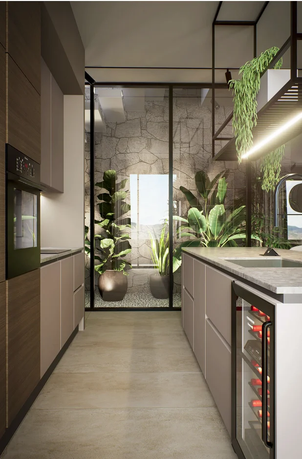
I think the strongest organizational feature here is the clear linear arrangement. The cabinetry and appliances stay close to the walls, leaving a straightforward passage through the center. The island provides additional workspace without blocking the circulation route, while the under-counter refrigerator makes productive use of the lower section that might otherwise remain visually empty.
This is the kind of layout I would study when working with a particularly narrow kitchen. Keeping the floor path open is just as important as adding storage. I would also resist the temptation to fill every available wall with cabinets because the glass partition and open visual connection at the end of this kitchen help create a sense of depth.
Soft Blue Kitchen With A Colorful Dining Nook
This compact kitchen feels playful and airy through its pale blue cabinetry, black countertops, and reflective backsplash made from small rectangular tiles in soft neutral and muted accent shades. Simple brass-toned handles run across the upper cabinets, while black fixtures provide definition around the sink and counter. A round wooden dining table sits beside the kitchen, accompanied by sculptural chairs with rounded backs and blocks of peach, coral, and pink. Large windows bring abundant natural light into the room.
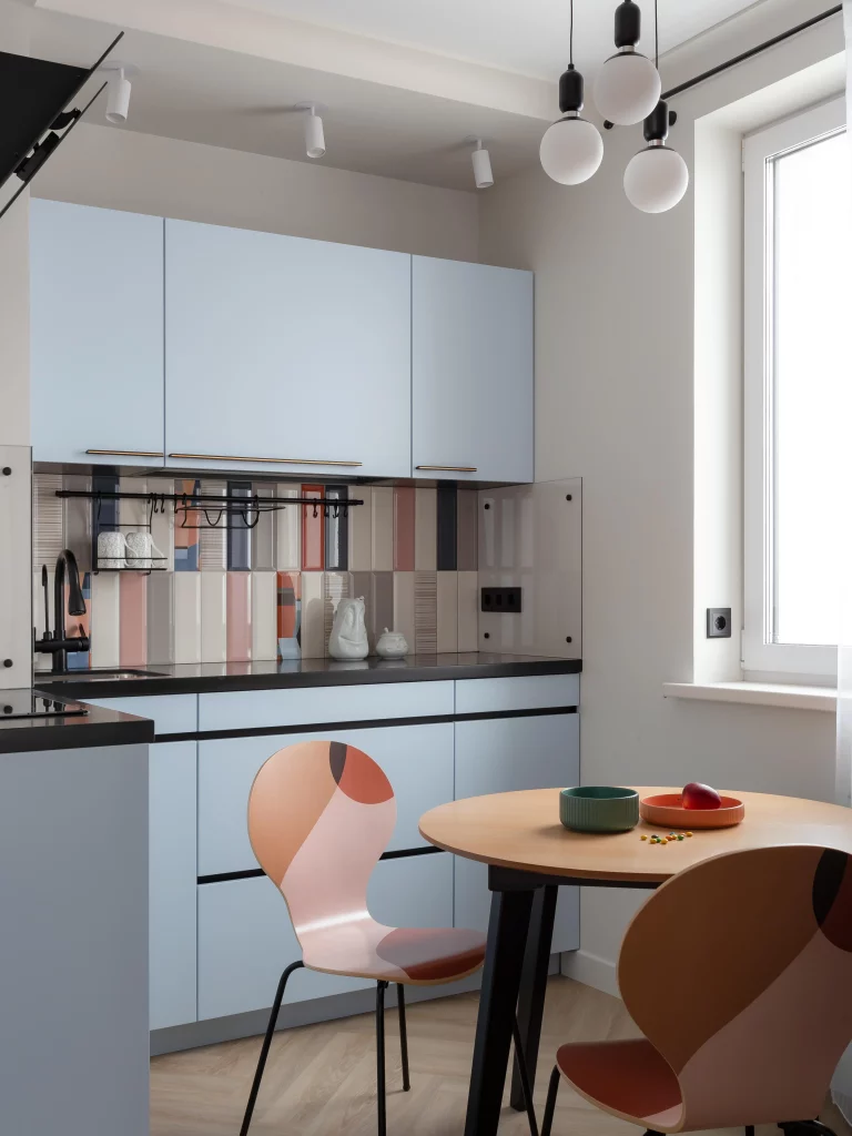
The organization here benefits from a very straightforward cabinet layout. The upper cabinets provide closed storage, while the lower drawers and cupboards create a continuous working zone. Because the backsplash adds visual variety, keeping the cabinetry itself simple prevents the room from becoming overwhelming. The round table also fits naturally into the compact dining area without creating sharp corners that interrupt movement.
I would use this kitchen as a reminder that organization does not have to mean a completely neutral room. The storage remains efficient because the cabinets are visually clean, while personality comes through the backsplash and dining furniture. For me, that is a smart balance: keep the functional elements streamlined and let a few carefully chosen surfaces or furnishings provide character.
Elegant Neutral Kitchen With A Sculptural Island Light
This kitchen uses a soft cream and beige palette throughout the cabinetry, island, walls, and upholstered bar stools. The island has a substantial stone-look countertop and a vertically textured front, while the upper cabinets on the back wall combine smooth fronts with a long fluted section. A large sculptural pendant composed of many small metallic elements hangs over the island, creating the room’s most noticeable decorative feature. Built-in appliances are arranged neatly within the cabinetry, and the light flooring continues the calm, neutral atmosphere.
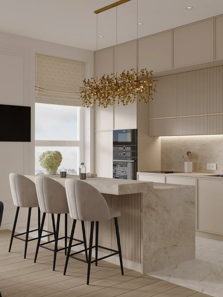
I like how the storage remains almost visually seamless. The cabinets cover a large portion of the walls, yet their pale finish allows them to blend into the room rather than dominating it. The island adds another layer of storage while also functioning as a breakfast or casual dining surface, with three upholstered stools positioned beneath it.
For a small kitchen, I would borrow the principle of letting cabinetry disappear visually. When storage occupies a significant amount of wall space, a restrained color palette can make it feel less imposing. I also think the sculptural light works because the rest of the room is so controlled; one expressive element is enough to give the space personality without adding clutter.
Taupe Kitchen With Illuminated Display Shelving
This kitchen combines taupe cabinetry with a white veined backsplash and countertop, creating a warm but polished setting. Glass-fronted cabinets with internal lighting display a few carefully arranged vessels, while a tall cabinet on the right contains another illuminated open shelving section filled with ceramics, books, and decorative objects. A white island extends into the foreground, where three wooden dining chairs with upholstered seats create a casual eating area. A leafy branch in a glass vase adds a natural accent to the counter.
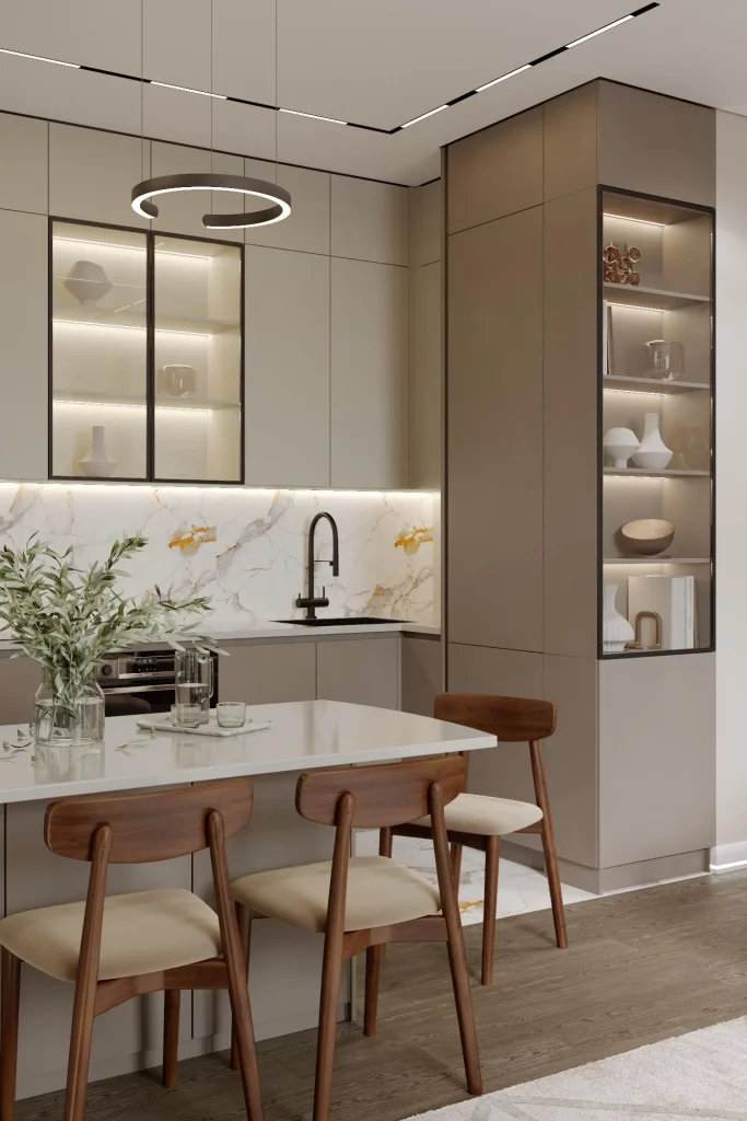
The illuminated shelving is especially useful because it transforms storage into a visual feature. Rather than leaving everything exposed, most of the kitchen remains behind closed cabinet fronts, while selected objects are given dedicated display areas. I find this approach practical for a small kitchen because it establishes a hierarchy: everyday supplies can stay hidden, while a limited number of attractive pieces can remain visible.
If I were organizing a compact kitchen in this style, I would be selective about what earns a place on the illuminated shelves. The image shows how much calmer the room feels when only a few vessels and accessories are displayed. The white countertop also remains relatively clear, which gives the kitchen a sense of breathing room despite the amount of cabinetry.
White And Black Kitchen With Textured Backsplash Storage
This smaller kitchen creates contrast with white lower cabinetry, matte black upper cabinets, and a white backsplash scattered with irregular gray and darker fragments. A slim illuminated strip runs beneath the upper cabinets, brightening the countertop and sink area. Open wooden shelves in one corner hold cups and vessels, while tall white cabinetry on the right integrates the oven. A black range hood anchors the cooking zone, and a white vase filled with dried golden stems sits on a small black side table near the foreground.
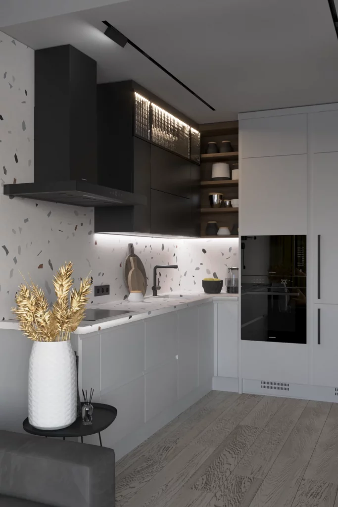
The combination of closed cabinetry and a small amount of open shelving makes sense for organization. The tall cabinet gives the kitchen additional vertical storage, while the open shelves provide easy access to selected items without requiring another large cabinet section. Under-cabinet lighting is also practical because it directly illuminates the work surface rather than relying only on general ceiling lighting.
What I take from this design is the importance of keeping visual weight balanced. The dark upper cabinetry is substantial, but the white lower cabinets and pale floor counteract it. I would use the same principle in a compact kitchen by pairing visually heavier storage with lighter surfaces elsewhere, allowing the room to feel structured without becoming closed in.
Minimal Blue And White Kitchen With Full-Length Storage
The final kitchen takes a wonderfully simple approach, using deep blue lower cabinets and matching blue cabinetry on the right side against a pale gray backsplash and white upper storage. The long L-shaped counter contains a sink, cooktop, and a few neatly arranged everyday items, while a large white fluted cabinet section occupies the wall above the main work surface. Black track lighting follows the ceiling line, and warm wood flooring softens the cool cabinetry.
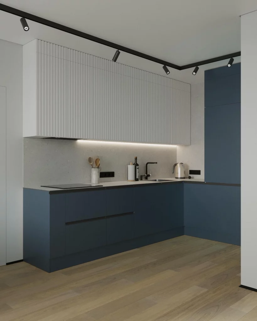
I like the efficiency of this arrangement because there is very little unnecessary visual interruption. The lower cabinets provide a continuous band of storage, while the tall blue cabinet at the right makes use of vertical space. The pale backsplash creates a clear working surface between the lower and upper storage, and the limited number of countertop objects keeps the kitchen looking exceptionally tidy.
For me, this is a strong example of how restraint can make a small kitchen feel larger. I would focus first on creating uninterrupted cabinet runs and keeping frequently used tools grouped around the work zones, as shown here. The blue cabinetry then becomes the defining feature rather than competing with an excess of decoration, proving that a well-organized kitchen can be both practical and visually distinctive.
Dark Corner Kitchen With Open Shelving And Warm Wood Accents
I see a compact L-shaped kitchen wrapped in deep charcoal-brown cabinetry, with a wood countertop running along both walls. A built-in microwave sits within the upper cabinetry, while the lower cabinets keep the main work area visually uninterrupted. The backsplash has a dark stone-like finish, and a narrow open shelf on the back wall provides space for small containers, bottles, white vessels, and a simple green decorative arrangement. Track lighting follows the ceiling, while concealed illumination beneath the upper cabinets and along the shelf adds a warm glow. The wood flooring, wood countertop, and tan upholstered dining chairs soften the darker palette.
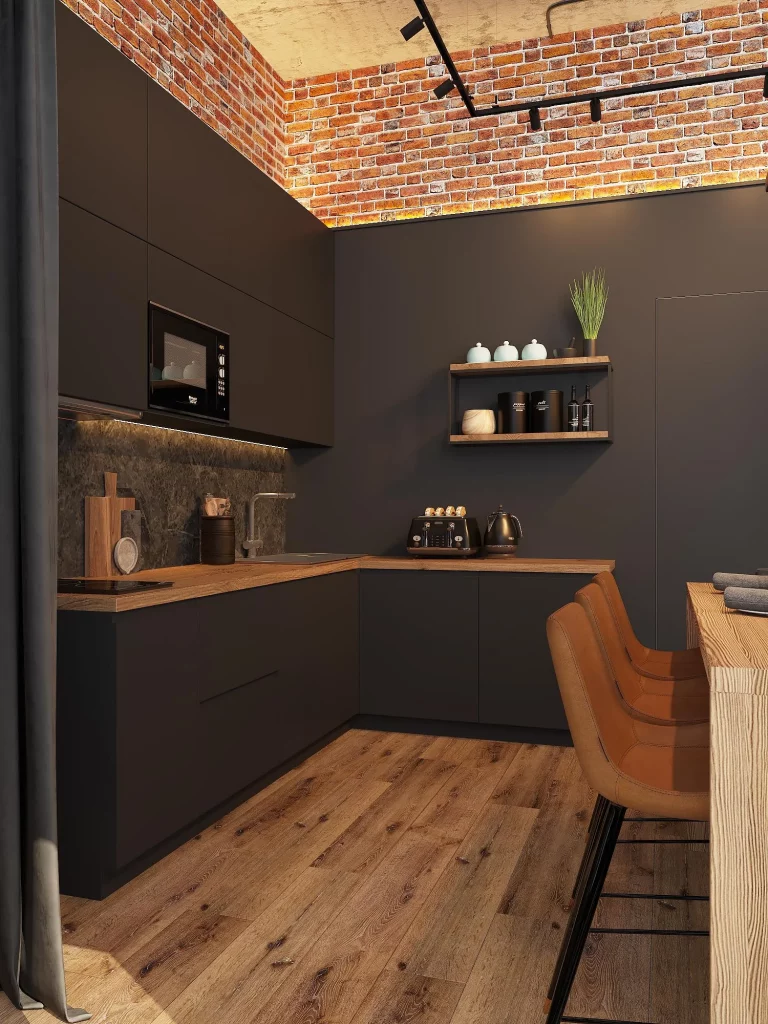
For me, the strongest organization idea here is the balance between concealed and visible storage. Most everyday kitchen clutter can disappear behind the uninterrupted cabinet fronts, while the open shelf provides a small designated area for items worth displaying. The L-shaped counter also makes good use of the corner without requiring a large island, and the integrated microwave prevents another appliance from occupying valuable countertop space.
I would use this approach when working with a small kitchen that needs to feel visually calm. Keeping the majority of storage behind matching cabinet fronts creates a clean architectural effect, while one carefully selected open shelf adds accessibility and personality. I also like the way the countertop extends toward the dining area, creating a natural connection between cooking and eating without making the kitchen feel crowded.
Warm Taupe Kitchen With A Compact Dining Counter
This kitchen uses a soft taupe palette across the upper cabinetry and combines it with pale cabinetry at the left side. The corner counter has a light stone finish and a textured backsplash, with a built-in oven positioned vertically to save floor and counter space. A narrow peninsula extends into the adjoining area, supported by a fluted white base, and two round stools tuck neatly underneath. A glass-fronted partition appears at the right, helping separate the kitchen from the adjacent space without making the room feel closed. A geometric black ceiling detail provides a crisp architectural contrast.
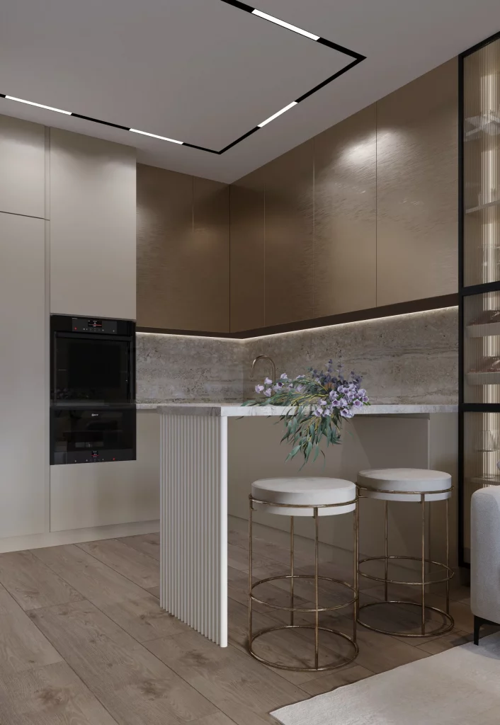
The compact peninsula is the organizational feature I notice first because it serves more than one purpose. It provides additional counter space while also creating a small place for two people to sit. Keeping the stools underneath when they are not in use preserves the walking area, which is particularly valuable in a small footprint. The tall appliance column also makes efficient use of vertical space instead of spreading appliances across the room.
I would take the same vertical approach in a smaller kitchen where floor area is limited. Tall cabinetry and built-in appliances can concentrate storage and equipment into one zone, leaving the main counter clearer for preparation. The restrained color palette also helps because there are fewer visual interruptions, allowing the compact layout to appear more cohesive.
Minimal Beige Corner Kitchen With A Built-In Dining Table
Here, the kitchen is arranged in a precise corner configuration with tall beige cabinetry on the left and pale cabinetry continuing around the back wall. The counters are finished in a white marble-look surface with delicate veining, and a matching backsplash runs beneath the upper cabinets. Under-cabinet lighting traces the work surface, while a built-in coffee machine and oven are incorporated into the cabinetry. A wood dining table projects from the kitchen area and is paired with upholstered cream chairs. Above it, an unusual curved pendant fixture becomes the room’s main decorative statement.
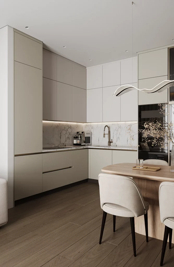
I like how little countertop space is sacrificed to visual clutter. The coffee machine is integrated into the cabinetry, the sink remains centered within the corner work zone, and the upper cabinets provide continuous closed storage. The dining table is also positioned directly beside the kitchen rather than requiring a separate dining zone, which makes the overall footprint work harder without introducing unnecessary furniture.
For a small kitchen, I would pay close attention to this kind of visual continuity. Matching cabinet tones across multiple walls can make separate storage sections read as one larger composition. I also find that connecting a dining surface directly to the kitchen is a useful solution when there is not enough room for a freestanding island and separate table.
Turquoise Kitchen With A Spacious Work Island
This interior takes a completely different direction with turquoise walls and matching cabinetry surrounding a large white island. The island has a ribbed white base and a smooth pale countertop, with three upholstered dining chairs lined along one side. The kitchen cabinetry combines turquoise and warm beige sections, while black built-in appliances create contrast. The backsplash is made from small rectangular tiles in soft blue and neutral tones. Three decorative pendant lights hang above the island, and a light-colored sofa occupies the foreground, showing that the kitchen forms part of a larger living area.
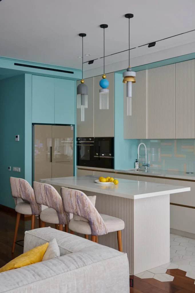
The island is doing several jobs at once. It creates a generous preparation surface, provides seating for three, and visually separates the kitchen from the living area without a wall. I also like the use of vertical cabinetry around the perimeter because it keeps many functions against the walls and leaves the center available for everyday activity.
In a compact open-plan home, I would consider an island like this only when the circulation around it remains comfortable. When the proportions allow it, combining food preparation and dining into one central element can eliminate the need for additional furniture. The consistent ribbed treatment on the island also adds texture without requiring extra objects to organize.
Terracotta Kitchen With A Long Shared Dining Surface
This kitchen is framed by a strong terracotta-colored cabinetry and backsplash composition, with black cabinetry at both sides and a substantial wood table extending across the foreground. A black island-like block sits between the kitchen and dining area, while two black stools fit beneath its overhang. The cooking area includes a microwave and oven stacked vertically on the left, a sink toward the right, and a compact black appliance positioned near the center. A long linear light fixture hangs above the kitchen, and a curved illuminated element crosses the upper portion of the room.
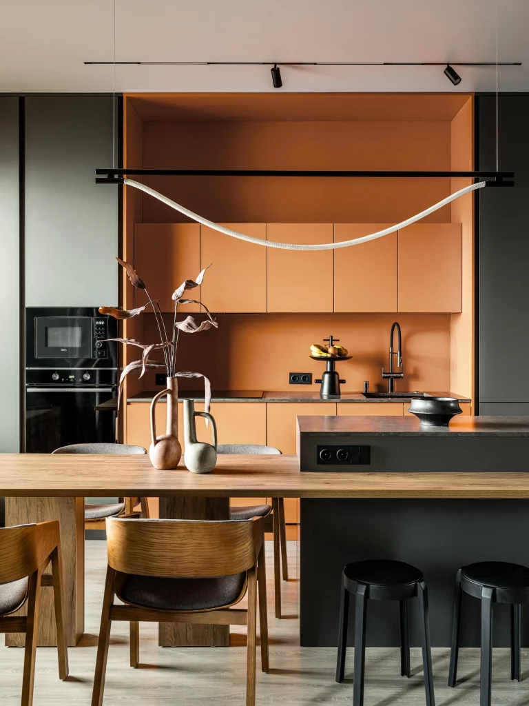
The organization works because the appliances and work zones are concentrated along the back wall, leaving the large table to function as the main social and dining surface. The tall appliance arrangement is especially efficient, since the microwave and oven occupy one vertical section rather than taking up separate areas. The dark island also provides another usable surface without visually competing with the long table.
I would borrow the idea of separating work and gathering zones when planning a narrow kitchen. Keeping cooking equipment against one wall can make the central area more flexible, particularly when the room also needs to accommodate dining. The limited number of finishes helps the space feel intentional despite the strong terracotta color.
Matte Black Kitchen With Layered Under-Cabinet Lighting
This kitchen features almost entirely matte black cabinetry and a large black island, contrasted by a warm wood-toned backsplash and wood flooring. The upper cabinets run in a long horizontal line, while the lower cabinets continue the same dark finish. Warm illumination runs beneath the upper cabinets and along the base of the cabinetry, creating a glowing outline around the work areas. The island contains a cooking surface and provides additional counter space. Beyond it, a dining area is visible with sculptural pendant lighting and vertical wood slats adding another layer of texture.
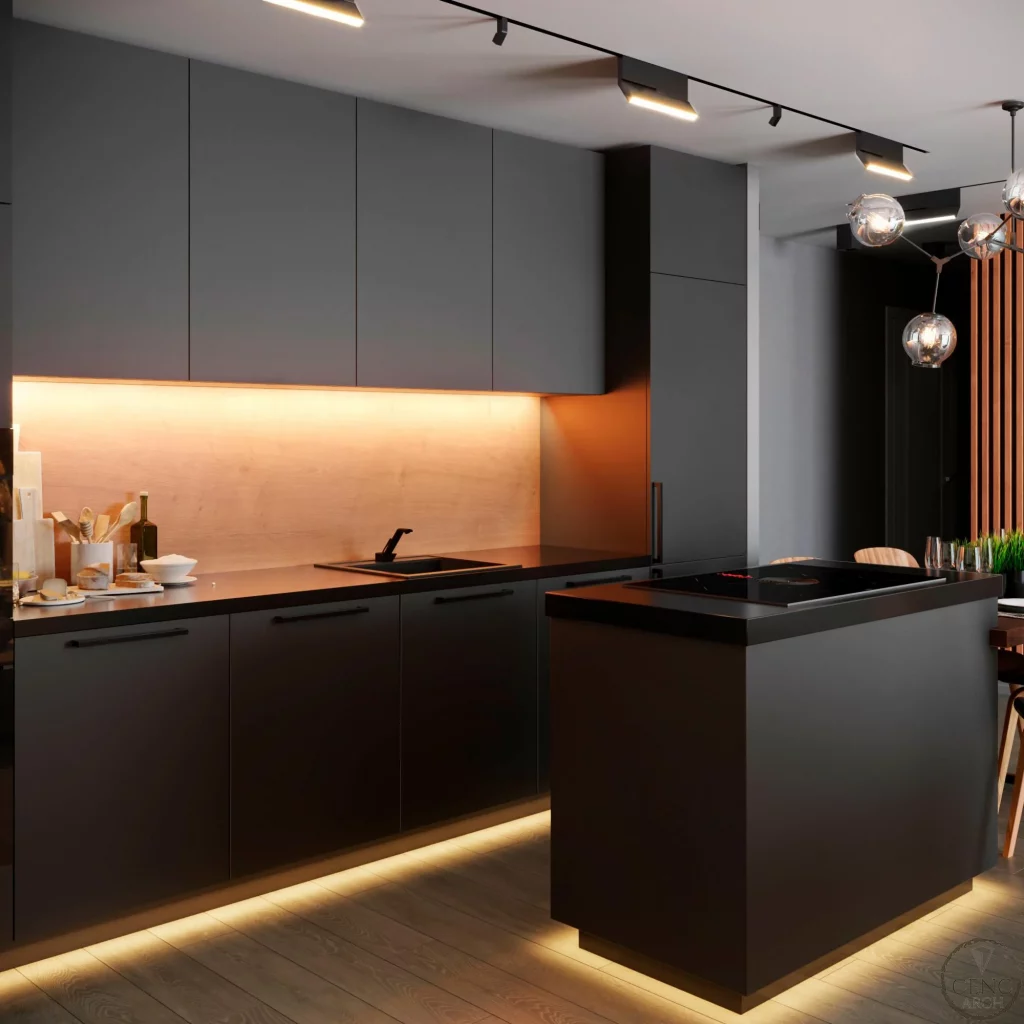
I find the lighting especially useful from an organizational perspective because it clearly defines the working areas without adding physical objects. The long counter offers a generous preparation zone, while the island concentrates another major task surface in the center. The extensive closed cabinetry is also ideal for keeping appliances, cookware, and supplies out of sight, which is valuable when a small kitchen is part of an open living space.
This is a good reminder that organization is not only about adding storage. I would also think about how lighting makes storage and work surfaces easier to use. Under-cabinet illumination can make a compact counter more functional in the evening, while concealed base lighting can visually lift dark cabinetry and give the room a more spacious appearance.
White Kitchen With Green Cabinetry And Patterned Backsplash
This kitchen combines crisp white upper cabinetry with deep green lower cabinets and a decorative black-and-white patterned backsplash. A built-in oven is integrated into the lower cabinetry, while a round dining table sits directly in front of the kitchen and is surrounded by dark upholstered chairs. The upper cabinets provide substantial closed storage, and the backsplash occupies the entire visible work area behind the counter. Two pale pendant fixtures hang above the dining table, while a black rectangular screen is integrated into the adjoining white wall.
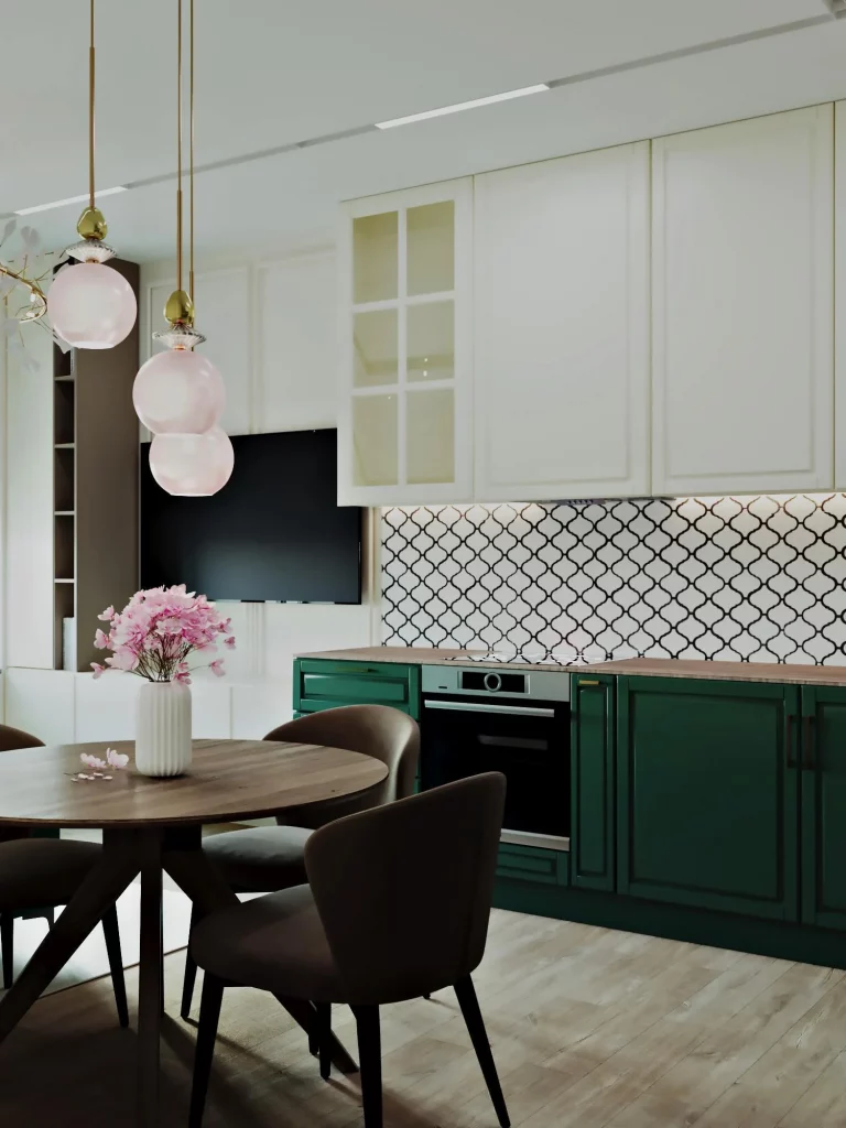
The layout makes good use of the relationship between the kitchen and dining area. The dining table is close enough to the work surface to be practical but does not occupy the main preparation zone. Meanwhile, the lower green cabinets create a strong visual base, while the white upper cabinets keep the upper half of the room feeling light and orderly.
If I were adapting this idea to a small kitchen, I would keep the storage strategy simple and let one backsplash pattern provide the visual interest. Closed cabinets are particularly useful here because the patterned backsplash already creates plenty of detail. Keeping counters relatively open allows the cabinet color and backsplash to remain the focus without making the room feel overloaded.
White And Marble Kitchen With Framed Architectural Storage
This kitchen is defined by soft white and beige cabinetry surrounded by a dramatic marble-look surface that frames the entire kitchen opening. Matching material appears across the backsplash, side columns, floor area, and small counter extension with bar seating. The cabinetry uses flat, handleless fronts for a particularly seamless appearance. Two stacked built-in ovens occupy a tall cabinet at the right, while the sink sits beneath the upper storage. A wood-toned floor extends into the surrounding space, creating a subtle transition between the kitchen and adjoining room.
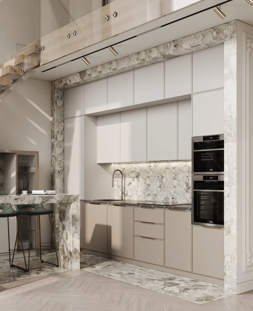
The organization here is very disciplined. Tall storage surrounds the main work zone, the ovens are stacked vertically, and the countertop remains largely free of unnecessary objects. I especially like the way the material frame visually defines the kitchen without adding a separate partition. The small bar extension also offers a useful secondary surface while taking up very little additional floor area.
For me, this is a strong example of how built-in storage can make a small kitchen look more substantial. I would focus on taking cabinetry as high and as continuously as the room allows, particularly when there is limited floor space. Handleless fronts can also reduce visual noise, making a wall of storage read more like a clean architectural surface.
Soft White Kitchen With Pink Ribbed Accent Wall
This kitchen uses white cabinetry, a pale countertop, and a soft pink ribbed wall treatment above the work area. Black built-in appliances and a glossy black refrigerator create contrast on the right side. The dining area is positioned directly in front of the kitchen, with a white rectangular table, four upholstered chairs, and several large circular pendant fixtures suspended overhead. The floor combines gray stone-like tiles around the kitchen with wood flooring toward the adjacent area. A neutral decorative arrangement sits at the center of the dining table.
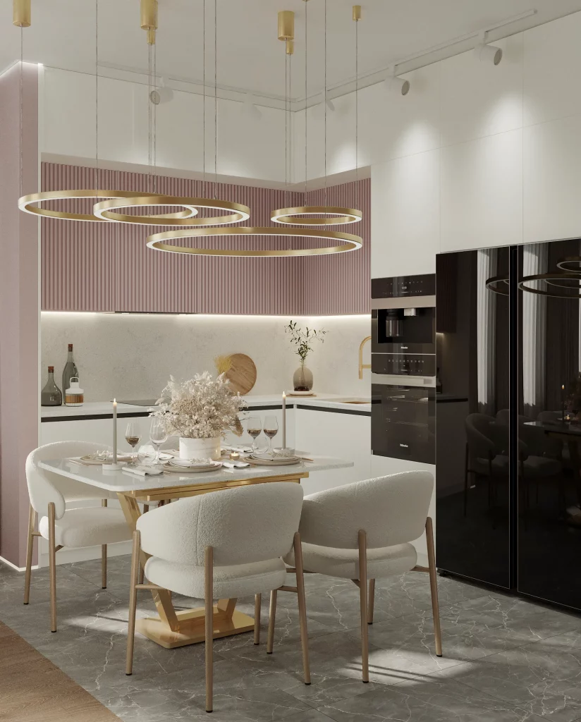
The dining table is a particularly effective use of space because it sits directly in front of the kitchen instead of requiring another separate room. The long cabinetry wall keeps storage concentrated around the perimeter, while the black appliance column provides a clear vertical zone. I also like how the ribbed wall adds texture without reducing the usable work surface or requiring additional decorative objects.
I would use a similar strategy in an open kitchen where the dining area needs to feel connected but still distinct. A change in floor material can help establish separate zones without building a wall, while consistent cabinetry keeps the kitchen visually unified. The generous closed storage also means the room can remain composed even when the dining table is being used every day.
Sage Green Kitchen With Tall Cabinet Storage
The final kitchen features a muted sage green cabinetry system with framed doors, brass-toned handles, and tall storage reaching close to the ceiling. A large refrigerator and stacked built-in appliances occupy one side, while the counter and cooktop continue along the adjacent wall. The countertop is white, and the backsplash combines pale rectangular tiles with warm beige tones. White upper cabinetry appears above the cooking area, while a green upholstered dining chair is visible beside a dark table.
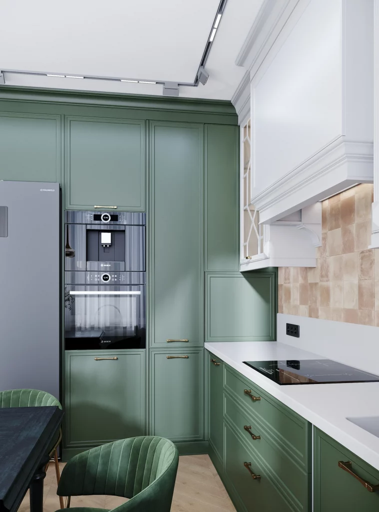
I think the tall cabinetry is the standout organizational idea because it makes excellent use of vertical space. The refrigerator and stacked appliances are grouped into one tall section, while the surrounding cabinets provide additional storage without spreading the kitchen footprint outward. The drawers beneath the counter also offer practical storage close to the cooking area, where frequently used items can remain accessible.
For a small kitchen, I would take particular inspiration from this arrangement. Rather than trying to add more floor-standing storage, I would first look upward and consider how much of the wall can be used efficiently. The restrained combination of green, white, beige, and brass also shows that practical storage does not have to look purely utilitarian; thoughtful cabinet detailing can make even a compact kitchen feel carefully designed.
These ten kitchens show me that small-space organization can take many forms, but the most successful solutions usually share one quality: they make every part of the room work harder. Tall cabinets, integrated appliances, multifunctional counters, compact dining areas, concealed storage, and carefully controlled open shelving can all help a small kitchen feel more capable without making it feel crowded. I hope these interiors gave you a few ideas worth borrowing for your own space. Leave a comment and share which kitchen organization idea or room you liked most.
A small kitchen doesn’t have to feel cramped or chaotic. I’ve found that the best results come from using every inch thoughtfully while keeping the surfaces as clear as possible. With smart storage, practical organization, and a few space-saving details, even a compact kitchen can feel comfortable and easy to navigate. The goal is not to fit in more things, but to make the things you use every day work better for you. A well-organized small kitchen can be just as stylish, functional, and enjoyable as a much larger one.