
Small kitchens can be surprisingly functional when every cabinet, surface, and corner is planned with intention. In this collection of Modern Kitchen Organization Ideas for Small Spaces, I’m looking at practical layouts that make compact kitchens feel more organized without sacrificing style. From streamlined cabinetry and clever built-in storage to movable tables and carefully arranged open shelving, each space offers a useful lesson in making the most of limited room. I especially love how different colors, finishes, and furniture arrangements can create distinct personalities while keeping everyday essentials within easy reach. Whether you are working with a narrow kitchen, a compact apartment layout, or simply want to reduce visual clutter, these interiors provide plenty of inspiration. Let’s explore each design and see which smart organization ideas could work beautifully in your own small kitchen.
Compact Kitchen With a Mobile Dining Island
I see a compact kitchen organized around a large white rectangular table that doubles as a practical central work or dining surface. The table has an open lower frame and wheels, making it visually lighter than a solid island while allowing it to be moved when necessary. Three stools with dark upholstered seats fit underneath, while a white open shelving unit along the left side provides several levels for displaying glassware, dishes, decorative vessels, and other kitchen pieces. Across the room, deep red paneled cabinets provide substantial closed storage, including a glass-front cabinet for displaying glassware. A cream subway-tile backsplash with a decorative patterned strip adds detail without overwhelming the compact layout.
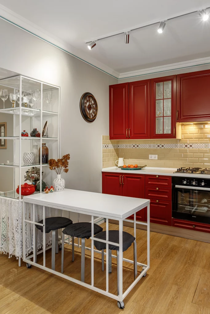
For me, the strongest organizational idea here is the combination of closed and open storage. The red cabinetry hides everyday kitchen necessities, while the open shelving keeps frequently used or attractive pieces visible and easy to reach. I also like the way the wheeled table creates flexibility. In a small kitchen, having a large central surface that can potentially be repositioned can make the room much more adaptable for cooking, dining, or simply creating more floor space.
When I look at a layout like this, I would focus on giving every visible storage zone a clear purpose. Glassware can stay together on the open shelves, while less decorative items can remain behind the paneled cabinet doors. I also find that keeping the central surface relatively uncluttered makes a small kitchen feel more orderly. The restrained tabletop styling shown here demonstrates how organization can actually become part of the room’s visual character.
Deep Blue Cabinetry With a Dedicated Dining Corner
This kitchen uses deep blue cabinetry to make a strong visual statement while keeping the working area concentrated along the right side. In front of it, a small round white dining table is paired with two upholstered chairs in a muted dusty-pink tone. A tall curtain hangs beside the window, and the floor features a striking geometric black-and-white pattern. The cabinetry rises vertically and incorporates multiple drawers and doors, while a built-in appliance is integrated into the cabinet wall.
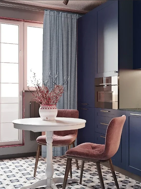
I think the compact dining arrangement works particularly well because the round table avoids sharp corners and occupies only a defined portion of the room. Instead of adding a large island or bulky dining set, the design gives the kitchen a simple eating area while leaving the cabinetry responsible for most of the storage. The tall cabinet composition also makes good use of vertical wall space, which is one of the most valuable resources in a small kitchen.
From my perspective, this is a good reminder that organization does not require every surface to be filled with storage accessories. The clean cabinet fronts create visual order, while the small table provides a useful everyday zone without competing with the kitchen itself. If I were recreating the feeling of this room, I would preserve the simple furniture arrangement and let the cabinetry remain the dominant organizational feature.
Wood Cabinetry Framing a Window-Side Breakfast Nook
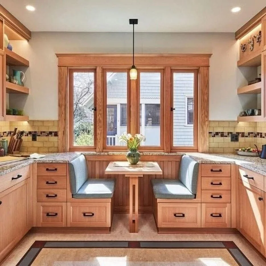
Here I see a warm kitchen built around extensive wood cabinetry and a large central window. Two built-in upholstered seats face one another beneath the window, with a very small table positioned between them. Storage surrounds the seating area, with drawers and cabinets integrated on both sides. Open shelving appears at the upper left and right, providing accessible display space for small kitchen items and dishes. The backsplash is made from warm-toned tile with a narrow decorative border, while a small pendant light hangs directly over the table.
I especially like how the seating is incorporated into the kitchen rather than treated as a separate furniture zone. The cabinetry does not stop at the work areas; it frames the breakfast nook and uses the available wall space efficiently. The drawers beneath and beside the seating provide a practical organizational opportunity, while the open shelves give frequently used or decorative objects a dedicated place instead of allowing them to spread across the counters.
For me, this is one of the clearest examples of making a small kitchen perform more than one function. The compact table creates a place to sit without requiring a full-size dining area, and the surrounding cabinetry maintains a strong sense of order. If space is limited, I would take inspiration from this approach by considering whether a window-side corner could accommodate built-in seating and storage at the same time.
Light Cabinetry With Patterned Window Shades
This kitchen has a pale, highly detailed appearance, with light-colored paneled cabinetry extending along the left wall and a small dining table positioned near the windows. The upper cabinetry includes decorative detailing, while the counters and backsplash continue the light palette. Patterned Roman shades cover the windows and introduce an ornate motif, and a large chandelier hangs above the dining area. The glossy floor reflects the light and includes a decorative patterned section beneath the table.
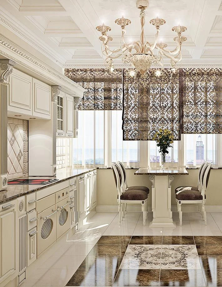
The organization here comes primarily from the extensive cabinetry along the kitchen wall. Because the cabinets occupy much of the available vertical space, the countertops can remain relatively open. I also notice that the dining area is compact and clearly separated from the main preparation zone, allowing the kitchen to include seating without requiring a large footprint.
I would use this image as inspiration for anyone who wants a small kitchen to feel visually structured rather than crowded. The repeated light cabinetry creates continuity, while the patterned shades and floor provide visual interest without adding more furniture. In my experience, this kind of controlled repetition can make a room with many decorative details feel more cohesive.
Deep Blue Storage With Warm Countertops and a Compact Bar
This compact kitchen combines deep blue paneled cabinets with warm wood countertops and a small raised eating surface extending from the main work area. The upper cabinets include a glass-front section, while a microwave is integrated directly into the cabinetry. White square tiles cover the backsplash, and exposed brick appears along the right side. Two stools fit beneath the projecting wood surface, while two decorative hanging lights illuminate the compact space.
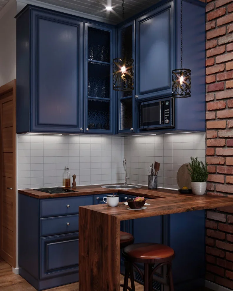
I find the built-in appliance placement especially useful in a small kitchen because it keeps the microwave from consuming valuable counter space. The cabinetry also takes advantage of the wall height, while the wood countertop creates both a working surface and a casual seating area. Instead of adding a separate table, the design gives one compact extension several functions.
This is the kind of organization I would consider when floor space is tight. A small peninsula or projecting counter can provide a place for quick meals while preserving the main circulation area. I also like the balance between the closed cabinets and the single glass-front section because it keeps most belongings visually contained while still giving the room a little openness.
Window-Side Sink With Open Shelving
This kitchen places a large sink directly beneath a wide window, bringing natural light to one of the main working areas. Deep blue lower and upper cabinets contrast with a white countertop, while three dark open shelves are installed against a small-format gray patterned backsplash. The shelves hold bowls, vases, and small decorative pieces. Brass-toned cabinet pulls add a subtle accent, and a gray Roman shade covers the upper part of the window.
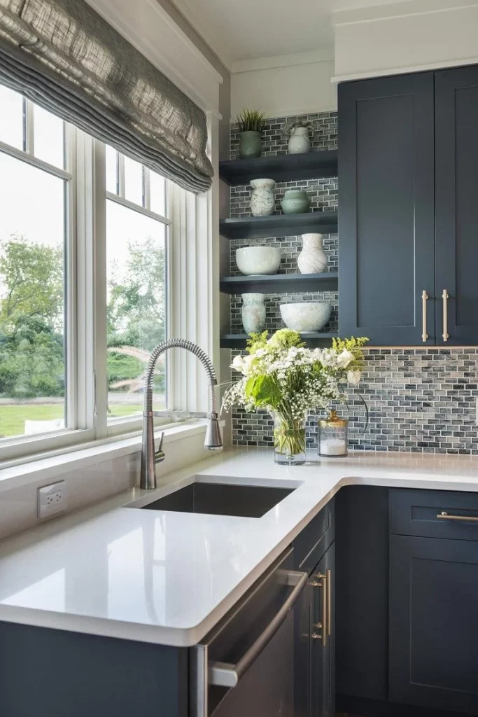
The open shelves are the organization feature I notice first because they turn an otherwise narrow wall section into useful vertical storage. Items can be reached without opening a cabinet, and the arrangement gives the room a sense of depth. At the same time, the closed cabinetry below and to the right keeps larger quantities of kitchen items concealed. The generous white countertop also provides an uncluttered working zone around the sink.
I would be careful with open shelving in a small kitchen, but this image shows how effective it can be when the contents are deliberately arranged. Rather than filling every shelf, the displayed pieces have enough breathing room to remain visually readable. For me, that is the key lesson: open storage works best when it is organized almost like a display rather than treated as a place to put everything.
Streamlined White Kitchen With Integrated Storage
This kitchen takes a very clean approach, using simple white cabinet fronts across the upper and lower sections. A black range hood and cooktop create a strong contrast in the center, while the oven is positioned directly below. A narrow open storage section beside the oven holds several bottles and other items, providing an accessible alternative to completely closed cabinetry. Under-cabinet lighting runs beneath the upper units, illuminating the pale countertop and backsplash.
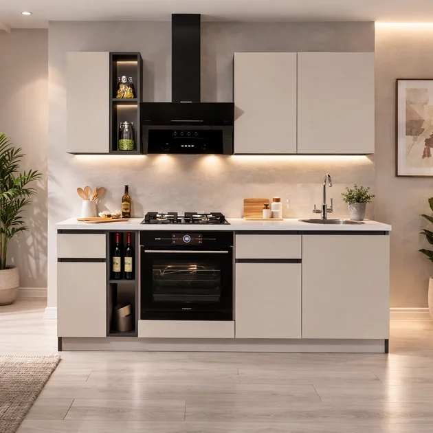
I like how efficiently the appliances and storage are arranged along one continuous wall. The cabinetry keeps the visual lines simple, while the narrow open compartment makes use of a small section that might otherwise become dead space. The countertops remain mostly clear, and the built-in oven avoids taking up additional floor area. Even the lighting contributes to the feeling of organization by clearly illuminating the working surface.
When I think about organizing a small kitchen, this is the kind of layout I would study closely. A compact kitchen benefits when appliances, cabinets, and work surfaces are planned as one continuous composition instead of as separate pieces. I also appreciate the idea of reserving a narrow open section for items that are used regularly while keeping the majority of storage behind closed doors.
White Kitchen With Wood Framing and a Patterned Backsplash
This L-shaped kitchen uses white cabinetry with warm wood trim and matching wood countertops. The upper cabinets are simple and flat-fronted, while the backsplash is the main decorative feature, covered with a repeating black-and-white geometric pattern. A black sink sits beneath the window, and a black faucet provides contrast. Small containers, a bowl of fruit, and a framed piece rest on the counter, while the large windows keep the workspace naturally bright.

The organization feels effective because most of the storage is hidden inside the white cabinetry, leaving the countertops available for a small number of practical and decorative items. The L-shaped configuration makes use of two walls while keeping the center of the room open. I also like the wood countertop because it visually defines the working surfaces without requiring additional furniture or storage pieces.
For me, this image demonstrates why small kitchens often benefit from choosing one strong decorative surface instead of adding many separate accents. The patterned backsplash provides personality, while the cabinetry remains visually quiet and organized. If I were applying this idea to another compact kitchen, I would keep the counter display similarly restrained so the pattern remains the focal point rather than competing with clutter.
White Compact Kitchen With a Hidden Appliance Zone
This small kitchen uses white cabinetry and a warm wood countertop to create a bright, streamlined workspace. A black induction cooktop sits directly on the counter, with a compact appliance mounted above it. The lower cabinets provide closed storage, while drawers continue along the right side. A white decorative partition with an organic cutout pattern separates the kitchen from the adjacent area without completely closing it off. A small kettle, glassware, and a bowl of fruit are grouped together on the counter near the sink.
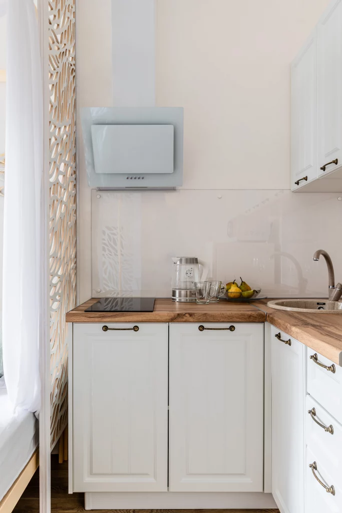
I find the compact appliance arrangement particularly useful because the kitchen does not need a large cooking zone to remain functional. The clean white cabinetry keeps the room visually calm, while the wood countertop adds definition and warmth. The decorative partition also makes the boundary between spaces clear without taking up the visual weight of a full wall.
My favorite organizational lesson here is the importance of keeping the countertop purposeful. Only a few objects are visible, and they are grouped into small functional zones. In a compact kitchen, I find that this approach makes daily tasks easier because the eye can immediately understand where the main activities happen. The simpler the visible surface, the more spacious the entire kitchen tends to feel.
U-Shaped White Kitchen With Efficient Wall-to-Wall Storage
The final kitchen uses a compact U-shaped arrangement with white cabinetry extending along both sides and across the wall beneath the window. The counters are light, and the cabinetry has simple, clean fronts. Built-in black ovens are stacked on the right, while a sink and cooktop occupy the opposite sides of the room. A small black clock and a calendar hang on the left wall, and a few containers sit along the counter beneath the window. The central walkway remains open and unobstructed.
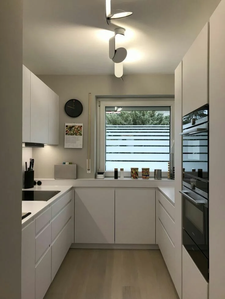
For me, the biggest organizational advantage is the way the U-shaped layout keeps storage and appliances around the perimeter. That leaves the middle of the kitchen clear for movement while placing the main working areas within a compact footprint. The tall appliance column on the right also uses vertical space efficiently instead of spreading appliances across the room. The simple white cabinetry helps all of these elements read as one cohesive composition.
I would take this image as a practical example of why a small kitchen does not necessarily need more furniture to become more functional. Careful placement of cabinets, appliances, and counters can provide plenty of working capacity while protecting the central floor area. I especially like the uncluttered window wall because it keeps the room feeling open and gives the compact layout a natural visual endpoint.
Black-Framed Open Shelving With Warm Wood Storage
The first kitchen combines black-framed open shelving with warm wood cabinet fronts and a dark countertop, creating a compact but highly organized composition. I immediately notice how the upper shelves provide dedicated spaces for plates, cups, jars, and a few decorative kitchen items, while the lower cabinets keep larger essentials concealed. A stainless refrigerator sits at one side, and the tiled backsplash provides a clean backdrop for the shelving and hanging utensils.
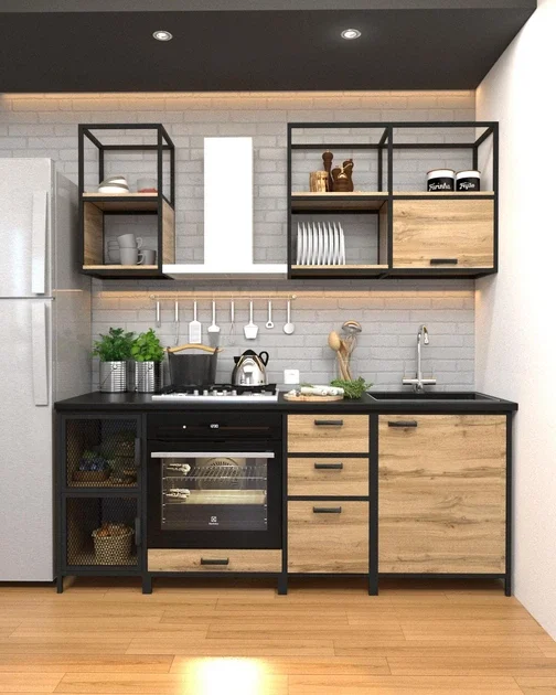
I think this arrangement works particularly well in a small kitchen because the open shelving makes frequently used items visible and accessible instead of hiding everything behind solid doors. The combination of open and closed storage also prevents the room from feeling completely enclosed by cabinetry. The lower drawers and cupboards provide substantial concealed storage, while the small open section beside the oven creates another useful place for baskets and kitchen supplies.
When I organize a compact kitchen, I like to reserve open shelving for the things I reach for most often. Here, plates, cups, and selected containers are positioned at convenient heights, while the countertop remains relatively uncluttered. The black framing also gives the storage a defined architectural appearance, making a practical solution feel intentional rather than improvised.
White Kitchen With a Long Breakfast Counter
This bright kitchen uses white cabinetry, a pale countertop, and a long wood-look counter that extends beneath a large window. I like how the counter doubles as both workspace and a casual dining area, with three stools tucked underneath it. Slim pendant lights hang above the seating area, while white cabinets, integrated appliances, and a marble-look backsplash maintain a clean and streamlined appearance.
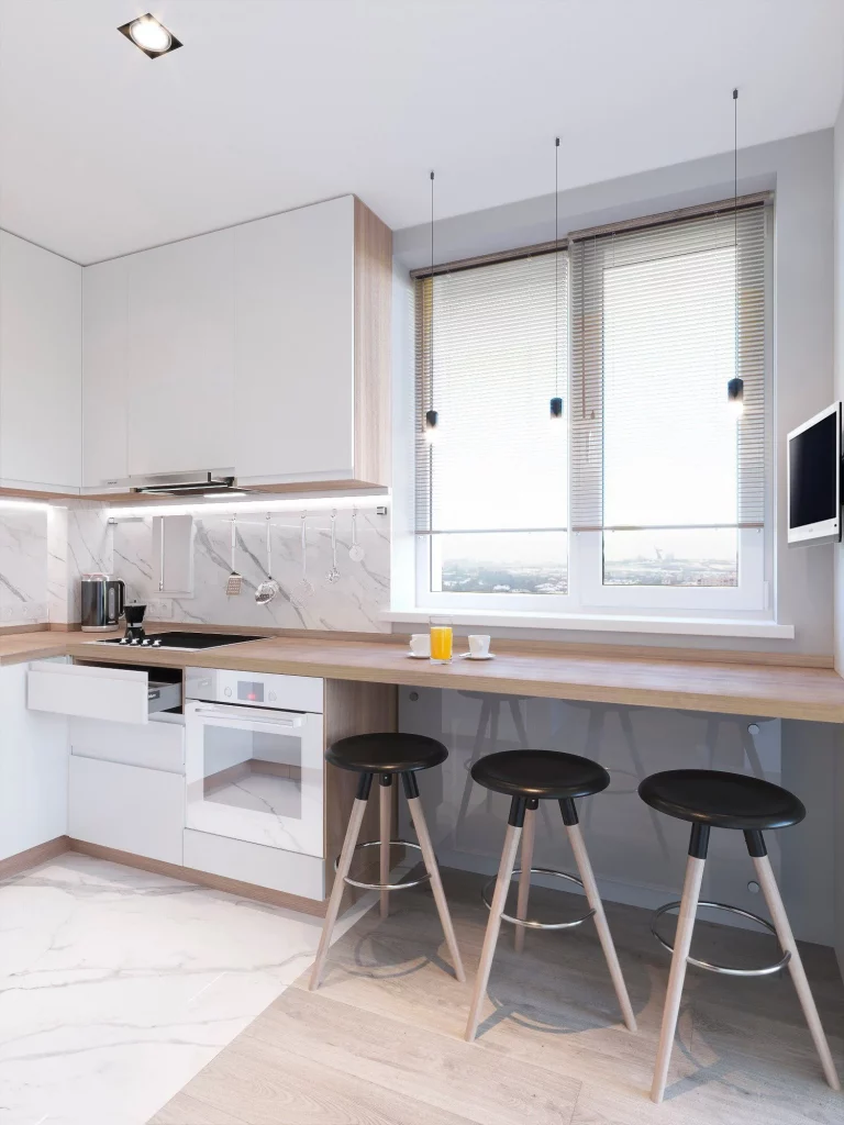
For a small kitchen, I find this particularly effective because the counter provides additional usable surface without requiring a separate dining table. The stools occupy the area underneath rather than taking up valuable floor space, and the large window keeps the composition visually open. The cabinetry also uses the available wall efficiently, while drawers and built-in appliances help maintain a tidy appearance.
I would use this idea when a kitchen needs to perform several jobs at once. A counter like this can become a place for breakfast, coffee, quick meals, or even temporary work space. Keeping the upper cabinetry simple and white also helps the room feel lighter, while the wood-toned counter introduces enough warmth to keep the design from looking flat.
Soft Blue Tall Cabinetry With Integrated Appliances
The third kitchen makes strong use of vertical storage with tall soft blue cabinetry extending almost from floor to ceiling. I can see a compact work surface on the left, a small open wine-storage grid above it, and a continuous run of cabinets incorporating a microwave, oven, and refrigerator. The paneled doors and slim metal handles give the cabinetry a cohesive appearance despite the number of functions packed into this narrow area.
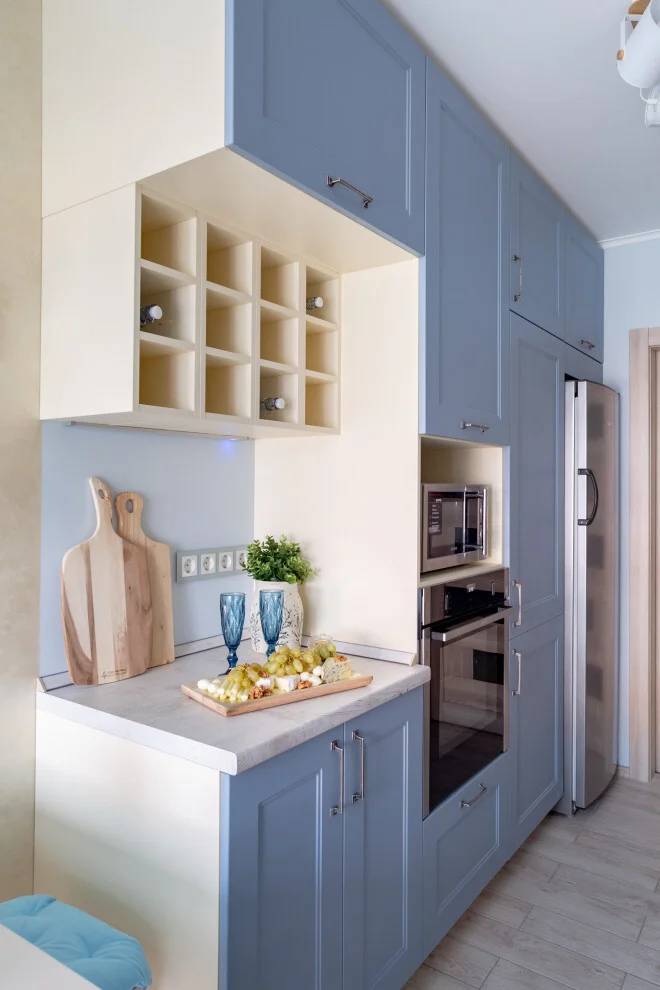
What stands out to me is how much equipment and storage has been concentrated along one wall. Instead of spreading appliances throughout the room, the tall cabinet arrangement keeps them grouped together and leaves the small counter area available for preparation. The open cubbies provide a lighter visual break and offer an accessible place for bottles, while the closed cabinets keep most kitchen items out of sight.
I often think vertical space is the overlooked resource in a small kitchen, and this image makes that point beautifully. If floor space is limited, I would look upward before adding more furniture. Tall cabinetry can accommodate appliances and storage in one continuous composition, while keeping the lower work area relatively simple and easy to use.
Warm Shelving and Hanging Mugs in a Compact Corner
This compact kitchen uses white paneled cabinetry, warm wood countertops, white subway tile, and two simple wood shelves mounted above the work surface. I particularly notice the row of colorful mugs hanging from a black rail, along with labeled-looking storage containers and small jars arranged on the shelves. The L-shaped countertop makes efficient use of the corner, while the cooktop occupies the shorter return.
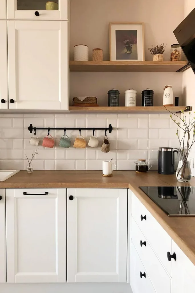
For me, the strongest organizational idea here is the combination of shelving and hanging storage. Cups that might otherwise occupy a cabinet are displayed directly beneath the shelves, freeing enclosed space for other necessities. The countertop remains functional because only a few frequently used items are left visible, while the shelves provide additional storage without making the lower work area feel crowded.
I would borrow the hanging-rail idea almost immediately for a small kitchen. It creates an easy-access zone for mugs while also turning an otherwise unused section of wall into functional storage. I also like the consistency between the wood shelves and countertop because that repeated material visually connects the different storage levels.
Full-Height White Cabinetry Around a Compact Appliance Wall
This kitchen takes a very different approach, using white cabinetry to surround a built-in microwave and oven, a large refrigerator, and a narrow glass-front storage section. I see a gray countertop running along the window side, with two white rounded chairs positioned beside it. The cabinetry reaches high toward the ceiling, giving the compact kitchen a very orderly, built-in appearance.
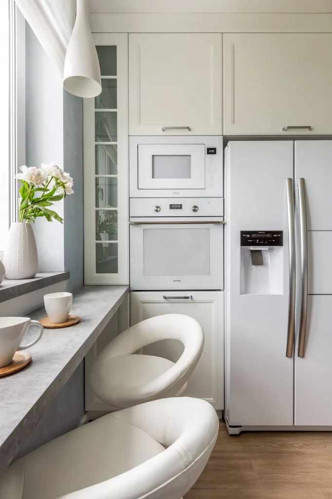
I think this layout demonstrates how full-height storage can make a small kitchen feel organized even when several large appliances are present. The refrigerator and ovens are incorporated into the cabinetry rather than appearing as separate pieces scattered around the room. Meanwhile, the countertop beside the window creates a useful secondary zone without interrupting the main appliance wall.
From my perspective, the glass-front vertical cabinet is an especially nice organizational detail because it adds visual variation to an otherwise solid wall of white cabinetry. When using extensive closed storage in a small room, I like introducing one transparent section or another small visual opening so the cabinetry does not become monotonous.
Minimal White Kitchen With a Wood Dining Zone
The sixth image shows a compact open kitchen with white lower and upper cabinets, a narrow tiled backsplash, and a wood-toned cabinetry wall on the opposite side. The kitchen transitions directly into a dining area with a small wood table and matching chairs. A simple pendant hangs above the kitchen, while a patterned rug is visible in the adjoining living area.
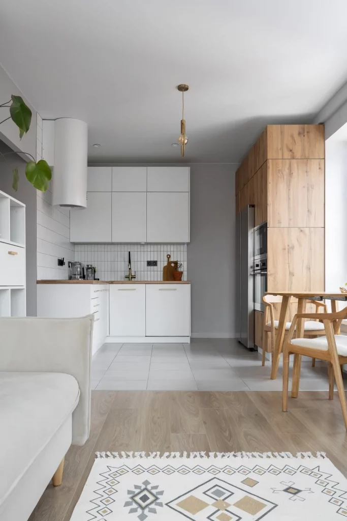
I like the way the kitchen and dining spaces share a restrained palette without looking completely identical. The white cabinetry keeps the cooking area visually light, while the wood-toned storage wall adds warmth and provides a substantial amount of enclosed storage. The refrigerator and built-in oven are incorporated into this taller section, allowing the main counter run to remain relatively uncluttered.
For a small open-plan home, I would pay close attention to this kind of visual continuity. Instead of trying to separate the kitchen completely, the design lets it blend naturally into the dining and living areas. The result feels efficient because the kitchen does not require a large island or additional freestanding storage to function.
Dark Blue Cabinets With Open Shelf Display
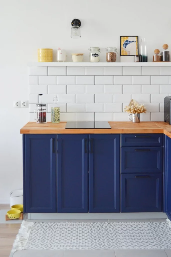
This kitchen uses deep blue lower cabinetry beneath a warm wood countertop, with a broad white subway-tile backsplash above. A long open shelf runs across the upper portion of the wall and holds jars, containers, and small decorative pieces. I also notice a compact black cooktop centered along the counter, keeping the working area straightforward and visually clean.
The open shelf is particularly useful in this arrangement because it provides storage without introducing another row of bulky upper cabinets. The white tile reflects light around the darker blue cabinetry, while the wood countertop creates a warm transition between the two. I like how the everyday storage remains visible but carefully arranged, giving the kitchen personality without overwhelming the limited space.
If I were recreating this approach, I would treat the open shelf as a curated storage zone rather than a place to put everything. In my experience, open storage works best when similar containers or frequently used pieces are grouped together. The image shows how even a simple shelf can become both practical storage and part of the overall kitchen composition.
Compact Corner Kitchen With Efficient Open Storage
This small corner kitchen makes clever use of an L-shaped arrangement, with white lower cabinets, warm wood countertops, and a white subway-tile backsplash. Above the counters, two long open shelves provide space for dishes, glasses, containers, and kitchen accessories. A black range hood occupies the corner, while the cooktop and sink are positioned along the two countertop runs.
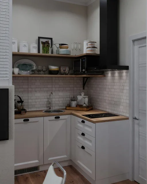
I find this layout especially practical because the corner is fully utilized without filling the walls with upper cabinets. The open shelves keep useful items close at hand, and the lower cabinets provide closed storage underneath. The consistent wood surface also visually ties the two sides of the L-shaped kitchen together, making the compact footprint feel deliberate.
For me, this is a good example of how open shelving can solve a storage problem in a narrow kitchen. Rather than forcing additional cabinetry into every available section, the shelves create accessible storage while leaving more of the wall visually open. I would keep the most frequently used dishes and glassware here and avoid overcrowding the shelves.
Wood-and-Gray Kitchen With Honeycomb Backsplash
The ninth kitchen combines wood-toned lower cabinets with darker gray upper cabinetry and a honeycomb-pattern backsplash. The refrigerator stands at the right side, while the oven and cooktop occupy the center of the composition. Under-cabinet lighting illuminates the countertop, creating a practical work zone and emphasizing the geometric backsplash.
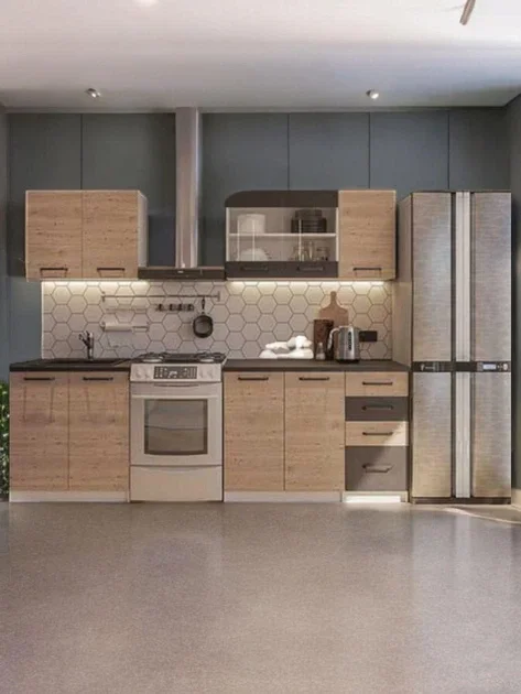
I like the balance between closed cabinetry and the small open sections in the upper storage. The wood fronts bring warmth to the darker gray backdrop, while the backsplash creates a clear visual layer between the upper and lower cabinets. The lighting beneath the cabinets is also useful because it places illumination directly over the preparation area instead of relying entirely on the ceiling fixtures.
When organizing a small kitchen, I think this kind of layered storage is worth considering. The lower cabinets can handle everyday equipment and larger items, while the upper compartments can display or hold smaller pieces. Keeping the countertop mostly open is equally important because usable work surface becomes especially valuable when there is limited room.
Small Green L-Shaped Kitchen With Glass-Front Cabinets
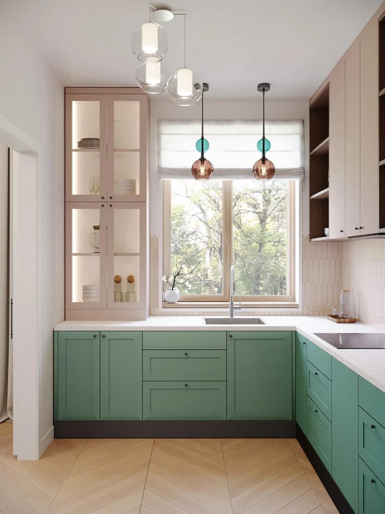
The final kitchen uses muted green lower cabinetry, white countertops, a pale geometric backsplash, and a large window above the sink. A tall glass-front cabinet stands at one side, displaying plates and glassware, while additional closed cabinets occupy the opposite wall. Two colorful glass pendant lights hang in front of the window, adding a distinctive decorative detail without taking up countertop space.
I think the organization here is particularly successful because the storage is distributed vertically and horizontally without making the kitchen feel heavy. The glass-front cabinet provides an accessible display area, while the lower drawers and cabinets keep the main work surfaces clear. The large window also gives the compact L-shaped layout an open focal point, making the room feel more spacious.
If I were taking inspiration from this image, I would focus on the combination of practical closed storage and one carefully chosen display cabinet. In a small kitchen, that balance can make organization much easier because most items can stay hidden while a selected group remains visible and easy to reach. The result feels personal, functional, and thoughtfully arranged rather than simply packed with cabinetry.
Plum Cabinetry With A Compact Dining Corner
I immediately notice how efficiently this small kitchen combines cooking, storage, and dining in one compact footprint. The lower cabinets are finished in a muted plum tone, while the tall and upper cabinetry is white, creating a strong contrast without making the room feel visually heavy. A narrow tiled backsplash sits behind the sink, and the dark blue oval dining table is positioned directly in front of the kitchen. Matching blue chairs repeat the table color, while a white sculptural vase and greenery add a simple focal point to the tabletop.
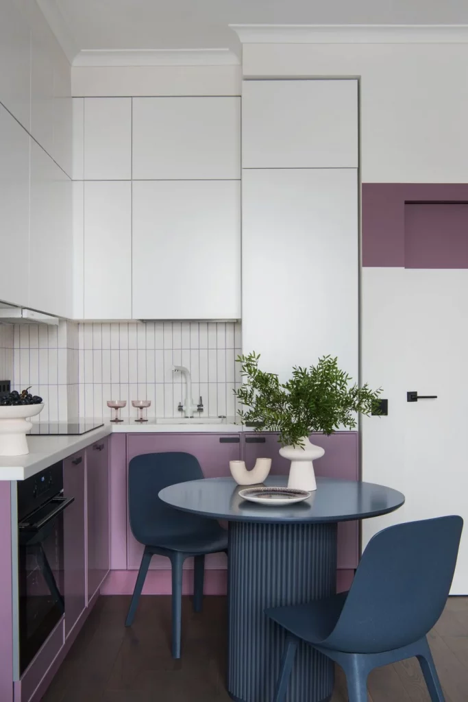
What makes this arrangement work for a small space is the way the dining area occupies the open portion of the kitchen rather than requiring a separate room. The tall white cabinet beside the kitchen provides substantial enclosed storage, while the upper cabinets keep the cooking zone visually tidy. I also like the combination of the rounded table and vertically ribbed table base because it gives the compact arrangement some visual softness without taking away usable floor space.
From my perspective, this is a great example of using a limited footprint without allowing the kitchen to become purely utilitarian. I would keep the organization similarly focused on closed cabinetry and a small dining surface that fits naturally into the available space. The restrained palette of white, plum, and deep blue also helps individual elements feel coordinated rather than cluttered.
Warm Wood And Gray Cabinetry In A Streamlined Kitchen
This compact kitchen uses a simple single-wall arrangement with light wood cabinetry above and below the main work area, combined with gray cabinet fronts. The white freestanding range sits at the center, with the sink and countertop positioned nearby. A dark gray wall surrounds the cabinetry and creates definition, while warm under-cabinet lighting illuminates the work surface. A bright window at the side brings daylight into the room and visually opens the compact layout.
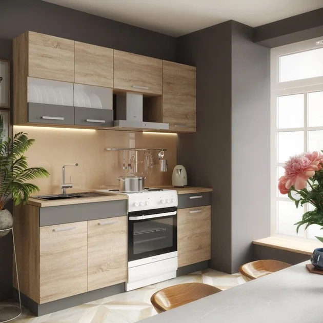
I like the straightforward storage strategy here because the cabinets extend across almost the entire available wall. Upper cupboards make use of vertical space, while the lower cabinets provide continuous storage underneath the counter. The open space around the range remains practical, and the countertop is kept relatively clear, which makes the small kitchen appear more orderly.
When I look at a kitchen like this, I think the key lesson is to make the cabinetry do most of the organizational work. The combination of wood and gray also creates enough visual variation without requiring numerous decorative objects. For a similar result, I would concentrate on a continuous cabinet run, keep frequently used surfaces uncluttered, and use lighting beneath the upper cabinets to make the work zone easier to use.
Soft Green Cabinetry With A Dedicated Dining Nook
The third kitchen has a softer, more architectural appearance, with pale green cabinetry featuring rounded corners on the right side and tall warm wood cabinetry toward the back. A light wood dining table sits directly against the kitchen area and is paired with a blue upholstered chair. The wall beside the table has white textured panels, while three globe-style pendant lights hang in a vertical arrangement. The wood flooring continues through the room, visually connecting the kitchen and dining areas.
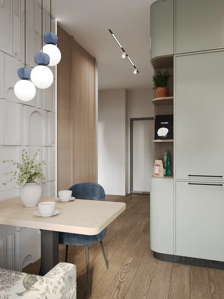
For me, the strongest organizational idea is the use of vertical cabinetry to keep the main kitchen visually contained. The tall wood storage occupies one side of the narrow passage, while the pale green units use the opposite side efficiently. The dining table is also compact enough to fit into the available floor area without blocking the circulation path. This creates a clear separation between preparation and dining while keeping both functions close together.
I would take inspiration from the way this interior limits the number of visible objects. The shelves built into the rounded cabinet area provide a small amount of open display space, while the larger storage areas remain behind doors. In a small kitchen, I find that balance particularly useful because a completely open storage system can quickly look crowded. Here, the combination of enclosed cabinets and a few visible objects keeps the composition controlled.
Teal Accent Wall Framing A Compact Kitchen
This kitchen makes a strong impression through its deep teal wall, which surrounds a compact run of light wood and gray cabinetry. The cabinets are arranged around a white range and a simple countertop with a sink. A few framed pieces are displayed on the teal wall, and the kitchen opens toward a dining area with matching green seating. The light floor and large windowed area help balance the darker wall color.
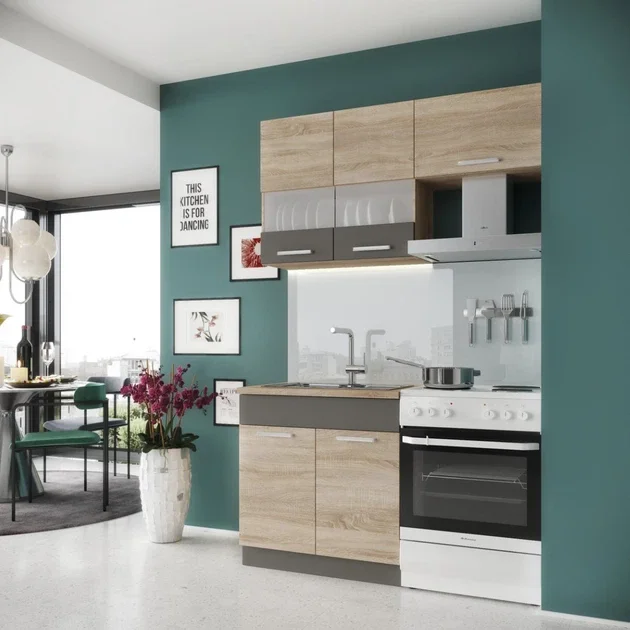
I like how the wall color visually defines the kitchen without requiring a complicated layout. The cabinetry itself remains relatively simple, with upper storage extending over the main work area and lower cupboards providing practical organization. Because the kitchen is compact, the strong wall color gives it a clear identity while the pale cabinetry prevents the storage from visually disappearing into the background.
My approach to organizing a space like this would be to let the cabinetry remain the primary storage solution and keep the surrounding wall relatively selective. The visible framed pieces work because they are limited in number and arranged around the kitchen rather than covering every available surface. I also like the continuity between the kitchen and adjacent dining area, which makes the small space feel more connected.
Dark Contemporary Storage With Mesh Cabinet Doors
This compact kitchen takes a completely different direction with a dark palette and highly distinctive upper cabinet doors. The upper storage features black perforated or mesh-like fronts, allowing glassware and dishes to remain partially visible. Below, dark gray cabinet fronts sit beneath a pale countertop and a backsplash composed of large light panels with dark seams. A stainless-steel refrigerator occupies the side, while a wood dining surface and white chair appear in the foreground.
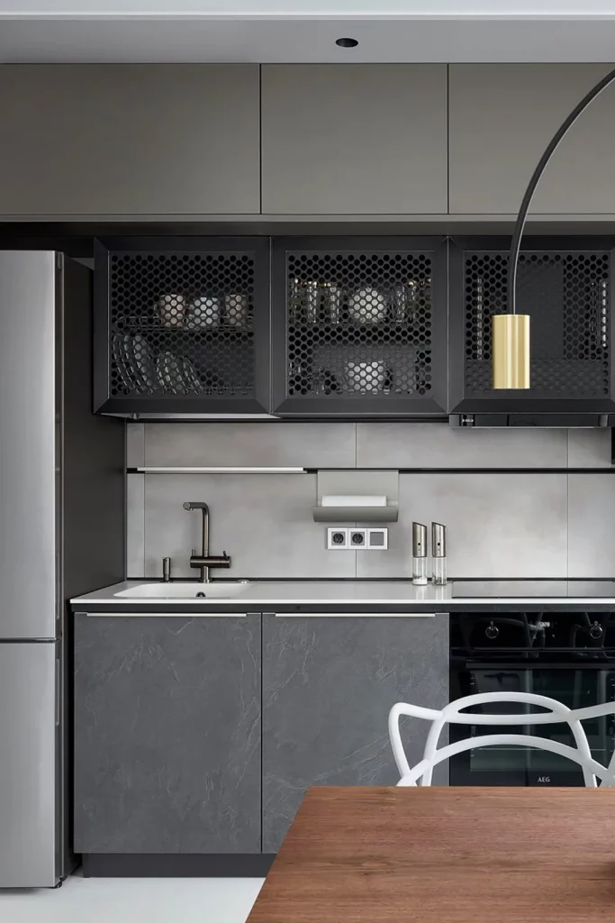
The organization here is especially interesting because the upper cabinets provide storage while also functioning as a display area. The mesh fronts break up the solid dark cabinetry and allow the contents to contribute to the design. Meanwhile, the lower cabinets conceal everyday kitchen items, creating a useful distinction between what is displayed and what is kept out of sight.
I would use this idea carefully in a small kitchen because visible storage can either create character or visual clutter. In this example, the dark cabinet framework gives the exposed dishes a consistent background, so the arrangement feels intentional. For a similar look, I would reserve partially visible storage for attractive everyday pieces and rely on closed lower cabinetry for items that do not need to be seen.
Light Wood Cabinets Maximizing A Small Kitchen Wall
This kitchen uses a compact U-shaped or corner arrangement with light wood cabinetry surrounding a white freestanding range. A dark charcoal wall provides contrast behind the cabinets, while a window on the left brings natural light into the cooking area. The lower cabinets combine wood fronts with gray drawer and cabinet fronts, and a continuous countertop provides workspace. Beyond the kitchen, part of a living area is visible, making the compact room feel connected to the rest of the home.
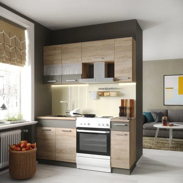
I think the most effective organizational feature is the full use of the corner and upper wall. Storage rises above the range and continues along both sides, creating a generous amount of enclosed cabinet space without extending the kitchen into the adjoining room. The countertop remains relatively open, so the room feels functional rather than crowded.
For a small kitchen, I would particularly study this approach to vertical storage. Instead of adding freestanding pieces that could interfere with circulation, the design relies on cabinetry already integrated into the kitchen footprint. The dark wall also helps visually frame the cabinet arrangement, giving the compact cooking zone a deliberate architectural boundary.
Streamlined Gray Kitchen With An Integrated Dining Area
This interior combines a compact L-shaped kitchen with a dining and living space. The kitchen cabinetry is a soft gray, with broad, handle-light fronts and a pale countertop. A glass-front display cabinet stands at one end, while several slim pendant lights hang above the main area. The room also contains a dining table, chairs, curtains, artwork, and a few carefully placed decorative objects, creating a polished but lived-in atmosphere.
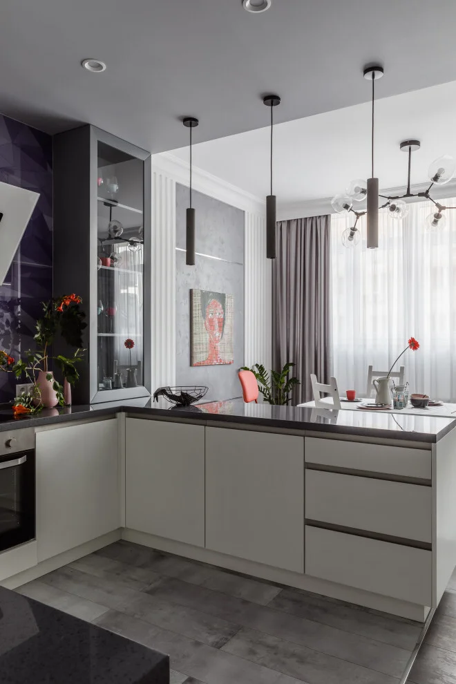
What I appreciate most is the clean relationship between storage and circulation. The lower cabinetry follows the available wall and turns the corner, while the glass display cabinet adds a vertical storage element without making the room feel completely enclosed. Because the cabinetry has a restrained appearance, the dining area can occupy the same visual field without competing with the kitchen.
In my experience, this type of open arrangement benefits from consistency more than excessive decoration. The gray cabinetry creates a quiet backdrop, allowing the dining area and lighting to add personality. I would keep visible storage selective and make sure the main countertop remains as clear as possible, especially when the kitchen shares space with a dining or living zone.
Beige Cabinetry And Dark Stone-Look Backsplash In A Narrow Kitchen
This image shows one of the narrowest kitchens in the collection. Beige cabinetry fills the back wall, with tall upper cupboards reaching close to the ceiling. A dark, richly patterned backsplash stretches across the cooking area and contrasts with the lighter cabinet fronts. The compact layout also incorporates a washing machine beneath the counter, an oven, a microwave, and a cooktop. Large light floor tiles with dark veining continue through the narrow room.
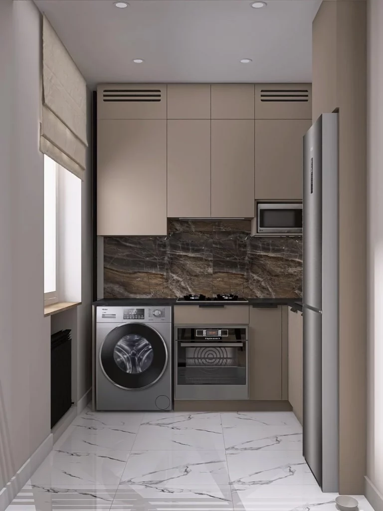
For me, the most practical feature is the way several essential functions are concentrated into one organized wall. The washing machine is positioned beneath the counter alongside the cooking appliances, while the upper cabinets provide storage above. The tall cabinetry uses the vertical dimension efficiently, which is especially important in a narrow kitchen where adding floor-standing storage would reduce the already limited walking space.
I would approach a kitchen with this shape by prioritizing built-in or under-counter functions and maximizing the upper storage. The restrained beige cabinetry keeps the room from feeling overly busy despite the number of appliances. The dark backsplash adds definition, but because it occupies a concentrated area behind the work surface, it does not overwhelm the entire narrow space.
Glossy Orange Island In A Compact Open-Plan Kitchen
This kitchen proves that a small space can handle a strong accent color when the surrounding elements remain controlled. White upper cabinets contrast with dark cabinetry at the sides, while the central island features glossy orange fronts and a white countertop. The same orange finish appears in the backsplash area behind the sink. Black built-in appliances are integrated into the tall cabinetry, and the kitchen opens directly into a living area with blue and green furnishings.
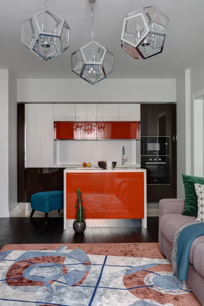
The island is the central organizational feature because it adds storage and work surface without separating the kitchen completely from the living room. The tall cabinetry keeps the appliances consolidated along one side, while the island provides an additional working zone. I also like the glossy finish because it reflects light and gives the strong orange color a crisp, contemporary appearance.
I would take the organization lesson from the layout rather than simply copying the color. In a small open-plan kitchen, concentrating appliances and storage along the perimeter allows the central area to remain useful and visually clear. The orange island then becomes both a functional element and the main design statement, showing that practical storage can also provide personality.
Light Wood Kitchen With A Cheerful Dining Nook
The final kitchen has a warm, compact composition built around light wood upper cabinetry and white lower cabinets. A large decorative backsplash behind the dining table features delicate botanical-style imagery in soft colors. The dining area is arranged around a small round white table with three pale yellow upholstered chairs. A dark translucent globe pendant hangs above the table, while a glass-front cabinet and open shelving appear on the right side.
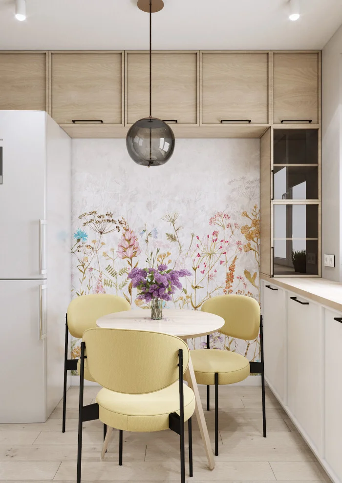
I find the dining nook particularly effective because the table is small and rounded, allowing the surrounding circulation to remain comfortable. The cabinetry uses the available wall space efficiently, while the glass-front storage provides a place for selected items to remain visible. The decorative backsplash also creates a clear focal point without requiring additional objects across the kitchen.
For me, this is a good reminder that organization and personality can coexist in a small kitchen. I would keep the main surfaces simple and let one strong visual feature, such as the backsplash shown here, provide character. The light cabinetry and compact table arrangement keep the room feeling open, while the limited number of visible accessories prevents the space from becoming visually crowded.
Layered Cabinetry and a Sculptural Compact Kitchen Layout
I see a sophisticated compact kitchen built around cream-colored paneled cabinetry, marble-look surfaces, and a dark gray fluted island. The cabinetry extends vertically across much of the wall, while a tall ribbed beige panel adds texture beside the cooking area. A glass-front cabinet with vertical detailing provides another visual layer, and the curved end of the peninsula creates a softer transition into the dining area. Three slim pendant lights hang above it, reinforcing the elegant, carefully planned appearance.
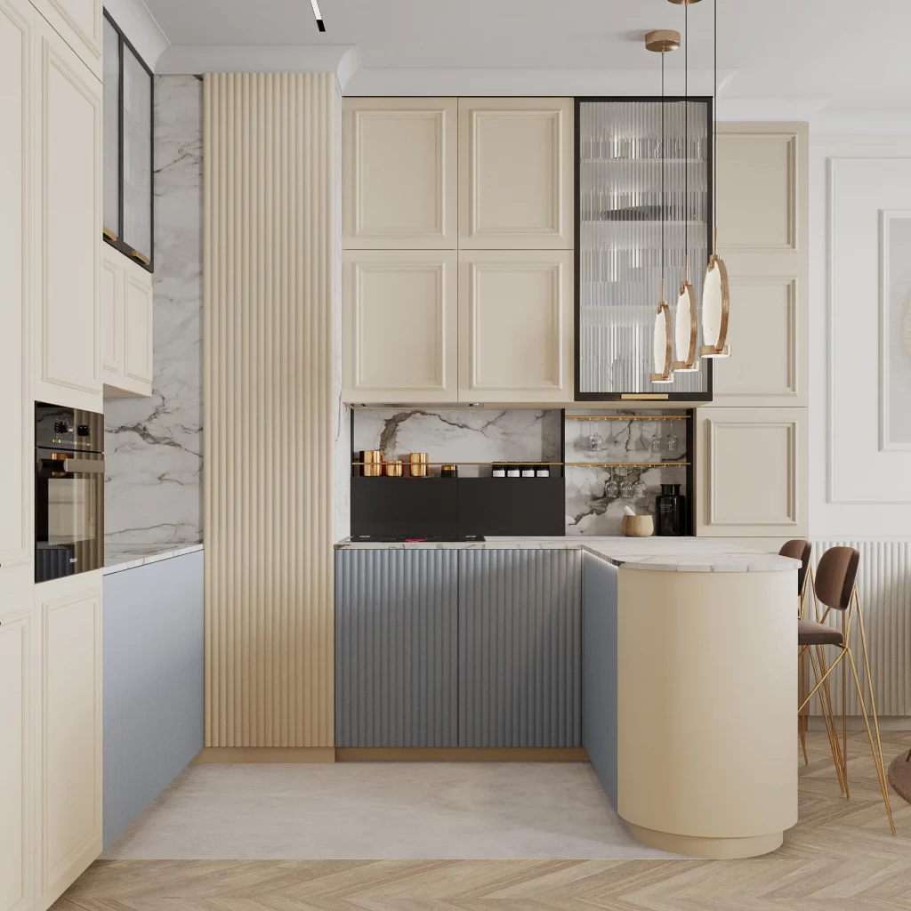
For me, the strongest organizational idea here is the combination of abundant closed cabinetry with a few intentionally visible storage areas. The tall cabinets make use of vertical wall space, while the open shelving beneath the upper cabinetry keeps frequently used glasses and small containers accessible. The dark lower storage visually separates the work area from the lighter cabinetry and also gives the kitchen a more structured appearance.
I would use this image as inspiration for a small kitchen where storage needs to work hard without making the room feel crowded. Full-height cabinets can keep everyday clutter behind doors, while one glass-front section can provide a place for attractive items that deserve to remain visible. I also like how the fluted surfaces add dimension without requiring additional decorative objects.
The curved peninsula is another detail I would pay attention to when organizing a compact room. Its rounded end reduces the visual heaviness of the cabinetry and creates a practical transition toward the stools. If I were recreating this approach, I would keep the palette restrained and allow the cabinetry, fluted textures, and marble surface to provide most of the visual interest.
Warm Storage in a Narrow Kitchen With a Window
This narrow kitchen makes excellent use of a long, compact footprint. Cream cabinetry fills the available wall space, while warm wood countertops and horizontal wood accents introduce contrast. The backsplash features a small geometric mosaic in several neutral shades, and a large window runs along the right side of the room. At the end, the cabinetry curves gently around the corner, while a pendant light adds a warm focal point overhead.
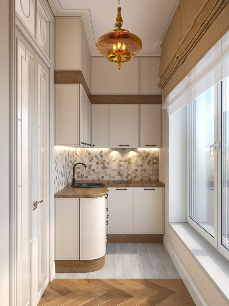
I like how the organization follows the shape of the room rather than fighting it. Storage is concentrated along the walls, leaving a clear central walkway, and the countertop provides continuous workspace around the sink and cooking area. The upper cabinets take advantage of the height, while the lower cabinets keep the working zone visually orderly.
For a narrow kitchen, I would take particular inspiration from the way this room separates functions without adding unnecessary structures. The sink, countertop, cabinetry, and cooking area are arranged along the same compact run, which keeps movement straightforward. The window also prevents the space from feeling completely enclosed, something I find especially valuable in a smaller kitchen.
The curved cabinet end is a detail I would consider when planning cabinetry for an awkward corner. It softens the transition and avoids a harsh visual stop at the end of the run. I would also keep the countertop relatively uncluttered, as this photograph shows how much more spacious a narrow kitchen can feel when the available work surface remains open.
Vertical Terracotta Backsplash With Streamlined Cabinet Organization
Here, the kitchen has a simple horizontal arrangement with white upper and lower cabinetry, a pale countertop, and a terracotta-colored backsplash made from narrow vertical tiles. The cabinet fronts are understated, while small coral-colored pulls add a subtle accent. A stainless-steel faucet and sink sit beneath the backsplash, with a few everyday kitchen items placed neatly on the counter.
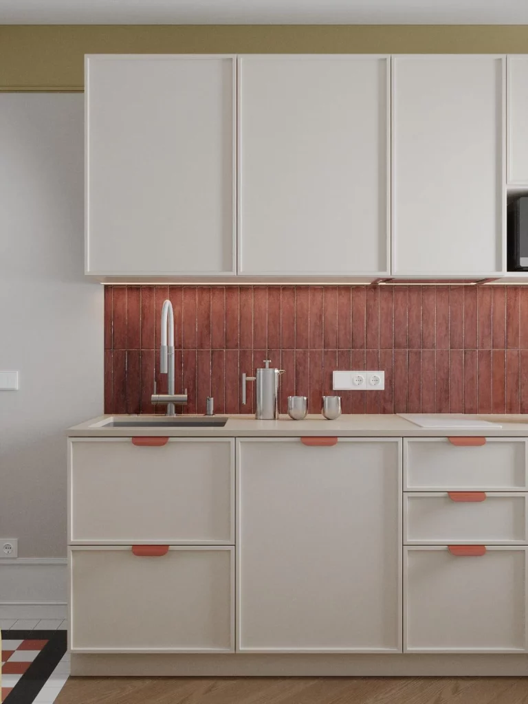
What works particularly well for organization is the balance between closed storage and a clear countertop. The cabinets provide concealed space for kitchen essentials, while the generous uninterrupted countertop keeps the main work zone easy to use. I also like that the backsplash extends across the full working area, creating a visually continuous surface rather than breaking the compact kitchen into too many sections.
When I look at small kitchens, I always pay attention to how much visual noise is created by handles, appliances, and accessories. This room keeps those elements controlled. The matching white cabinetry creates a quiet background, while the vertical backsplash provides enough texture and color to make the kitchen interesting without needing additional countertop decoration.
For a similar result, I would prioritize simple cabinet fronts and choose one strong backsplash detail instead of combining several competing finishes. The small colored pulls shown here demonstrate how even a modest hardware detail can give a compact kitchen personality while keeping the overall organization clean.
Compact White Kitchen With Open Vertical Storage
This small white kitchen combines closed cabinetry with a narrow black open shelving unit on the right. I see a black sink and faucet, a white marble-look backsplash, a built-in microwave, a black oven, and a front-loading washing machine integrated into the lower cabinetry. The open shelf provides several levels for visible storage, including containers and a trailing green plant, while a slim rail beneath the upper cabinets offers additional hanging space.
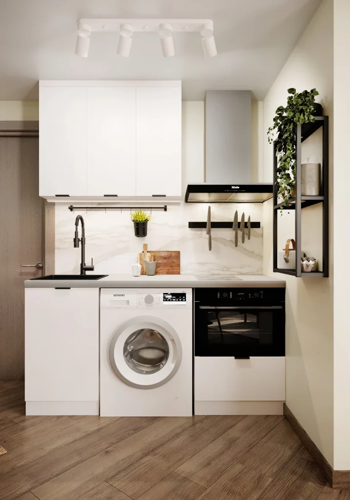
I find this arrangement especially practical because it uses several different storage methods within a very limited footprint. Most items can remain behind the white cabinet doors, while the open shelving keeps selected pieces immediately accessible. The hanging rail also makes use of otherwise unused wall space, and the compact arrangement keeps the sink, preparation area, washing machine, and oven within one efficient zone.
The placement of appliances is another useful organizational lesson for me. In a very small kitchen, integrating large appliances into the cabinetry helps preserve a continuous visual line. The white fronts surrounding the washing machine and oven prevent the room from becoming visually dominated by appliances, while the black elements create clear focal points.
If I were adapting this idea, I would be careful about what I place on open shelves. The photograph works because the visible items are relatively contained, while most of the kitchen remains concealed. I would use open storage for things I reach for often and reserve the closed cabinets for everything that could otherwise make the compact room look busy.
Dedicated Tea Station With Geometric Backsplash
This kitchen uses a soft white palette with paneled cabinetry, pale gray surfaces, and a geometric backsplash tucked into a compact recessed area. A white kettle, teapot, cups, and a small tray sit together on the countertop, creating a clearly defined beverage station. The surrounding cabinetry provides substantial closed storage, while the adjoining countertop continues into the main kitchen area.
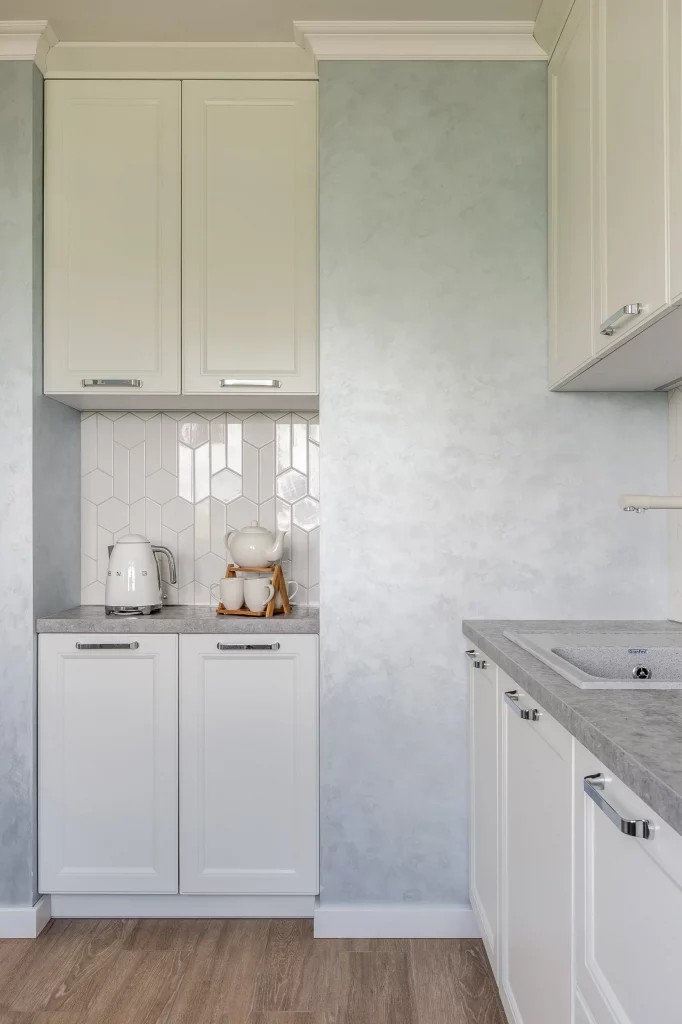
I particularly like the idea of grouping related items into one dedicated zone. Instead of spreading the kettle, cups, and serving pieces around the kitchen, this arrangement keeps them together in a small section of countertop. That makes the area easier to maintain and gives everyday items a logical home without requiring additional furniture.
The recessed arrangement also demonstrates how a small kitchen can benefit from dividing the available storage into purposeful sections. The upper and lower cabinets handle concealed storage, while the countertop niche becomes a practical station for items that are used frequently. The geometric backsplash gives this small area its own identity without overwhelming the surrounding cabinetry.
For my own approach to compact kitchen organization, I would borrow this idea of creating mini zones. A beverage area, preparation area, or appliance area can make a small kitchen feel much more intuitive. I would keep each zone visually simple, just as this photograph does, so the organization remains noticeable without making the room feel compartmentalized.
Black Feature Wall Framing a Compact Kitchen and Dining Area
This interior combines a compact white kitchen with an adjacent dining area centered against a black chalkboard-style wall covered with hand-drawn food and coffee illustrations. The kitchen itself has clean white cabinetry and integrated appliances, while the dining area features a rectangular wood table and upholstered chairs. Above the table, a sculptural arrangement of circular illuminated rings creates a strong focal point.
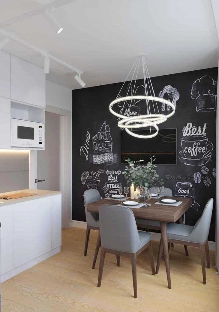
From an organizational perspective, I like how the kitchen remains visually restrained while the adjoining dining area carries most of the decorative expression. The white cabinetry creates a clean backdrop for the working zone, while the dining table provides a clearly defined place for meals. This separation helps prevent the kitchen itself from becoming overloaded with decorative objects.
The wall treatment also demonstrates how a compact kitchen can gain personality without using valuable countertop or cabinet space. Because the visual feature is concentrated vertically on the wall, the work surfaces remain available for practical use. I find that particularly useful in small rooms, where every bit of horizontal space matters.
If I were taking inspiration from this room, I would keep the kitchen storage visually simple and let one adjacent wall provide the personality. The combination of restrained cabinetry, a defined dining area, and a strong vertical feature shows that organization does not have to mean a completely plain interior.
Elegant Dining Nook With Built-In Kitchen Storage
The final image shows a compact dining area integrated into a refined kitchen setting. A round white pedestal table sits beside a large window, surrounded by upholstered chairs with dark wood frames. Built-in white cabinetry and integrated appliances occupy the surrounding walls, while a tall illuminated glass-front cabinet displays bottles on multiple shelves. A decorative chandelier hangs above the table, and the window brings natural light deep into the small space.
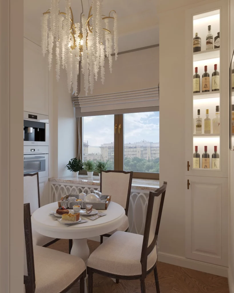
I see a smart use of vertical storage throughout this compact arrangement. The built-in cabinetry makes use of the available wall height, while the glass-front cabinet creates dedicated storage for bottles without taking up floor space. The round table is also well suited to the intimate footprint because its shape allows the seating area to remain compact and visually open.
What I appreciate most is the clear division between concealed and displayed storage. The white cabinets keep everyday kitchen necessities hidden, while the illuminated glass cabinet turns a specific collection into part of the room’s design. This approach can make organization feel intentional rather than purely functional.
For a small kitchen with an adjoining dining corner, I would take this as a reminder to consider the entire room as one connected space. Storage, seating, lighting, and circulation all need to cooperate. I would also keep frequently used items within the most accessible cabinets and reserve display storage, like the glass-front cabinet shown here, for objects that benefit from being visible.
When I look across these interiors, the most useful lesson is that modern kitchen organization starts with making every part of a small room work harder. Full-height cabinetry, dedicated countertop zones, open shelving, integrated appliances, and carefully planned dining areas can all improve functionality without sacrificing style. Which of these compact kitchen organization ideas would you most like to try in your own space? Leave a comment and share your favorite design from the collection.
A small kitchen can be both stylish and highly functional when every part of the space is used thoughtfully. These Modern Kitchen Organization Ideas for Small Spaces show how smart cabinetry, compact dining areas, open shelving, and integrated appliances can keep everyday essentials organized while maintaining a clean look. I especially love how each design proves that limited square footage does not have to limit creativity. Which kitchen idea was your favorite? Leave a comment and share the design you would most like to recreate in your own space.