
Are you looking for stylish yet functional kitchen cabinet color combinations for your upcoming kitchen renovation? Are you wondering if some colors can affect the mood, brightness, or depth of your kitchen space? In this article, I will walk you over some of the most timeless, trending, and unique cabinet color combinations that designers love in modern interiors. Whichever way you lean towards, whether a bold transformation or for a warm aesthetic, I’m sure you’ll find a combination that resonates with you and your space.
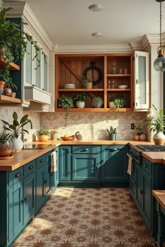
Turquoise Tranquility: Reviving Kitchens With Refreshing Cabinet Colors
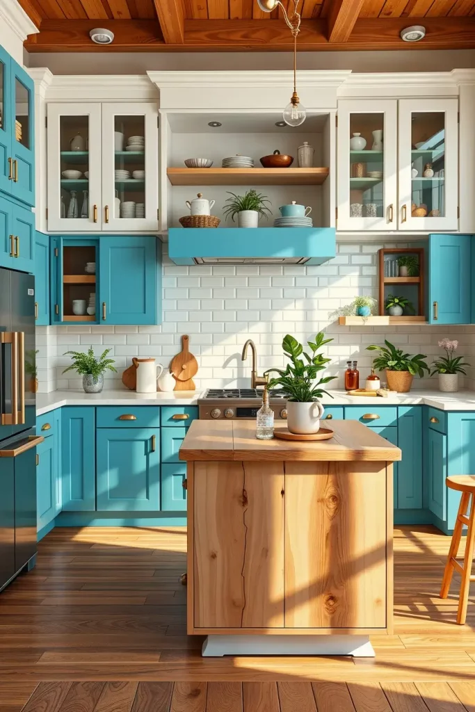
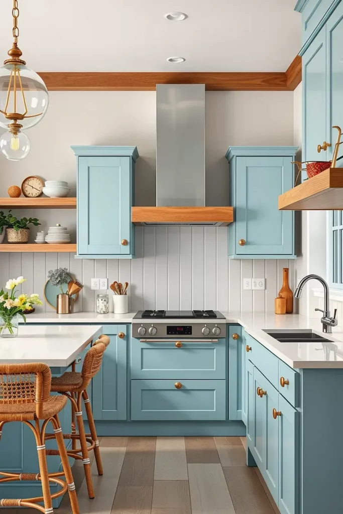
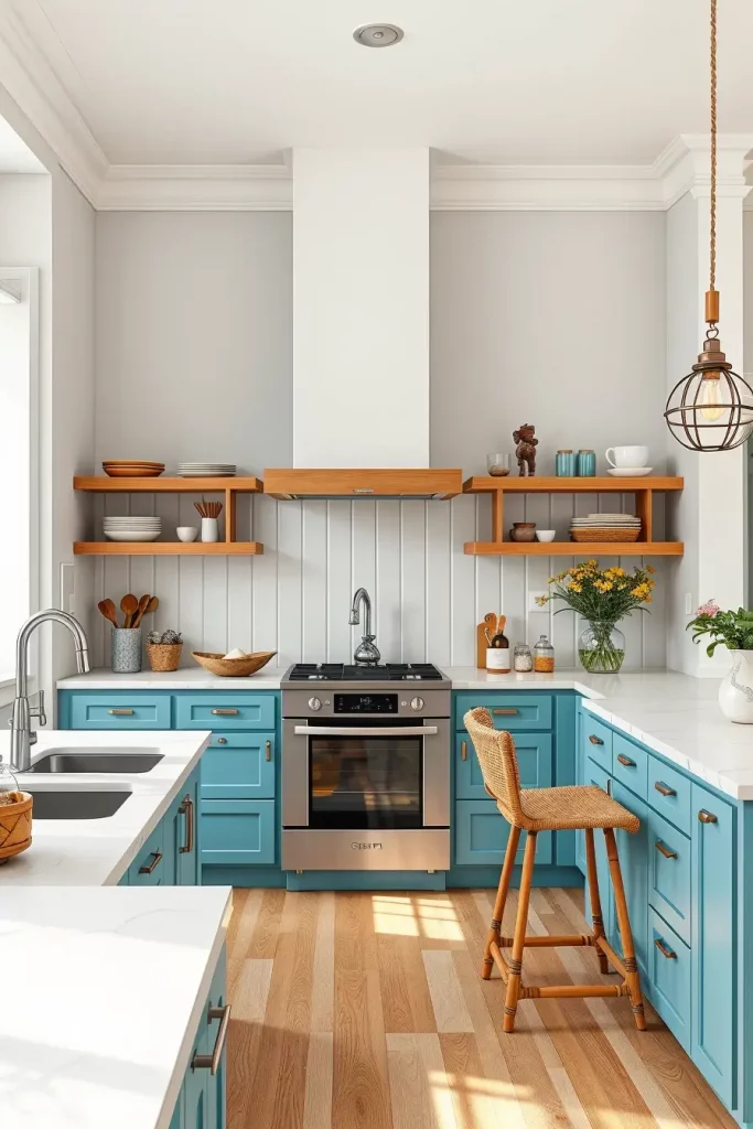
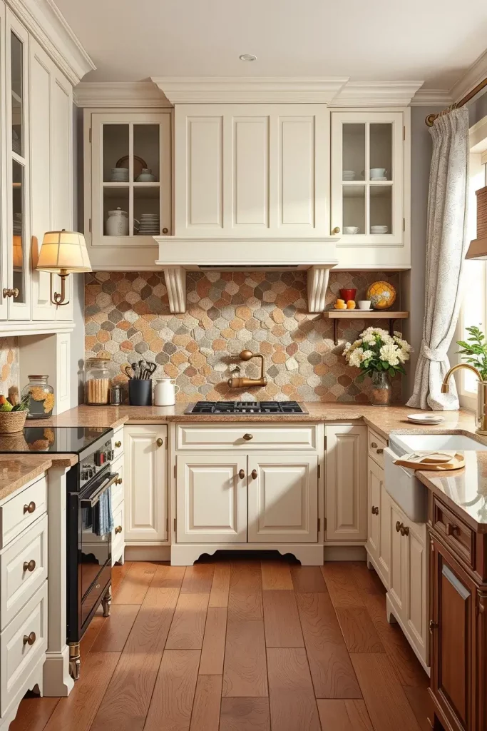
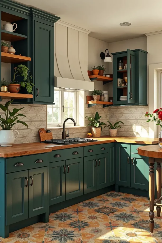
Along with bright yellow, turquoise is one of those colors that are sure to bring energy into any space. Turquoise can yield a coastal or retro-modern look if blended with the right tones, so when I use it for kitchen cabinets, I prefer pairing it turquoise with thoughtfully white walls and light wood flooring. This creates an inviting and airy feel, perfect for small kitchens. In smaller kitchens, where maintaining a pleasant light reflection is crucial to creating an illusion of space, this helps tremendously.
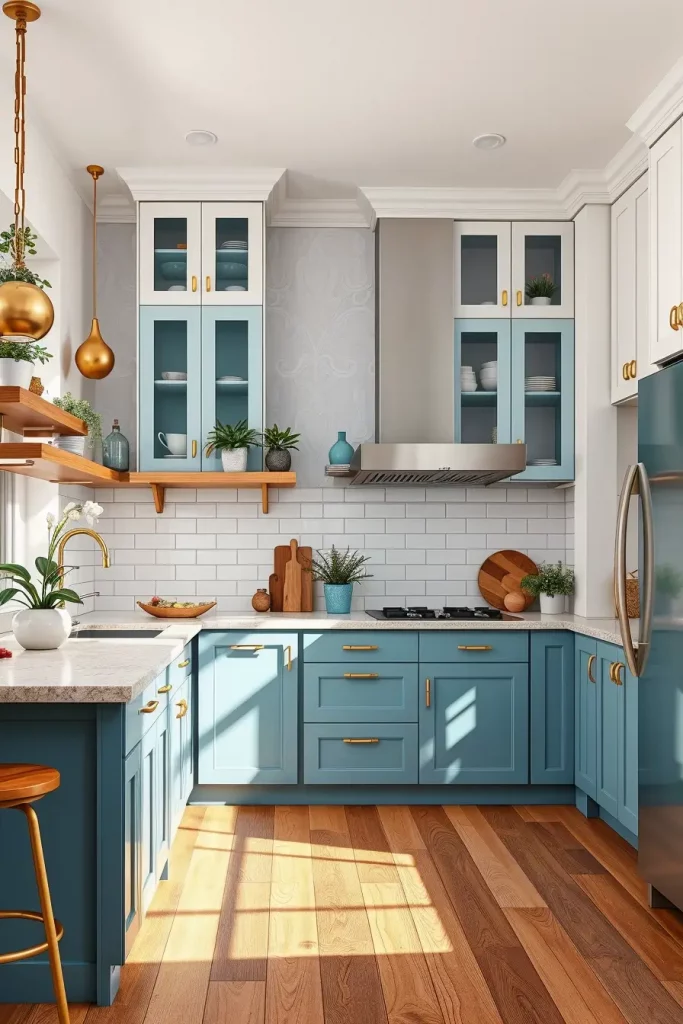
For this design, I added the eye-catching touch of matte turquoise for the lower cabinet sections, and the sleek white upper units evoke a sense of space. A gold or brass tile backsplash on artisans steel brings color to the eye while also making the space warmer with the addition of subdued floating shelves. I still suggest the addition of a center island for proper balance which can be accented with natural wood, and to soften the overall tone, it is essential with the addition of plants or woven textures to the display.
Personally, I have applied this scheme to the vacation homes I’m working on as well as more compact kitchens around city apartments. It is always well-received. Elle Decor noted that turquoise strikes the balance of ‘playful without being childish’ making it ideal when looking to liven up kitchen space. I couldn’t agree more, it is the type of color that makes one desire to cook instead of making it a tedious activity.
Along with a warm gold hue, woods will complement vividly if turquoise is the main focus. Without these introduces, the area can become too sterile and cold. If you intend on creating a coastal feel, a patterned floor tile could also be an interesting extra.
Apricot Glow: Soft Warmth for Cozy Cooking Spaces
Apricot’s unique charm comes from it generating a feeling of warmth and coziness while still integrating the soft energy of orange while combining it with the chill peaches give off. In a kitchen, apricot cabinetry works wonders in providing a mid-level range of energy that is greatly acceptable in any room. This color works exceptionally well in homes that favor light or mid toned wood, linen fabrics, or portions with Mediterranean design influences. Pairing apricot with sand or cream accentuates the overall look perfectly.
Matte apricot cabinetry also works nicely with a light beige countertop and an off white ceramic tiled backsplash. Brushed bronze or antique brass matte cabinet handles work beautifully alongside warm oak barstools which perfectly elevates the soft appeal of the cabinetry. Warm pendant lighting always beams from above, proving additional warmth and extending the soft flushed oak aesthetic. Light apricot vases as well as ceramics on open shelves help anchor the tone while providing subtle details.
Recall apricot kitchens creates a warm appeal fused with light nostalgia, evoking sweet earthy memories anchored in time. One client claimed it feels familiar but modern and elegant at the same time—a lovely reminiscence of her grandmother’s kitchen. Modern design does tap into cheerful and down toned elements as Archaeological Digest supports, citing peachy tones are back in fashion. I couldn’t agree more.
I would incorporate a brighly colored piece like a handwoven runner or seat cushions to add texture. If the space feels dark, you might want to opt for an ivory wall to lighten the room’s feel.
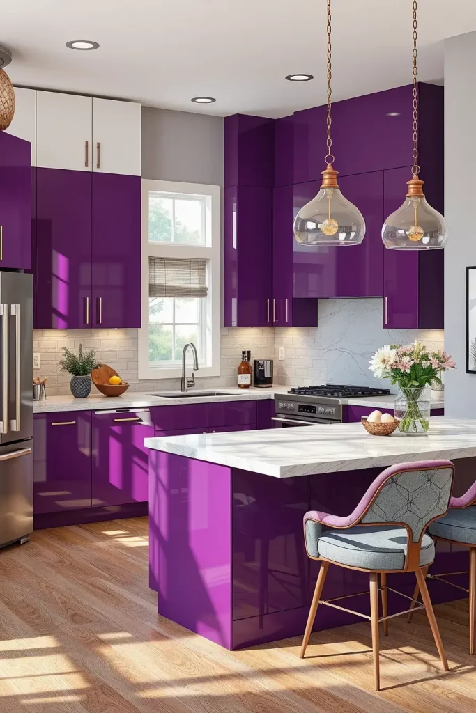
Amaranth Allure: Bold and Elegant Cabinet Statements
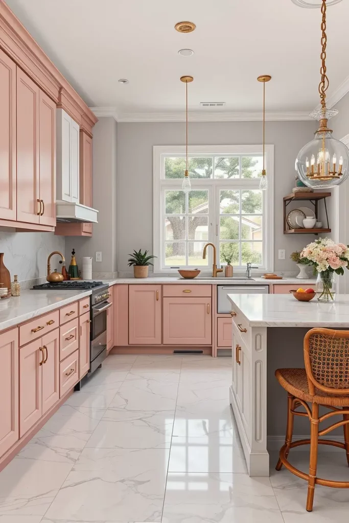
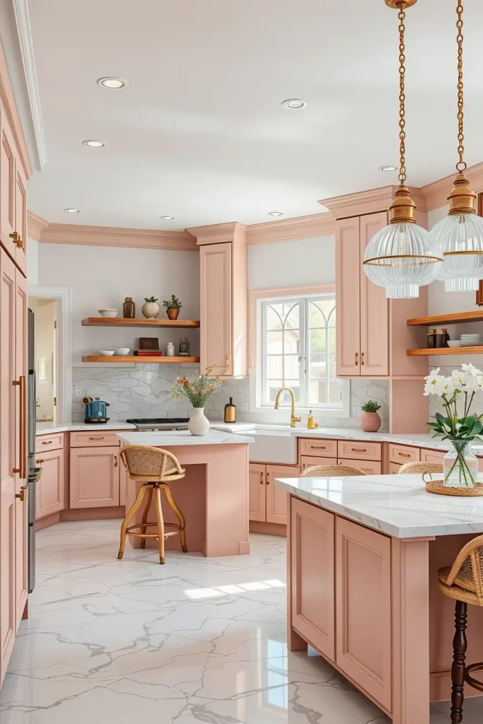
Amaranth serves as a deep pinkish-red tone, great for someone looking for something different yet stylish. In terms of kitchens, amaranth cabinets provide richness and personality while still looking regal and playful. I usually prefer using this color on lower cabinets and islands because it looks best when paired with soft grey, cream or even walls and countertops of subtle blush tones.
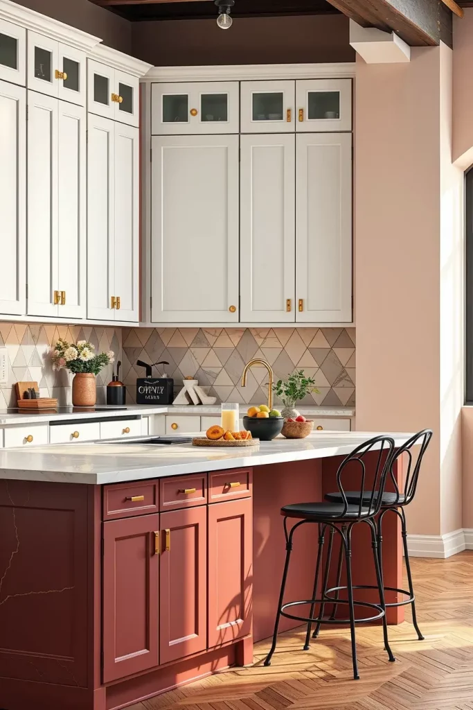
I’ve designed kitchens with amaranth that were anchored with light marble countertops featuring delicate veining with tall white upper cabinets and a subtly geometric mosaic backsplash. It’s essential to add gold hardware as it deepens the richness of the color and adds elegance. For furniture, I mostly suggest dark wood or black iron stools and fixtures which work to balance the color’s sweetness with structure.
I used this color combination for a creative director’s loft, and it remains one of the most dramatic yet livable kitchens I have done. Apartment Therapy cites that “deep pinks are the new neutral” in interiors bursting with color, and I have witnessed that myself with clients who desire a curated aesthetic with a personal touch.
This palette benefits from high ceilings or good lighting. Otherwise, the richness of the color might feel heavy. Think of incorporating reflective high-gloss elements like shallow shelving or mirror-backed shelving, or even windows.
Sandy Neutrals: A Breezy Blend of Beige and Cream
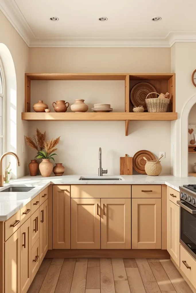
Sandy neutrals in interiors can be classified as a blend of beige and cream. If you are after a flexible kitchen design that remains timeless, sandy neutrals are perfect for you. These tones provide warmth, making them one of my go-to kitchen cabinet color combinations for minimalist or even transitional styles. Homes with abundant natural wood or neutral stone surfaces will also benefit from these hues.
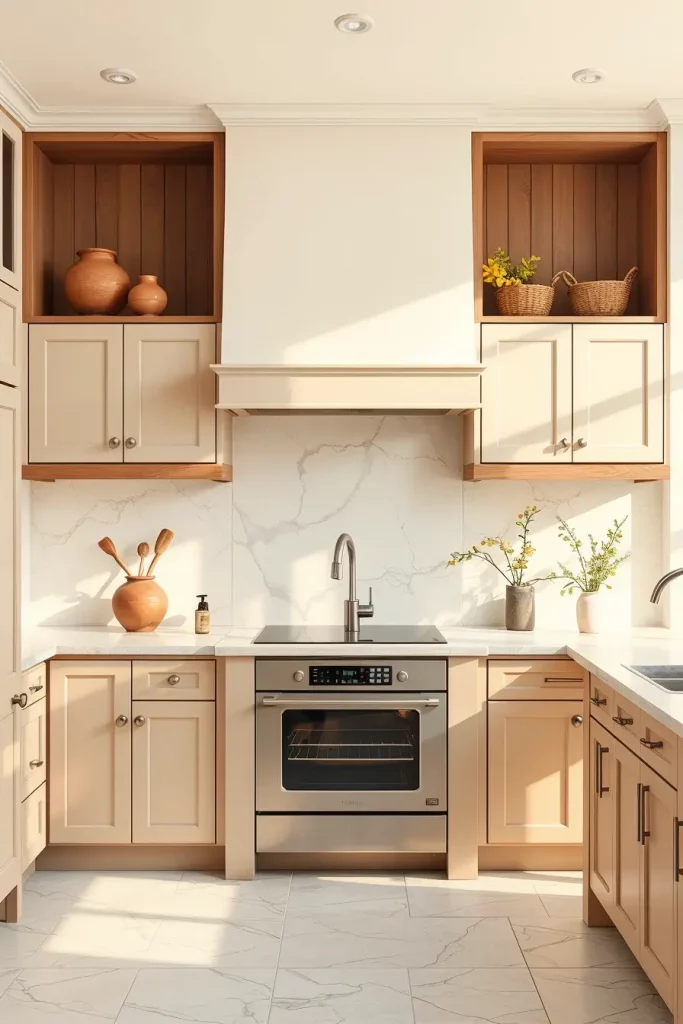
My favorite way of applying sandy neutrals is mixing a pale beige cabinet with cream or ivory walls. I usually pair them with quartz countertops featuring soft marbling to add some dimension. Organic clay pottery, woven baskets, and open wood shelving reinforce the relaxed feel. Brushed nickel or pewter hardware is best suited here so as not to draw too much attention.
This is a color scheme I recommend to clients who wish to get the most out of their decor as well as be timeless. You can change textiles, art, or appliances without gutting the entire kitchen. House Beautiful once remarked that beige kitchens are “quietly luxurious,” and I think that is a pretty apt description.
This appearance can benefit from texture: fluted cabinet panels or shaker styles. Avoid sleek and flat line work as this could make the area feel inhospitable.
Sunshine Yellow: Brighten Up With a Cheerful Cabinet Choice
Bright yellow is a color that warms the heart—and where better to channel this than the kitchen? Sunshine yellow cabinetry works beautifully in eclectic, country, or retro kitchens. To create some harmony, I often layer this shade with white or soft grey.
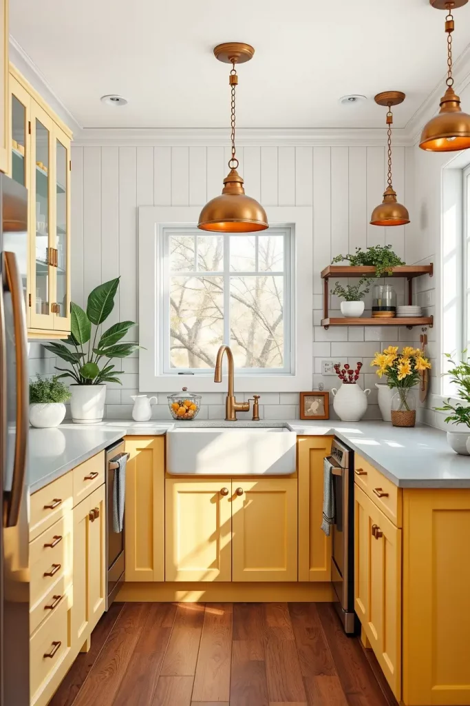
In one of my latest projects, I employed yellow for the lower cabinets and island fronts with white beadboard uppers and soft grey countertop. A herringbone backsplash in white or marble tile maintains the sharpness. Pendant lights betray the unmistakable energy of yellow while natural wood floors ground the room. Simple wooden stools paired with a few indoor plants grant that comforting lived-in aesthetic.
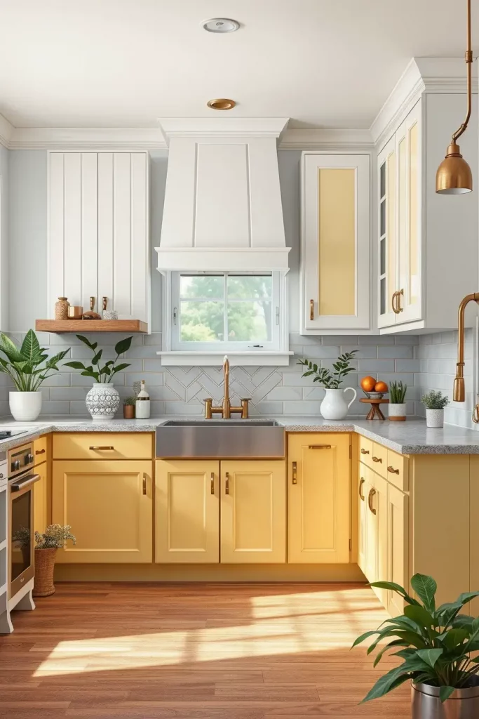
I’ve noticed how yellow hues work well in warm, brightly lit kitchens. They tend to bring natural light into the room. As noted by Real Simple, “yellow stimulates creativity and appetite,” which makes it a perfect fit for a room that revolves around food and family. Clients often describe this design as a daily mood booster.
To elevate the space, I’d suggest introducing a few black elements, like picture frames and light fixtures, to balance the sweetness with some contrast.
Aquamarine Accents: A Splash of Sea-Inspired Sophistication
Aquamarine is a blend of green and blue, making it ideal for open concept kitchens or large, well lit spaces. It also goes well with modern coastal or Scandinavian style homes. Aquamarine cabinets, in particular, suit those styles best.
In one kitchen, I installed flat front aquamarine cabinets with white quartz countertops and matte chrome handles. A pale grey vertical tile backsplash provided modern texture. To warm it up, I added white oak open shelving, rattan seat bar stools, and round glass pendants. The look was polished with contemporary clean lined furnishings and fixtures.
My clients frequently share that the shade aquamarine evokes for them thoughts of beach getaways or calming spas. It is calming and soothing but not too dull. According to Coastal Living magazine, aquamarine is described as one of the “refreshing and versatile colors” used in coastal interiors. Personally, I have found this to be true for all my projects as well.
This color blends exceptionally well with **reflective surfaces** such as glossy tiles or glass cabinet doors. Reflective surfaces increase the feeling of space and light which is always welcomed.
Black And White Balance: Classic Contrast That Never Fails
Black and white should always work together because you can never go wrong with black and white. They fit everything from ultra-modern to farmhouse kitchens. For me, a bold yet warm feel comes from using black lower cabinets and white upper ones, so that’s how I usually style them.
One of my best works includes matte black cabinetry below and white shaker cabinets above along with black and white mosaic tile for the splashback. A chrome accessory and a white marble waterfall island provided luxe accents. Resting in the kitchen were leather bar stools, which paired well with the brushed steel lighting. Abstract black and white artwork adorned the walls.
With clients who want elegance but need to leave color choices aside, this design is one I frequently revert back to. As noted in Domino Magazine, “Black and white kitchens are trending again for their editorial elegance,” something I have definitely seen over the past few years in high-end renovations.
You can introduce warmth into the color scheme by adding wood or metal accents. Even one warm pendant light, or a brass faucet can make the space less monochrome and more inviting.
Cherry Charm: Deep Red-Brown Cabinets That Radiate Warmth
The timeless cherry kitchen cabinets have a special place in all of our hearts. Their deep red-brown hues fill any kitchen with a gorgeous, inviting warmth and charm, creating a rich timeless atmosphere which is a backbone for any home. In my experience, this color blend works beautifully in houses with conventional style architecutures or shops featuring wood flooring in dark hues. It also works well for people who want to make a bold impression while still avoiding full-on dark or monochrome.
In this type of kitchen, I usually use full cherry wood cabinetry with a satin finish. In this case, I place these units with cream or light grey work surfaces to counterbalance the intense hue, and I enjoy placing a rustic stone or brick style accent till to add a splash of warmth, complemented by the rustic style charm. Oil rubbed bronze or matte black fittings also works nicely here. A queen cherry bar or island area is usually included with matching chairs and is enlivenedwith warm, soft illumination to further enrich the hues of the maple kitchen cabinet color combinations.
Through my design cherry cabinetry, I have learned that they are well liked by those who appreciate craftsmanship and heritage. As stated by HGTV, the cherry finishes are “timeless and luxurious”, which is exactly the impact they have in a kitchen setting. The clients say it gives them a lifted feeling in their spaces without compromising comfort.
If I were to further this design, I would add glass-paneled cabinets or crown molding to enhance the traditional look. They blend delightful with cherry shades and create a custom built appearance.
Creamy Dream: Subtle Tones for Elegant Kitchen Vibes
Cream is one of the easiest and softest scents to work with in a kitchen. Unlike white, which can feel too harsh, it is more gentle and goes well with an assortment of kitchens plasters and even enhances them. For clients who are looking to have a warm and welcoming space that is not too cold or modern, I recommend cream kitchen cabinets often.
In my preferred configuration, a shaker-style cabinet is paired with creamy stone countertops, while the mosaic tile backsplash is either taupe or beige. The flooring is light oak or engineered wood, and antique brass hardware warms the palette. The flooring usually consists of light oak or engineered wood. Warmth is added to the space through a farmhouse-style sink and open shelves. Linen curtains or roman blinds in a soft tone complete the space’s subdued look.
From suburban family kitchens to open-plan lofts, I have used cream cabinets everywhere. Real Simple magazine cites their capability to “soften and unify mixed materials” as a reason to recommend cream kitchens. I agree with this, as it’s the neutral that never feels boring.
To elevate the design further, I would add handmade elements like ceramic pendant lighting or natural woven baskets. They do not disturb the quiet elegance of the color scheme but instead bring charm to the area.
Peach Perfect: A Juicy Pop of Color for Modern Kitchens
Peach may not be the most obvious choice for kitchen cabinets, but it’s a hidden treasure for those seeking warmth and vibrant character. For a cheerful and welcoming atmosphere, peach cabinetry provides a subtle vibrance. I especially appreciate it placed within mid century modern or eclectic interiors.
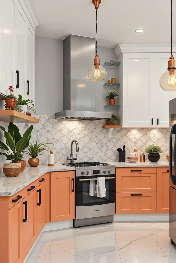
As part of one creative task, I painted the lower cabinets a soft peach blush while the upper cabinets were bright white gloss finished. The handles were matte black which introduces a stunning contrast. For the countertops, I selected pale quartz with warm undertones, along with a whimsical terrazzo backsplash to add some fun texture. The floating shelves were also painted in copper where I arranged lush green plants and a vibrant colored china. It was equally fulfilling to complete the look with copper pendant lights.
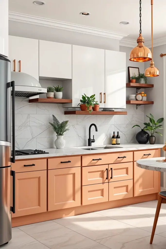
My clients rave about this combination because it feels fresh yet personal. Southern Living suggests peach tones work especially well where “They bring softness and energy to interiors.” Kitchens serve as the house’s epicenter for socializing, therefore, they need a lively atmosphere.
My personal recommendation would be adding powerful contrast, for example, through the oversize lighting features, the chairs, or even art. Rendered, peach benefits greatly from powerful grounding. It creates an exquisite aesthetic experience without appearing too delicate.
Lavender Luxe: Adding a Floral Twist to Kitchen Design
For the general aesthetic, lavender cabinetry is expertly paired with stunning gentle laces. It offers a soft quiet elegance that is unlike anything else. This shade of lavender cabinets usually goes in modern farmhouse or French styled kitchens that blend vintage and contemporary effortlessly. It has floral details that work harmoniously alongside soft hues.
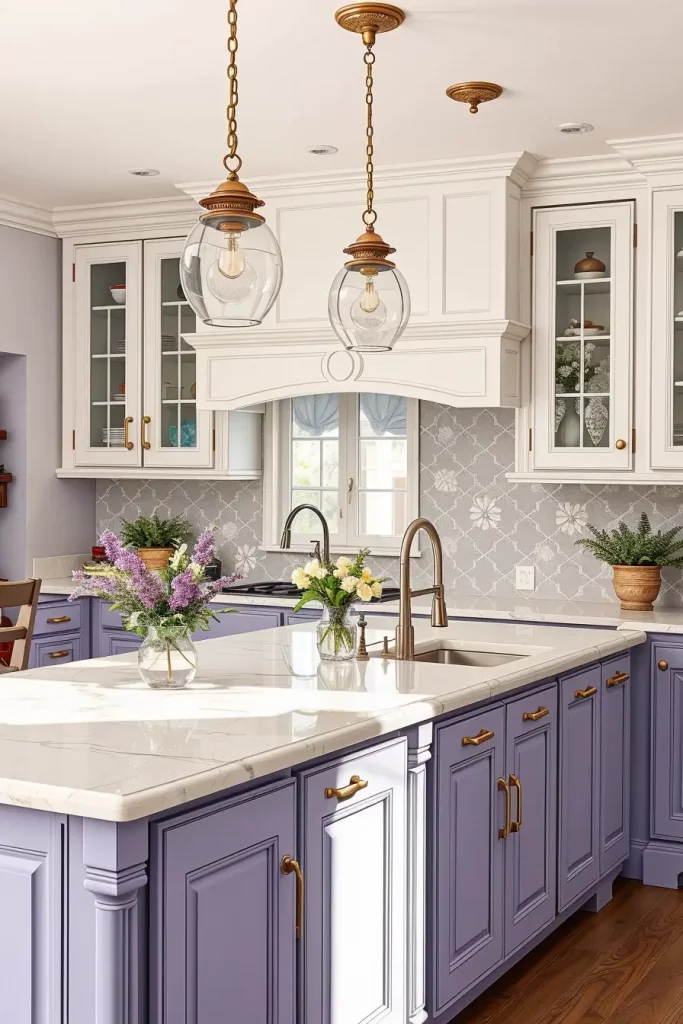
My preferred combination is light lavender cabinetry with white above, and quartz countertops that look like marble. A floral or light grey tiled backsplash helps to pull everything together. I often add pendant lights with vintage-styled glass and some brushed nickel hardware. Finishing touches could include lavender-themed decor or a small herb garden on the windowsill.
I designed lavender rooms for clients who wanted calming spaces but didn’t want to use traditional greys and browns. House Beautiful described lavender as “gentle but forward-thinking,” and it works beautifully in designs meant to blend nostalgia with modernity.
For stronger lavender, try adding hand-painted tiles or textured cabinet fronts with more dimension. These details enhance the calming presence of lavender while still adding warmth and a curated touch.
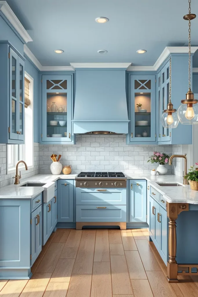
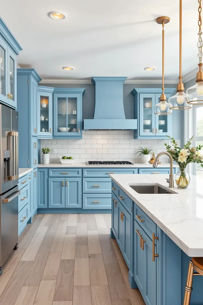
Blue Bliss: A Calming Hue That Transforms Cabinets
The blue trend has always captivated designers because it adds comfort and style, and modern blue kitchen cabinets are warm and welcoming. Light blue feels coastal and carefree while deeper navy shades provide a rich and moody feel. I especially enjoy a soft slate blue because it leans balanced and adaptable without trying too hard.
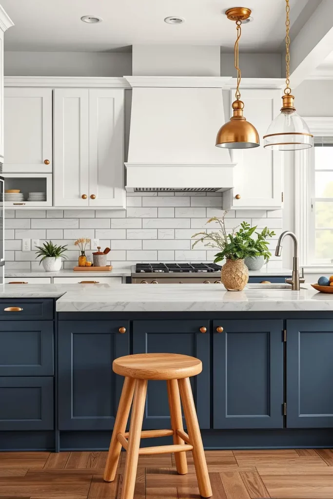
Most recently in my work, I used slate blue for the lower cabinets and paired them with bright white upper cabinets. The tops were a marble-like quartz while the counters were light grey that resembled subway tiles. The hardware used was chrome to match the polished look of the space. Additionally, the light wood furniture and plants softened the look. This combination creates a calming rhythm in the room without feeling monochromatic.
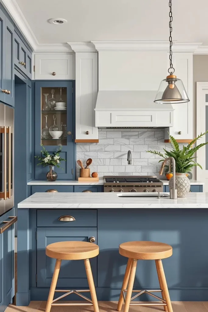
From my experience, most clients have said that blue increases the serenity and the polished look of their kitchens. Elle Decor says that blue ‘evokes confidence and serenity’, which complements how the color transforms kitchens perfectly.
This could use some natural warmth from textures, such as rattan for the light or wooden bar stools. These changes offer plenty of balance as they do not disrupt the aesthetic order.
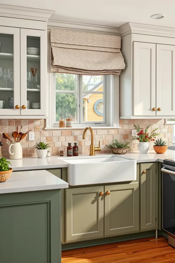
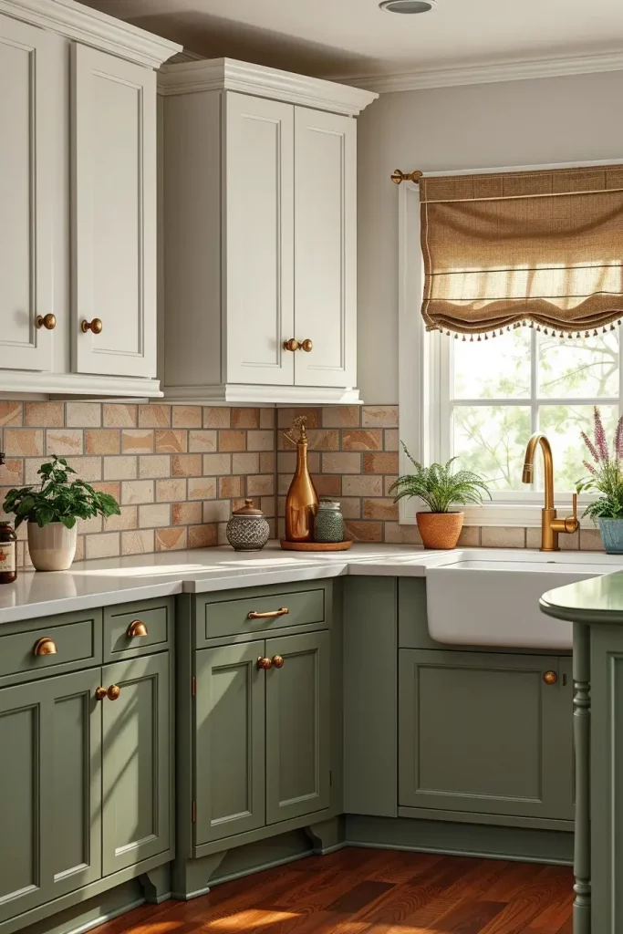
Olive Undertones: Earthy and Rich for Rustic Appeal
Olive cabinets offer a rustic, Mediterranean, or country style, while also being earthy and welcoming. Natural elements paired with warmer metals like brass and copper shine with olive.
My go-to is olive cabinetry together with a butcher block countertop with a white tile backsplash, perhaps in a vertical stacked pattern. I like to combine open shelving and wood fittings and blend in copper lighting to create some warmth. The walls can remain soft neutral, perhaps a delicate white or very pale grey. The flooring is best in reclaimed or distressed wood.
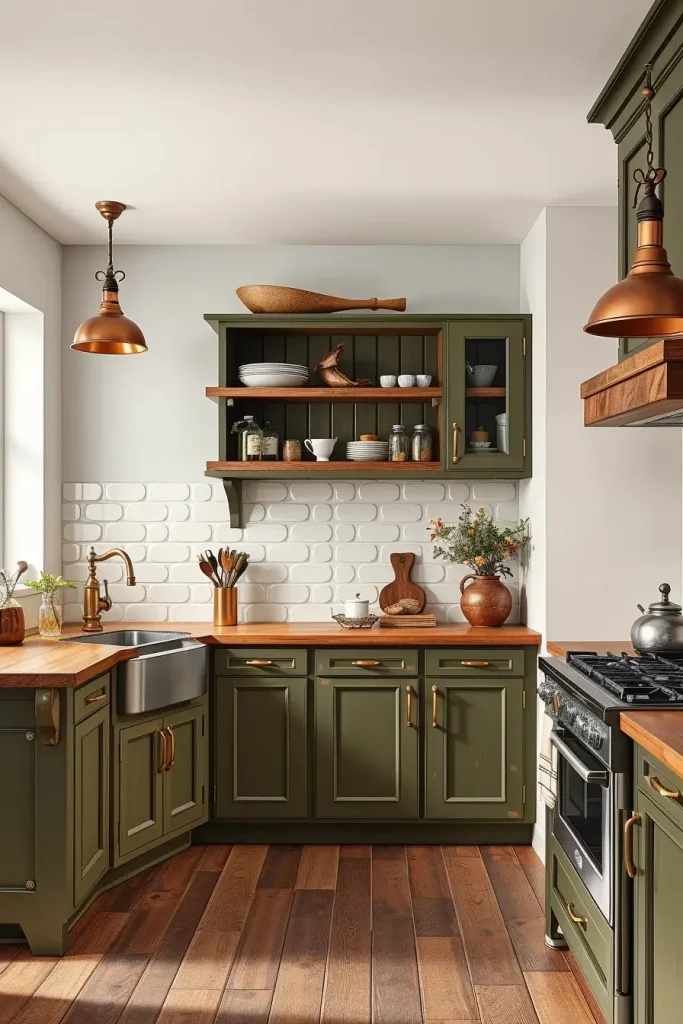
Clients choose olive for a cozier, but not too dark option. It is quite grounding and connects one to nature. Green hues such as olive are said to “bring the outside in” by Architectural Digest, which I find attract homeowners who appreciate biophilic design.
To further this, I’d also think about placing under the island handmade tiles or even a vintage style rug to add texture and visual interest.
Dark Green Tea Tones: Sophisticated Serenity in The Kitchen
Dark green tea tones have a moody and elegant feel making it perfect for kitchens that desire refinement and depth. Dark green cabinetry works particularly well in larger more open spaces or well-lit areas where one can afford to embrace drama without sacrificing brightness.
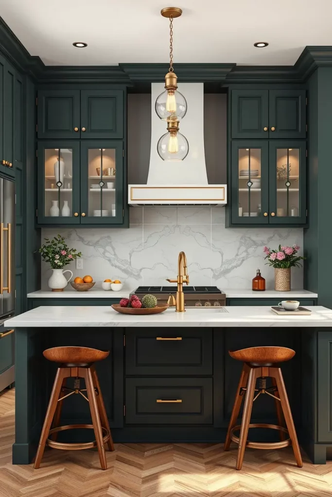
In one of my go-to designs, I featured dark green tea cabinetry on the island and lower cabinets, which I complemented with white upper cabinets and a white marble backsplash. The countertops were warm off-white quartz. To balance the look, I selected brass hardware and warm pendant lighting. Walnut barstools and matte black window frames completed the look.
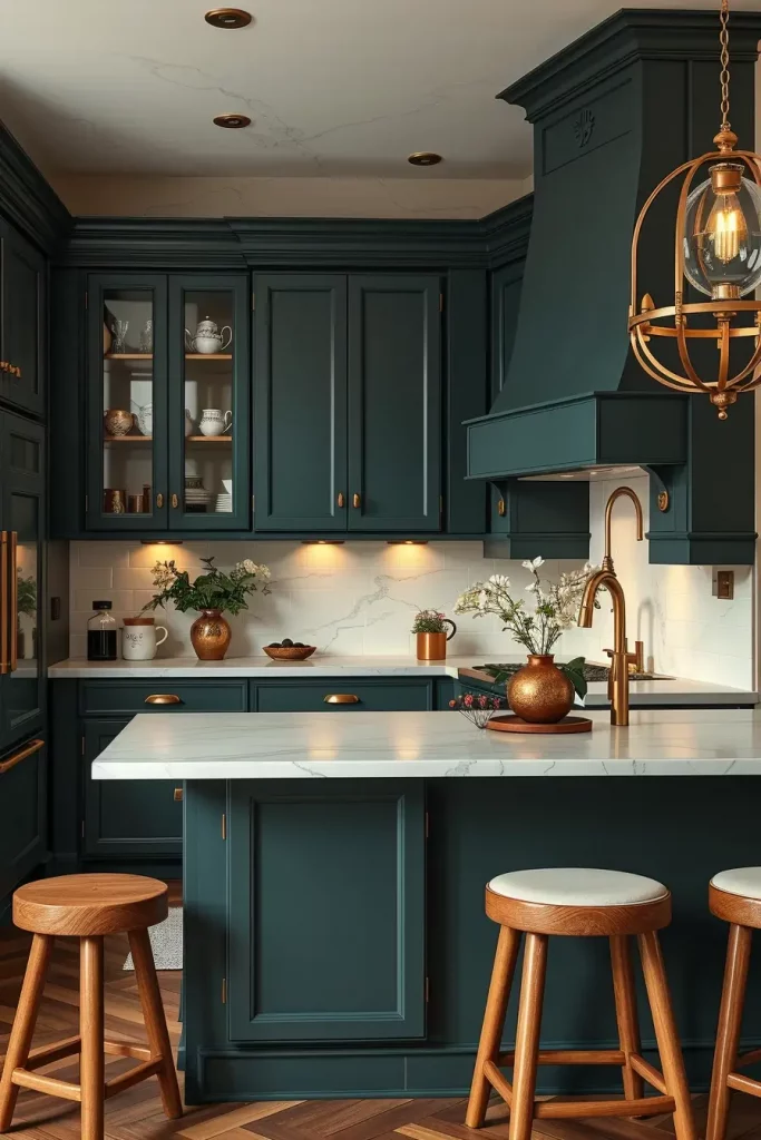
This color scheme is gaining popularity in contemporary design. As cited in Domino, “green kitchens are the new black,” and it’s easy to see why—they are luxurious, timeless, and comforting all at once.
To add more personality to this color scheme, consider using artwork, a patterned runner, or floating shelves made from live-edge wood. These tweaks help ground the design without losing its uniqueness.
Refinement of Cherry Wood: A Timeless Appeal with Extensive History
For me, cherry wood cabinets represent the zenith of kitchen design elegance, and the reasons are quite clear. Cherry undertones and marble countertops synergize beautifully with warm gold or bronzed fixtures. This works best with both traditional and transitional kitchens, providing a sense of balance and understated opulence. This is a look I often recommend to clients who desire a refined kitchen that feels timeless and inviting.
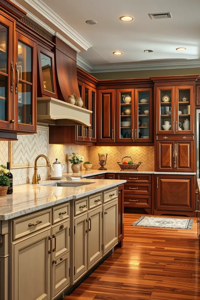
To achieve this look, I would pair raised panel cherry cabinets set at a satin finish with a light cream herringbone tile backsplash and antique brass handles. Supplemented with glass display cabinets for upper storage to break visual heaviness. An island in a softer shade like beige or warm white creates layered contrast, which I favor adding to this look. Completing the trim aesthetic are hardwood floors and crown molding around the cabinets.
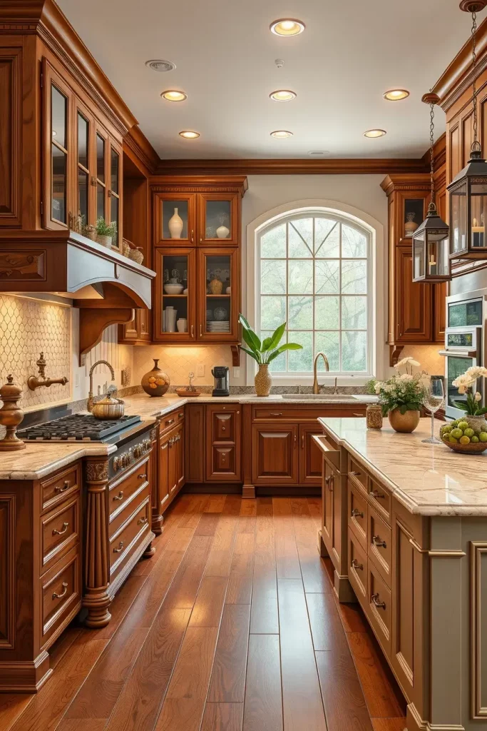
Cherry wood’s versatility with design is something I’ve always appreciated. Better Homes & Gardens puts it nicely: Cherry’s richness is best complemented by neutral walls like almond or greige. This allows the wood to truly shine without feeling too heavy, especially in medium-sized kitchens.
What I’d add here is installing LED strips under the cabinetry to improve countertop illumination and accent red hues of the wood. This gives added efficiency and also a modern twist to the traditional scheme.
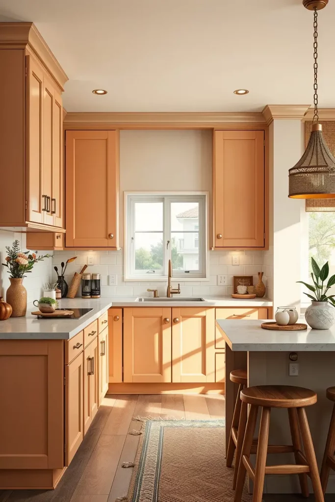
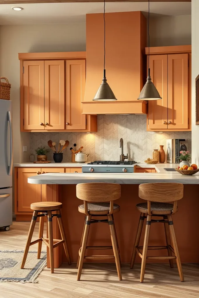
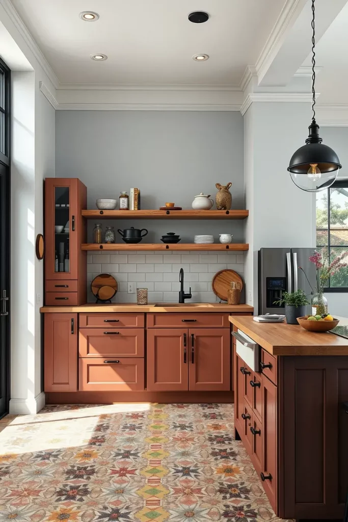
Dark Salmon Statements: Rich Warmth With a Hint of Boldness
Dark salmon salmon cabinetry adds warmth and personality to any contemporary kitchen design. It is a vibrant, rustic orange color, albeit softened by an earthy undertone that makes it more adaptable than one would expect. It is great for those homeowners looking to add some color but still want an overall warm and uplifting feel in the house.
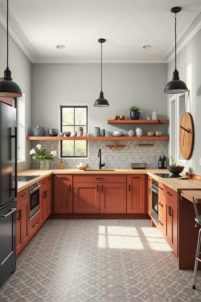
In my favorite set ups, I pair matte dark salmon cabinets with natural wood open shelves and a butcher block countertop to echo the organic matte tones. The visual appeal is further enhanced with matte black hardware and the patterned Moroccan-style tile flooring. Walls clad in white or very light grey soften the punch of color from the cabinets while also preventing the kitchen from feeling claustrophobic.
This tone isn’t particularly common, though it’s one of my favorites because it personalizes a space. Apartment Therapy praises darker peach and salmon tones for modernizing rustic kitchens while retaining some charm. I personally adore them, too. Those tones strike a balance between welcoming warmth and surprise sophistication.
For that unit, I’d add black industrial pendant lights that hang over the small prep island to create contrast and anchor the color palette. It’s the last detail that best integrates this delightful hue to a thoughtfully designed space.
Radiant Reds: Passionate Cabinet Colors That Pop
Making a statement with red kitchen cabinets can be considered bold, but the right execution can amplify the kitchen’s liveliness and personality. I’ve serviced clients that sought radiant red, and I know how strongly it delivers. It especially shines in eclectic or modern interiors where design dares to break away from the norm.
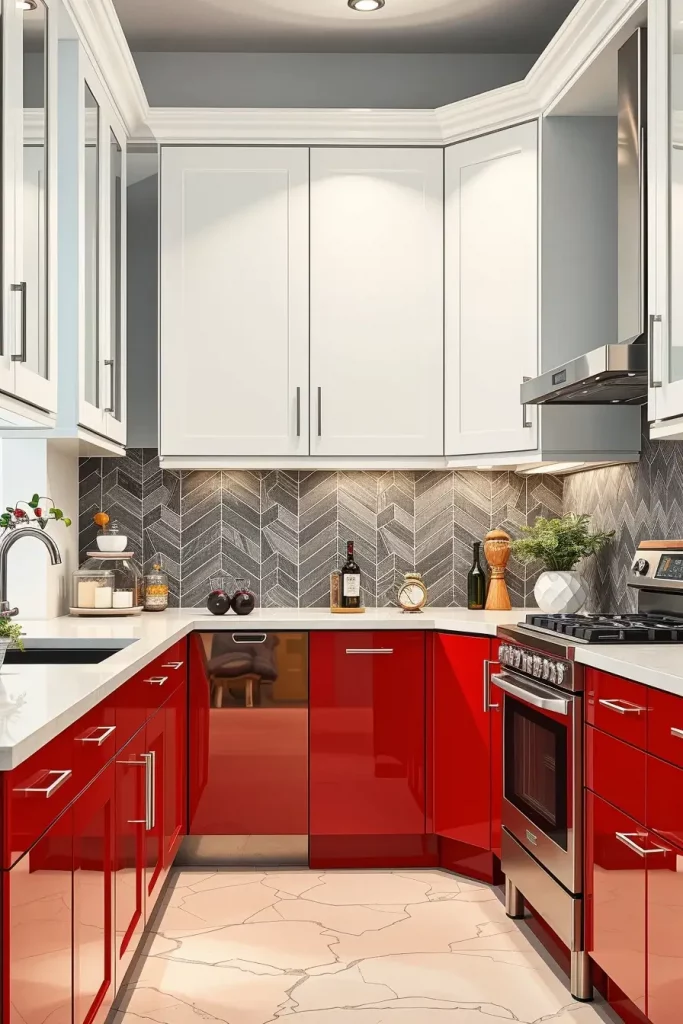
I recommend semi-gloss or gloss red base cabinets with white upper ones or open shelves for visual relief. In addition, a stark white quartz countertop alongside a black herringbone tile backsplash counteracts the red overpowering the room. The space’s modern feel is completed by stainless steel appliances and simple chrome or matte black hardware.

In my experience red works best in kitchens with ample light. As HGTV notes, rich reds may increase energy and appetite, which explains why they’re often used in dining spaces. However, controlling its dominance with neutral balance and selective placement is crucial.
What would enhance this further is red bar stools or even a matching toaster and stand mixer. Small touches that echo the cabinetry can balance the design and elevate it from a striking composition to an unparalleled masterpiece.
Pretty In Pink: Whimsical Cabinet Hues for a Chic Look
While pink kitchen cabinets may seem odd, they are increasingly being incorporated into modern and minimalist houses looking to add softness and charm. A dusty rose or blush pink can instantly energize the atmosphere and add an unexpected whimsical touch. In smaller kitchens, I love using pinks to foster a sense of calm and inspire creativity.
My go-to setup features shaker-style blush pink cabinets with rose or brass hardware. Blush pink cabinets are complemented by a white marble countertop with gentle grey veins. Itretains focus on the pastel ensemble. I frequently combine it with terrazzo tile flooring and fluted glass pendant lights to achieve a chic feminine accent.
One trend I follow closely is the integration of pink with natural elements. According to Elle Decor, pink is now entering the realm of understated luxury kitchens when softened and balanced with neutrals or natural stone finishes. I find this combination especially appealing for open-concept kitchen-living spaces.
To take this up a notch, I suggest including floating wood shelves or adding bar stools with cane backs. These elements add warmth and texture to the space, creating an inviting kitchen instead of a themed one.
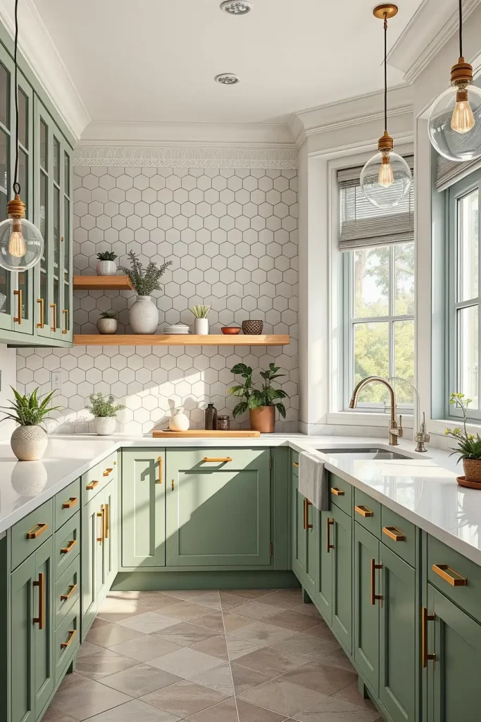
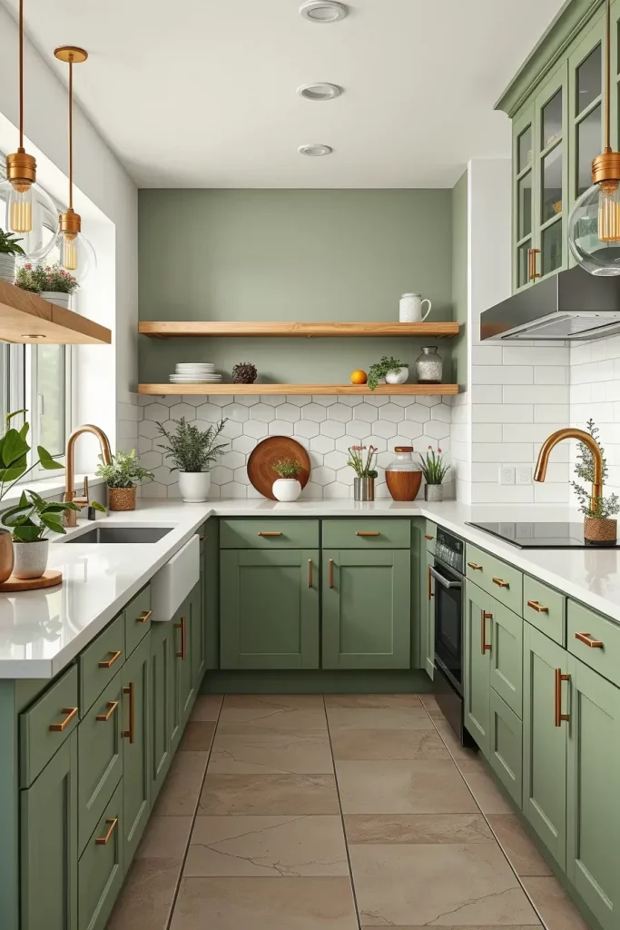
Olive Sage Serenity: Muted Greens that Evoke the Natural World
Olive and sage greens serve as earth tones that are both serene and nature inspired. They are ideal if you want to create a palette that bridges the gap between your kitchen and the outdoor world. I especially recommend this palette to houses with garden views or to those flooded with natural light.
My go-to design includes soft matte sage lower cabinets with white or light wood upper ones. This is added with a white quartz countertop and a zellige tile backsplash in natural clay hues to bring some warmth and balance. The space is paired with brass pulls and a farmhouse style sink to complete the look. A neutral linen roman shade over the window softens the edges of this grounded style.
For me, this palette has been relaxing and nostalgic all at once. House Beautiful notes that green has become the new neutral in kitchen design. It’s versatile and understated chic; the design works in both modern and classic interiors. I couldn’t agree more.
What I would add would be some dried florals or potted herbs to open shelves, which is more in line with the botanical theme while also being colorful and functional toward the design.
Sky Blue Serenity: Light, Airy, and Perfectly Fresh
Sky blue cabinets can transform your kitchen into a peaceful oasis. Best suited for the coastal or Scandinavian looks, it works very well with lots of light, air, and space. In kitchens that lack natural light, I like using this color because it lifts the room and mood.
Matte sky blue cabinets paired with white stone countertops and subway tile backsplashes deliver my ideal layout. To achieve my vision, I often floor with white oak or ash wood, add chrome fixtures alongside oversized pendant lights with glass shades, and crown the space with mid to light grey walls or icy blue for added depth.
I personally think this palette strikes the balance between warm and cold remarkably well, which is rare for palettes. It also has a deceptive effect that masks the spatial limitations of small kitchens. As reported by Domino, kitchens featuring a pale blue hue are becoming increasingly in vogue as they are nostalgic but at the same time pull on modernity’s presence.
To further refine this area, I would place small ceramic accessories or vases of the same color on open shelving. These touches increase spaciousness and lightness, which is desirable in any space, without making the room feel cluttered.
Pastel Palette: Subtle Shades for a Soft Statement
The entire pastel palette allows for a more daring yet sophisticated attempt in kitchen cabinetry design. This is a strategy I particularly admire in contemporary kitchens that wish to move away from ultra-white spaces but still want a clean softness mixed with ample modern aesthetics. Pastels are personal and approachable, which makes them endlessly stylish so long as they are properly balanced and proportioned.
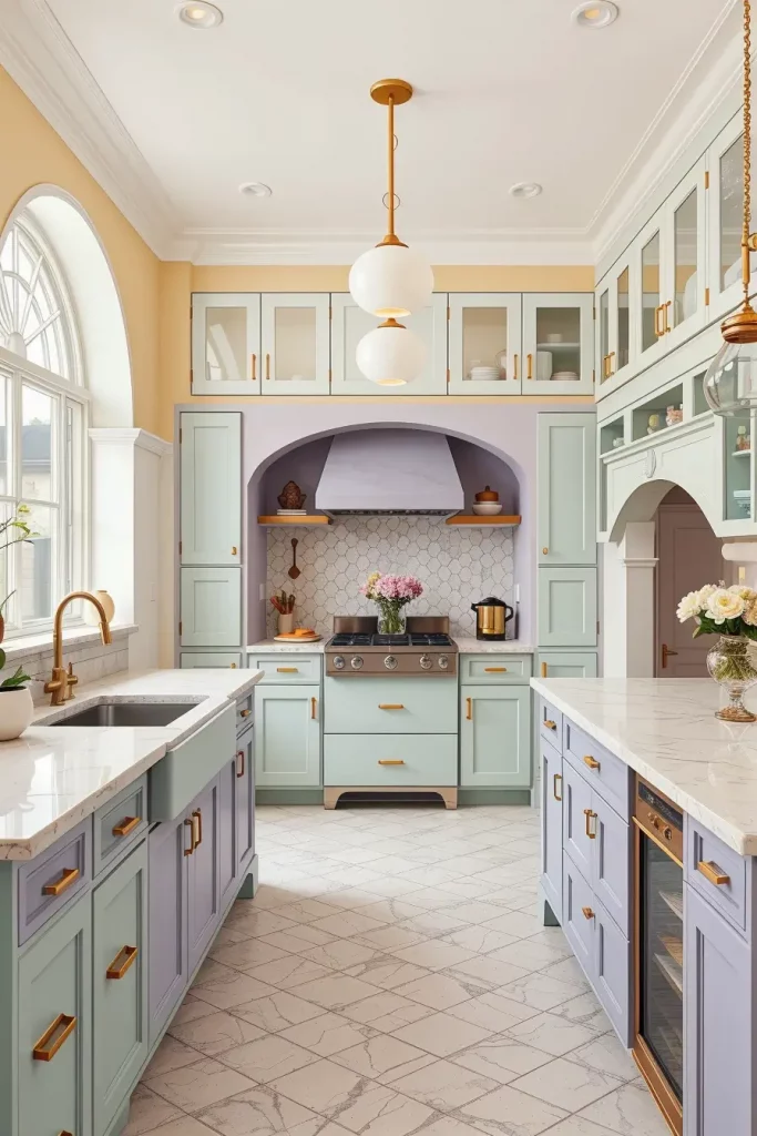
In the alternate lower cabinet sections or on accent pieces such as islands, I often implement a combination of very light mint, buttery yellow, and soft lavender. To anchor the design, I add white cabinets on top, gold fittings, and terrazzo topped countertops. These colors beautifully combine with satin finishes and sculptural structures, especially those featuring an arched doorway or rounded islands.
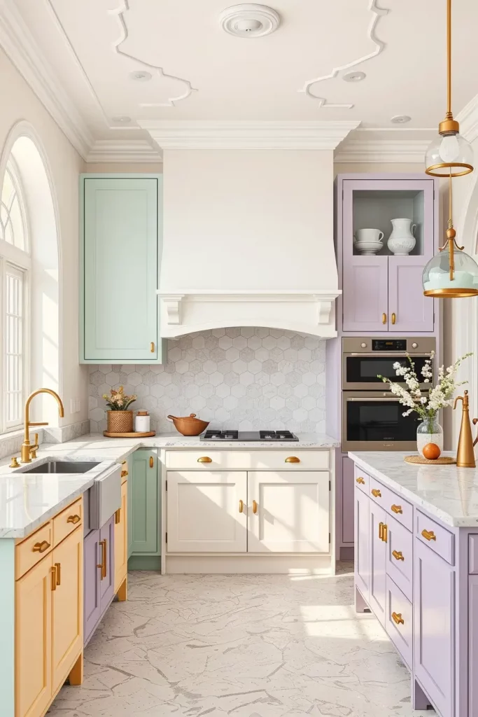
What stands out the most to me is the magic these kitchens create. Dwell Magazine has featured several pastel kitchens that prove color can be understated yet bold at the same time. This is ideal for families or anyone who wants to customize a certain area of their home.
To achieve this particular look, I recommend including a statement light fixture in pastel hues or glassware in pastel tones for display. It’s those narrow touches of the color spectrum that really complete the room.
Chic Chocolate: Deep, Rich, and Decadent Cabinet Choices
A kitchen starkly stands out and gains an essence of opulence with chocolate cabinets as they give a rich, grounded aesthetic. This is not only the most approachable, but also a very elegant style for homeowners and customers. The warmth the kitchen gives is cozy without losing sophistication and feels balanced with the rest of the tones present in the interiors. These tones shine greatly in open plan areas where there is abundant natural light, as they will not overpower the space.
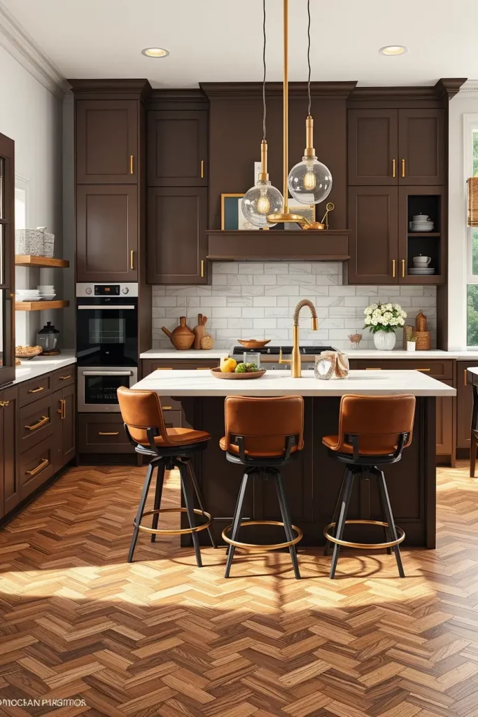
I personally prefer the setup where the matte chocolate brown cabinets with brass hardware are paired with creamy white marble countertops. I like to make the island a matching chocolate color, adding leather bar stools, which serve as great accent pieces. The strongest touch is achieved with herringbone hardwood floor in walnut or a corresponding color alongside the clear glass globe pendants the satin brass sconces over the countertop, offering modern finishing touches.
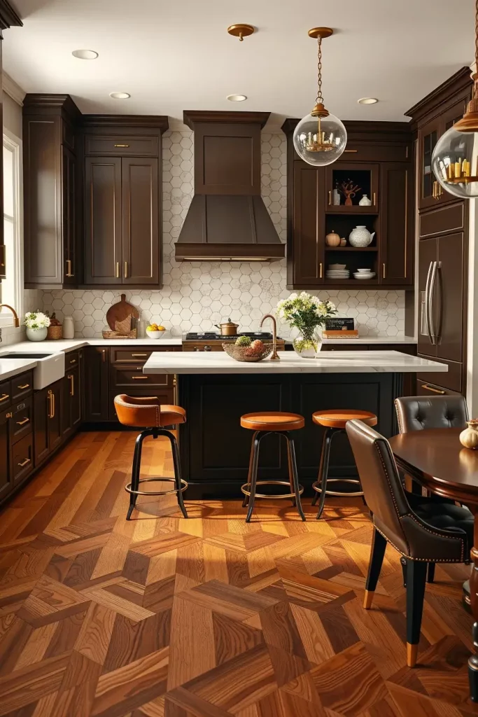
Personally, I find chocolate cabinetry extremely versatile. It pairs wonderfully with cream and taupe, and even navy accents as chocolate-brown cabinetry works seamlessly with a warm gold or brushed brass. As Architectural Digest states, chocolate and walnut tones are returning as preferred choices in modern luxury kitchens because flat colors lack the depth these tones provide. In my own projects, I have noticed how they add a soft, refined touch to family-friendly kitchens.
To complete this arrangement, I would add open shelving in a similar or contrasting wood tone and style it with ceramics as well as small green plants. This gives a crafted dimension to the cabinetry while still maintaining the structure’s clean lines.
Coral Kiss: A Warm and Vibrant Kitchen Highlights
A coral color for the cabinets adds a lively pop of color as it sits warm in between red and pink. I tend to reach for this hue when a client has requested a bright kitchen but wants it to still feels polished. This shade is best suited for contemporary or retro style kitchens, particularly in spots that are well-lit and need a boost of energy.
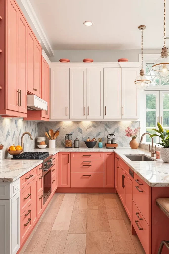
For my clients, I often select semi-gloss coral base cabinets. These are paired with soft white upper ones. Quartz or terrazzo countertops featuring delicate pink or beige veins are visually appealing. As for the flooring, I prefer lying oak and tile patterned them to be light coral friendly. I complete the design with brushed nickel fixtures and light wood accents to maintain some weight.
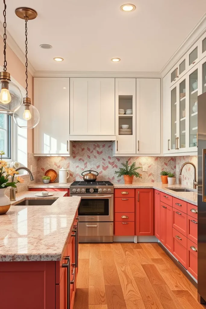
I’ve employed this specific design in both compact and open kitchens, and it gives off a sense of warmth in both scenarios. Southern Living recently cited coral cabinetry as one of the leading design trends for adding character into a space, and I could not agree more. It is a bold choice, yet surprisingly gentle and forgiving in many respects.
Best adds to the room would be retro lighting fixtures and colorful tiles for the backsplash, especially in pink, orange, and cream. These additions highlight the retro-modern embrace of the coral tone.
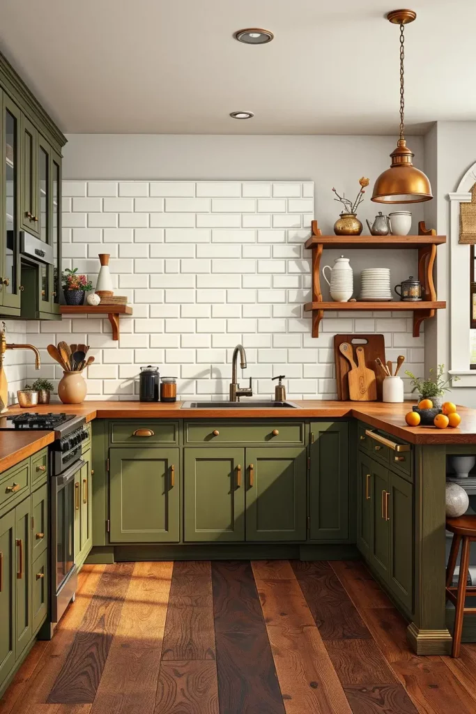
Going Green: Nature-Inspired Hues for a Harmonious Kitchen
Green is a classic addition in the combinations used for the color of kitchen cabinets, and for a good reason; it has natural origins and is calming. I often encourage solid green cabinetry to those homeowners wishing to bring more of the natural world into their kitchens. Be it forest, emerald or moss, rich greens always provide resonance and dimension to a room.
My dream kitchen incorporates matte, earth green lower cabinets with black or butcher block countertops. To break the solid look, I prefer incorporating cream upper cabinets or open wood shelving. The earthy patterned floor tiles also add depth and textural quality into the space. Brushed brass or matte black fittings are always a must; they contrast stunningly with the green.
I admire how green provides a calming anchor. As stated in Real Simple, the green kitchen benefits psychologically by reducing stress and improving mood. I have noticed this is the case with most families as the color helps to create a soothing ‘zone’ in the core of the home.
To contribute to a more cohesive experience, I recommend using hot green glassware, placing the potted growing plants on the window tops and on suspension shelves.
Cinnamon Spice: A Cozy Blend of Warm Earth Tones
Cinnamon also offers a more welcoming, earthy substitute to standard brown with its cinnamon-toned cabinets. This is a go-to color for me when designing rustic modern or Mediterranean-inspired kitchens. Especially in terracotta or warm stone kitchens, cinnamon brings an understated vibrance that feels comfortingly sophisticated.

I go for smooth matte cinnamon base cabinets paired with white or sand-colored uppers. The warmth and welcoming aesthetic is completed with travertine countertops, consigned clay tile backsplashes, and wrought iron light fixtures. For the flooring, medium oak or slate are inviting, sharp contrast to the warm cabinets.
In my kitchen redesign projects, I especially value cinnamon tones because they seem to always get recognition. Veranda Magazine praises cinnamon cabinetry for sustaining a warm and welcoming feeling in a room while not going out of style. This works best for kitchens that serve as social hubs.
To further enhance warmth and authenticity, I recommend handcrafted pottery, rustic kitchen cutlery, and natural fiber rugs. These elements assist in crafting a holistic inviting kitchen.
Khaki Combinations: A Minimalist’s Neutral Dream
Khaki kitchen cabinets are sandwiched perfectly between beige and taupe striking a balanced minimalist palette. This hue works best for more contemporary and Scandi-inspired settings that emphasize natural elements and clean lines, which I prefer. For those who enjoy neutral tones, khaki is soft, subtle, and comforting.
For this design, my focus is on the base khaki cabinets with no apron, light oak open shelving, and stone/concrete-looking countertops. Bright white walls and ceilings contribute to the brightness of the room, complemented by matte black fixtures and light wood furniture. A tall or built-in pantry unit is often included for practical storage without compromising design.
The best thing about using khaki is how it seamlessly integrates with other materials. It is warm without being overly yellow, and maintains a modern edge. Livingetc suggests combining khaki with natural wood and textured materials to add richness—something I know from experience can work very well.
To elevate this space, don’t forget to include soft pendant light fixtures with fabric shades as well as minimalist ceramic objects on the counter or open shelves.
Wood Wonders: Timeless Grain and Texture in Natural Cabinets
Natural wood provides timeless cabinetry with an organic character that never seems to fade. This type of cabinetry is particularly well suited for kitchens designed in a modern rustic or Japandi style. Wood’s grain and tone adds texture and warmth, which helps soften more industrial elements.
My preferred design includes flat-panel natural oak or walnut cabinets, topped with white or grey stone countertops and a bronze-hued ceramic tile backsplash in neutral shades. I suggest incorporating matte black or brass accents, depending on the decor. To maintain the visual coherence, light hardwood floors and open shelves crafted from the same wood are ideal.
Natural wood cabinetry stands has an unwavered charm for me. As pointed out by House & Garden UK, wood has once again started to be used in modern kitchen design because it offers warmth as well as being sustainable. I try my best to accentuate the natural knots and lines that form in wood because they adds individuality to every kitchen.
To complete my naturalistic approach, I tend to add gentle fabrics such as linens in the form of blinds or woven baskets, along with natural stone or clay for the accessories to aid in the tactile feeling.
Plum Presence: A Bold and Royal Touch in the Kitchen
Plum kitchen cabinets offer a bold choice while still being elegant for those wishing to showcase color in their kitchens. I enjoy employing plum in kitchens that have ample natural or electric light because it highlights the richness of the purple tones. This color is great in both monochrome as well as high-contrast interiors.
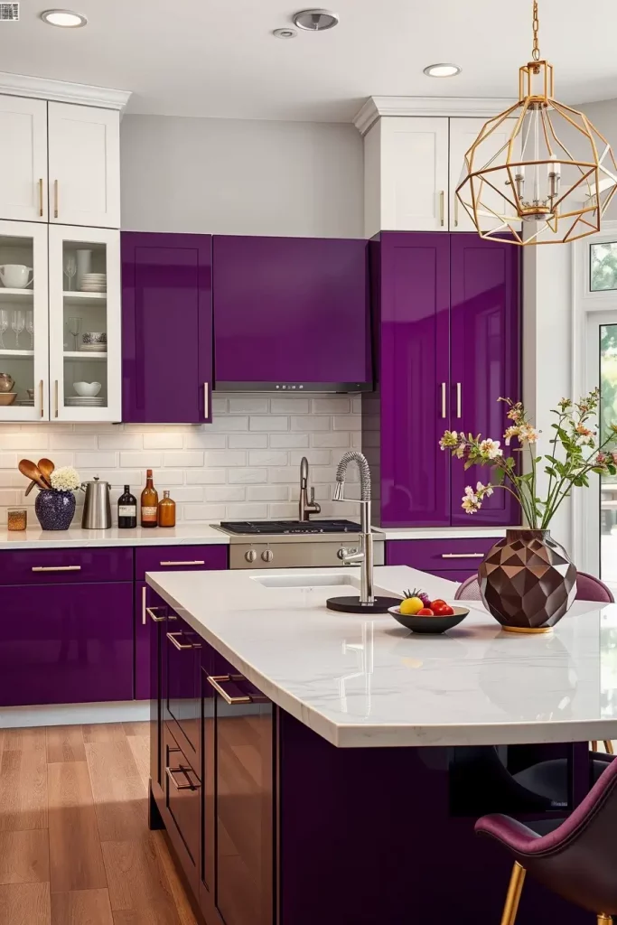
My favorite application involves high gloss plum base cabinets paired with white or cream upper cabinets and light grey or white marble quartz countertops. To soften the dramatic feeling, I add brushed gold or polished chrome hardware. The warm neutral tile or wood flooring completes the look. Geometric pendant lights complete the bold look.
In my opinion, plum has a distinct character and adds a hint of luxury. As noted in Elle Decor, shades of plum and eggplant are being used in contemporary kitchens because they are in balance with modern interiors and add depth without being overly bright. I have had good success using it in kitchens with little ornamentation, where the color does the talking.
To take this further, I’d suggest extending the color story by incorporating small dining chairs and plum-toned small appliances, furthering the color story and extending it through the space.
Salad Green Style: Fresh, Crisp, and Unexpectedly Chic
Of all the colors that can be invigorating, I find the cheerful combination of salad green with matte white or natural wood most revitalizing. This color works well with dull interiors as it is both vibrant and earthy, making a space feel fresh and grounded at the same time. Soft hues of green are reminiscent of herbs and garden life, which is fantastic for people who love organic, homegrown elements in their kitchens. In combination with open-concept houses, it looks brilliant in sunlit dining areas.
In terms of design, I usually go for shaker salad green cabinets paired with white quartz countertops. They can be completed with light oak floating shelves that provide warmth without competing with green. A modern white backsplash with subtle geometric texture is visually interesting along with Brushed brass handles but they do not clutter the design. The overall look is grounded by a neutral tile floor and pendant lights in clear or frosted glass add additional charm and brightness.
In my opinion, this combination presents a biophilic soft green kitchen design alternative to traditional white kitchens. Better Homes and Gardens notes soft green kitchens have become popular due to their connection with biophilic design, which fosters wellness by emulating nature. I have implemented this color combination in several remodels, and my clients have told me it increases their energization throughout the day.
To improve this section, I might add functional indoor decor like potted basil or rosemary sprigs along the window sills. These indoor herbs are visually appealing, serve a real purpose, and align wonderfully with the green theme.
Light Yellow Lift: Gentle Hues That Brighten Any Kitchen
Not only can a light yellow cabinet completely rejuvenate your space, but it can also give your home an airy lift together with a cheerful tone that feels effortless. I’ve observed that homeowners looking to achieve a stimulating sunlit kitchen are drawn to this kitchen cabinet color combo, particularly when paired with cream, beige, or soft gray accents. This is also a great option for small kitchens or those lacking natural light, as the understated tones work brilliantly to boost brightness.
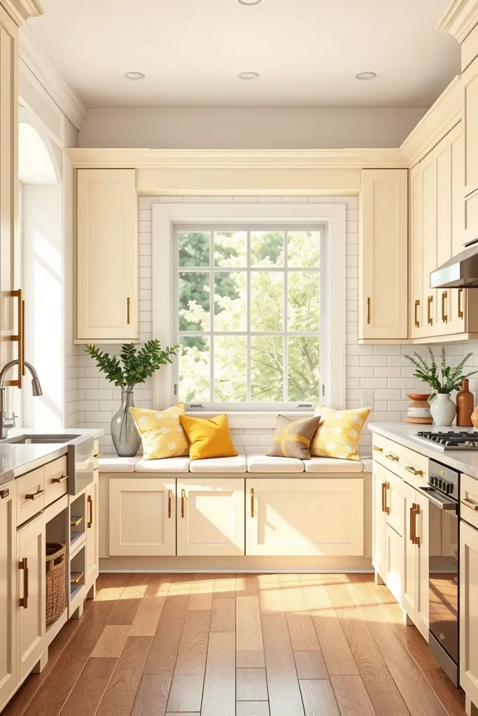
In these kitchens, I recommend warm, creamy yellow cabinetry accented with satin or semi-gloss finishes to bounce light. A white subway tile backsplash brings in a fresh feature alongside timeless elegance, while light beige and taupe countertops ensure the buttery vibe stays grounded. I prefer to arrange built-in seating near the window with cushions in shades of yellow, while woven baskets serve as storage. For flooring, medium toned hardwood or luxury vinyl planks preserve the welcoming, light-filled vibe.
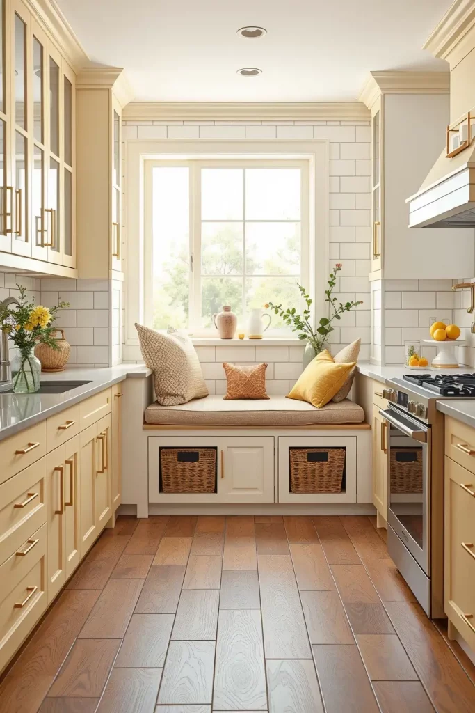
In my working experience, the most essential aspect of pulling yellow off in a kitchen is balance. Southern Living suggests yellow is an optimistic color; however, an excess of it can turn quite chaotic. This is exactly why I incorporate warm neutrals and minimalist accent pieces. One of my clients, a food blogger, said this palette helped her create inspires her and energizes her mornings every day.
To finish the section, I propose soft touches of greenery, like eucalyptus stems or freshly picked flowers, accompanied by a soft linen curtain. These elements bring balance to the bold yellow and make the kitchen even more inviting.
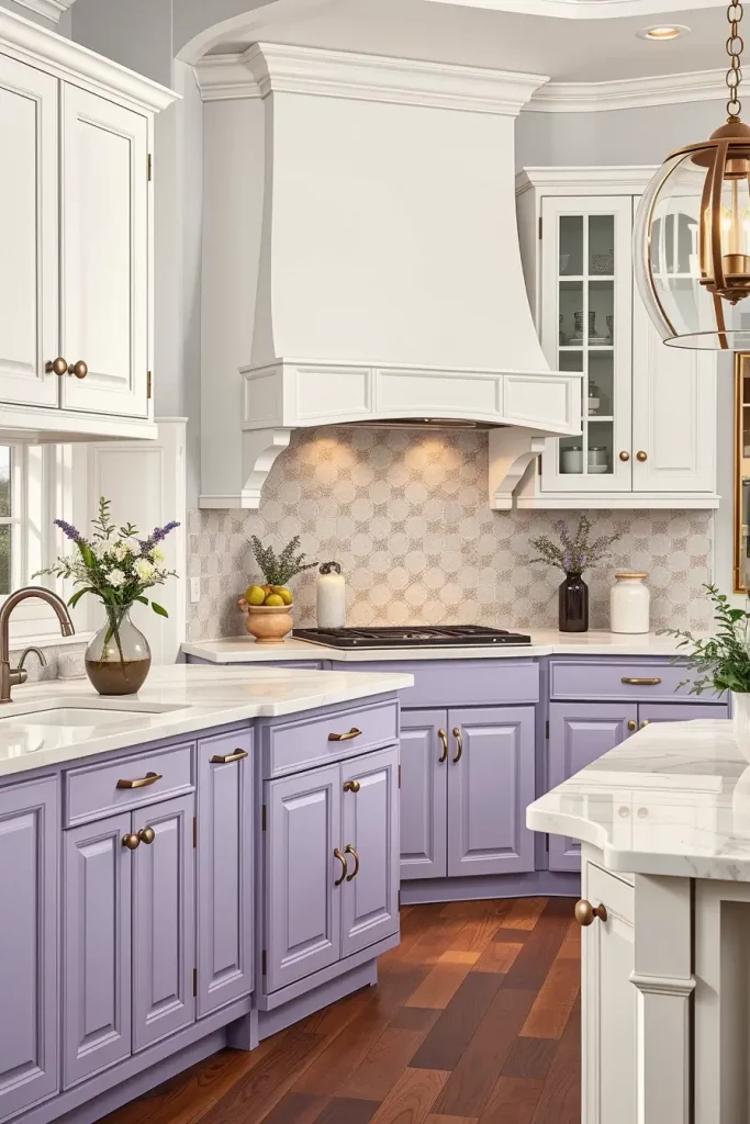
Pale Lilac Appeal: Whisper-Soft Elegance in Cabinet Design
Using pale lilac as a color for kitchen cabinets may appear unusual at first glance. Nonetheless, it works exceptionally well to evoke tranquility in an upscale environment. I’ve had clients who desired something understated yet one-of-a-kind, and lilac did the trick perfectly. This shade works especially well with cool grays, polished nickel, and white marble. Moreover, this color is perfect for both traditional and modern kitchens, especially in homes that embrace soft, feminine design elements.
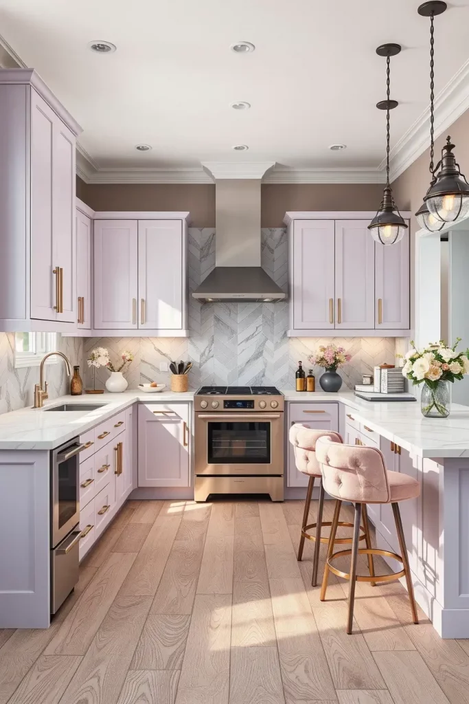
This is why, for this style, I prefer slab or inset panel cabinets in satin lilac alongside white marble countertops boasting soft gray veining. The balance is achieved with contemporary stainless steel appliances, and the delicate gray herringbone tile backsplash provides just the right amount of contrast. To underscore the sophisticated softness of the space, I often specify pastel velvet for the bar stools, and use matte black light fixtures. Light gray or whitewashed oak flooring enhances the gentle palette without a sense of cold sterility.
Personally, I think lilac kitchens have a stylish, creative flair which is great for a kitchen that also functions as a social or artistic area. As noted in Elle Decor, pastel kitchens are becoming popular due to their tranquil appeal and surprising aesthetics. This color combination seems to consistently delight people, and I’ve been told it’s for the best.
To further enhance this section, I might want to add illuminated display and glass cabinets to highlight the showpieces or glassware. That would enhance the feeling of space and softness while still maintaining the dreamy, luxurious essence.
Selecting suitable kitchen cabinet colors can style and compliment transform this area of your house. Be it soft neutrals or bold colors – there is always something out there for everyone. We would love to know what your preferences are. Tell about how the combinations worked out for you in the comments.